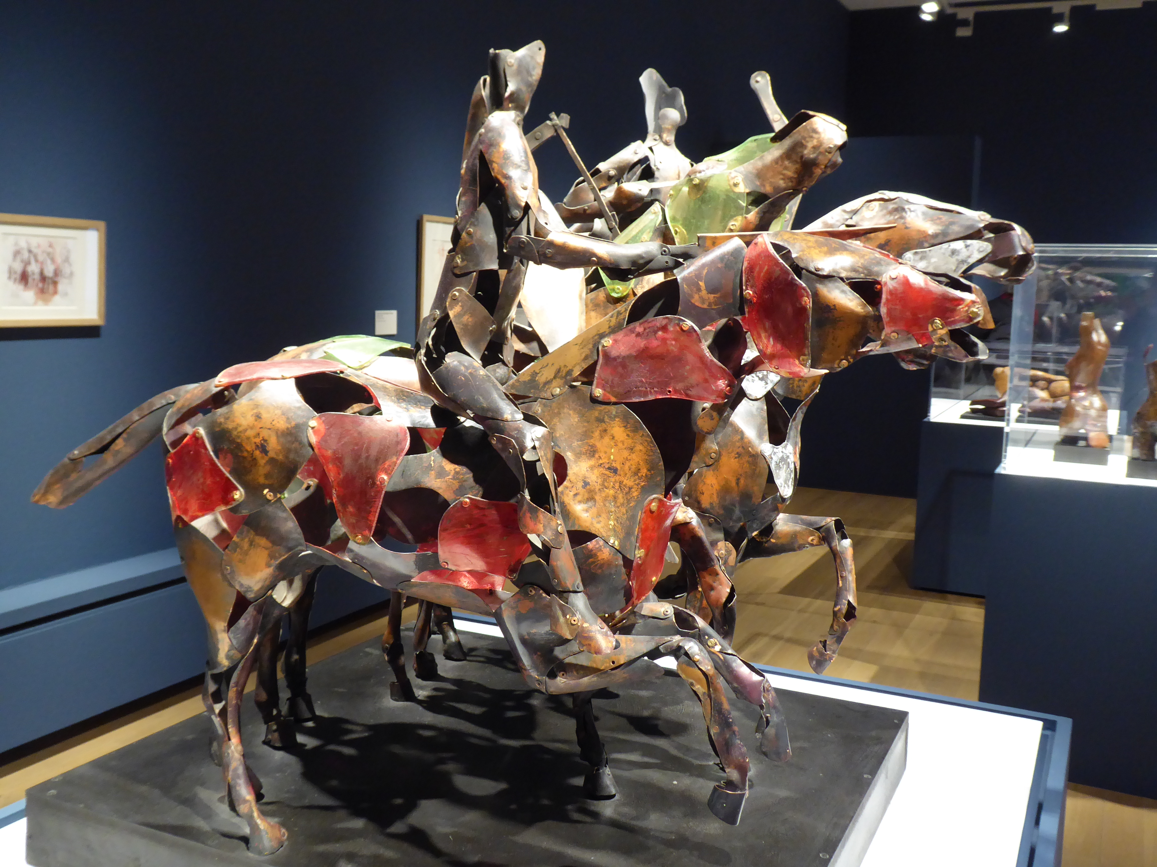
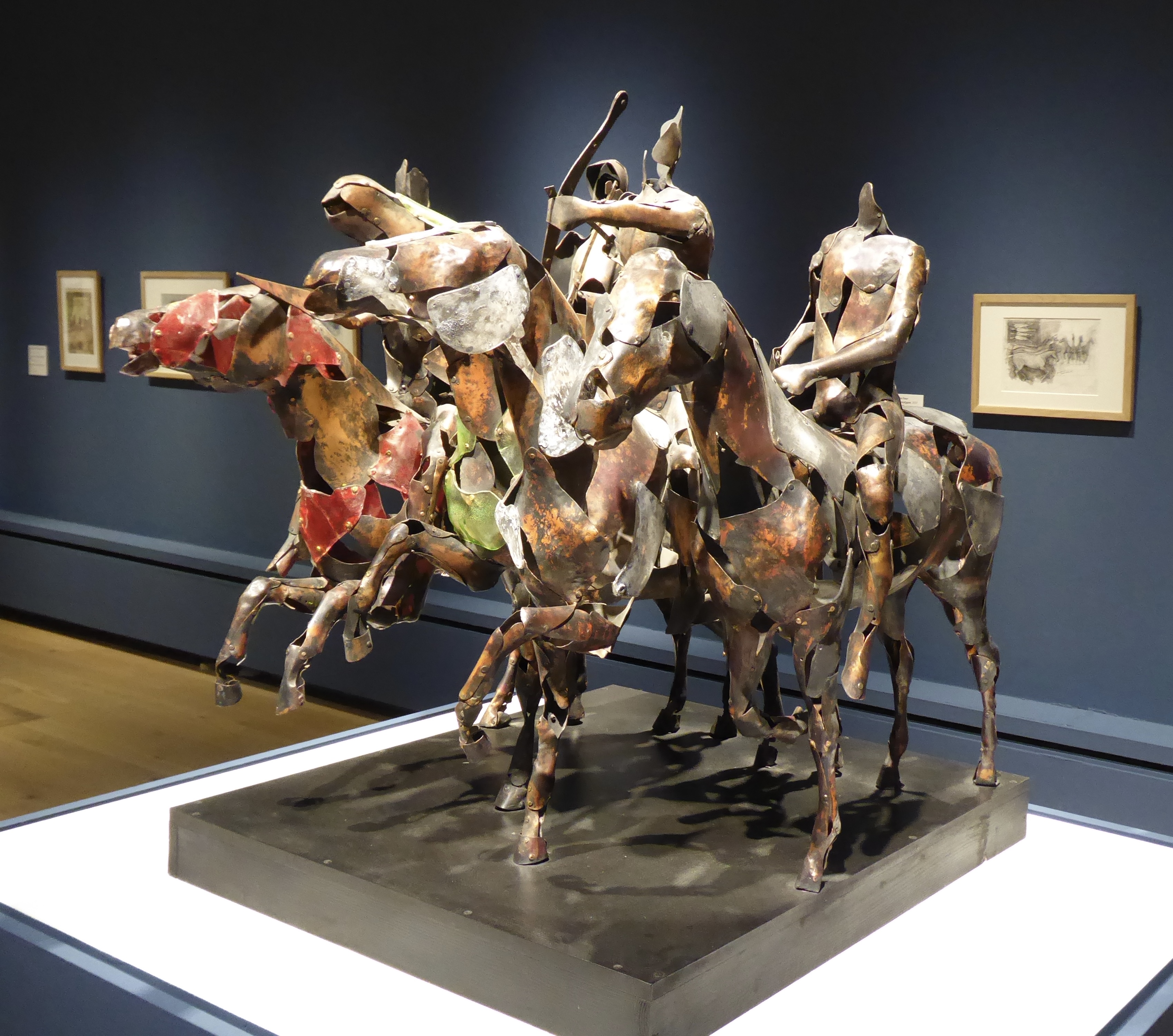
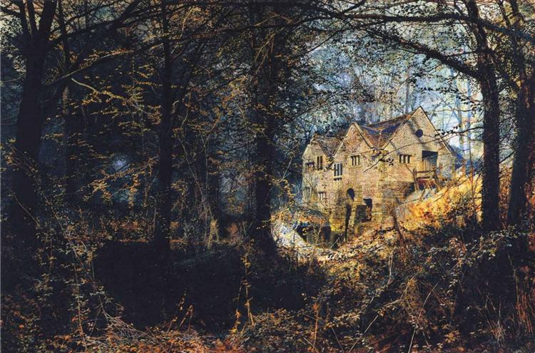
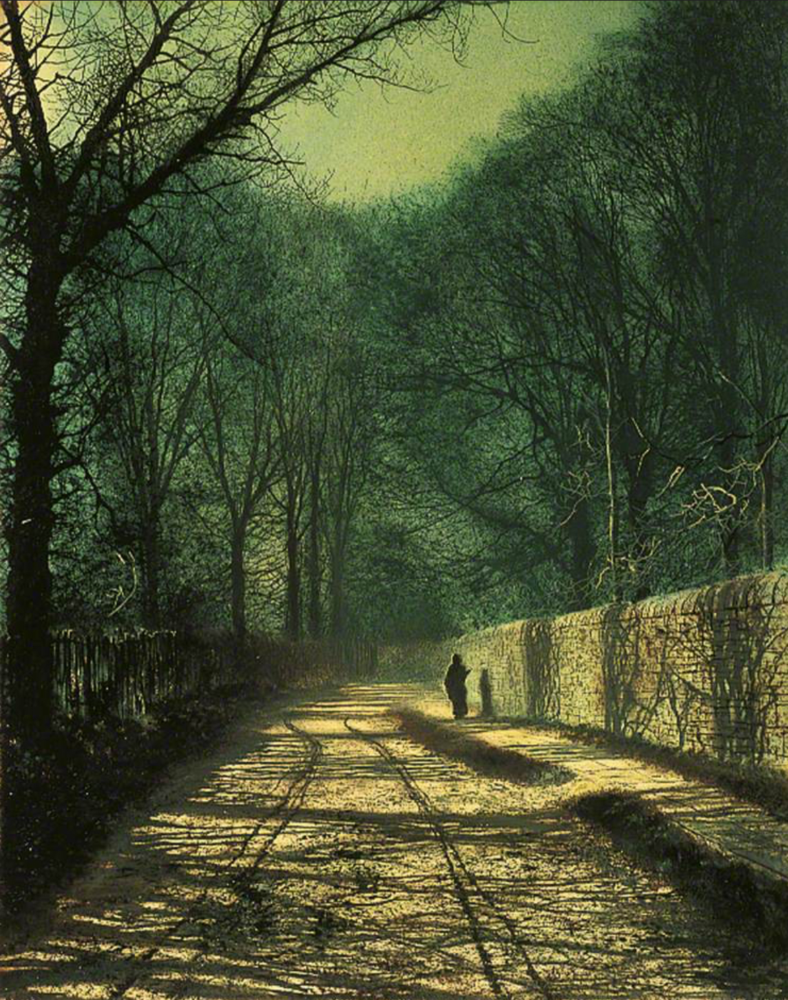
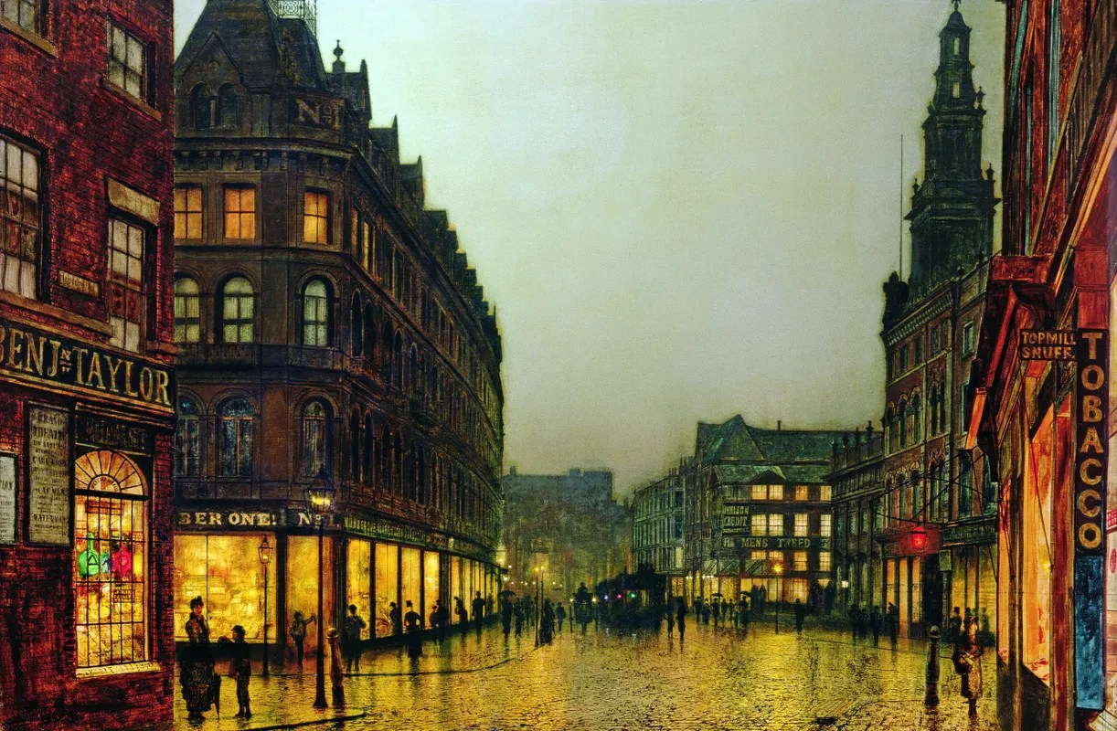
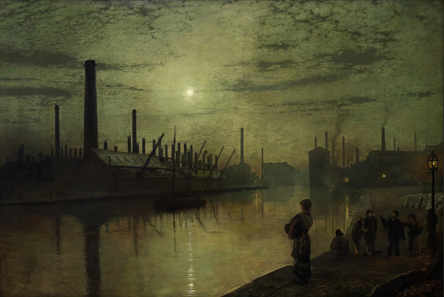
It was too cold and dank a day to want to do anything more than mooch up to the art gallery and look at the J Atkinson Grimshaw exhibition, “Nocturnes”.
No great surprise to learn that, as an artist, he was self-taught. (He obviously didn’t spend hours in life drawing classes.) He also churned out favourite scenes, as I discovered when looking online. But, oh, the light and shadows by Roundhay Park! The exhibition included some modern works to complement Grimshaw; they rather faded into insignificance beside his, but I noticed paintings by Judith Tucker that had been on display in the Burton Gallery – chosen, presumably, because of the lighted windows in dark landscapes.
There were also two extracts by Charles Dickens and James McNeill Whistler. Given yesterday’s visit to the Thackray Museum, I was inclined to view Grimshaw’s murky, polluted River Aire through Dickens’s eyes.
But the river had an awful look, the buildings on the bans were muffled in black shrouds, and the reflected lights seemed to originate deep in the water, as if the spectres of suicides were holding them to show where they went down. The wild moon and clouds were as restless as an evil conscience in a tumbled bed, and the very shadow of the immensity of London seemed to lie oppressively upon the river.
Charles Dickens
And when the evening mist cloths the riverside with poetry, as with a veil, and the poor buildings lose themselves in the dim sky, and the tall chimneys become campanili, and the warehouses are palaces in the night, and the whole city hangs in the heavens and fairy-land is before us – then the wayfarer hastens home; the working man, and the cultured one, the wise man and the one of pleasure, cease to understand, as they have ceased to see, and Nature, who, for once, has sung in tune, sings her exquisite song to the artist alone, her son and her master – her son in that he loves her, her master in that he knows her.
James McNeill Whistler
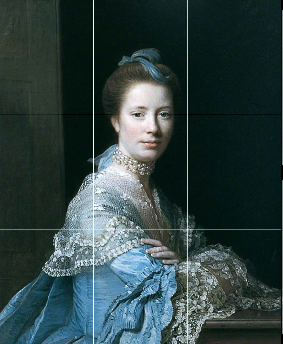
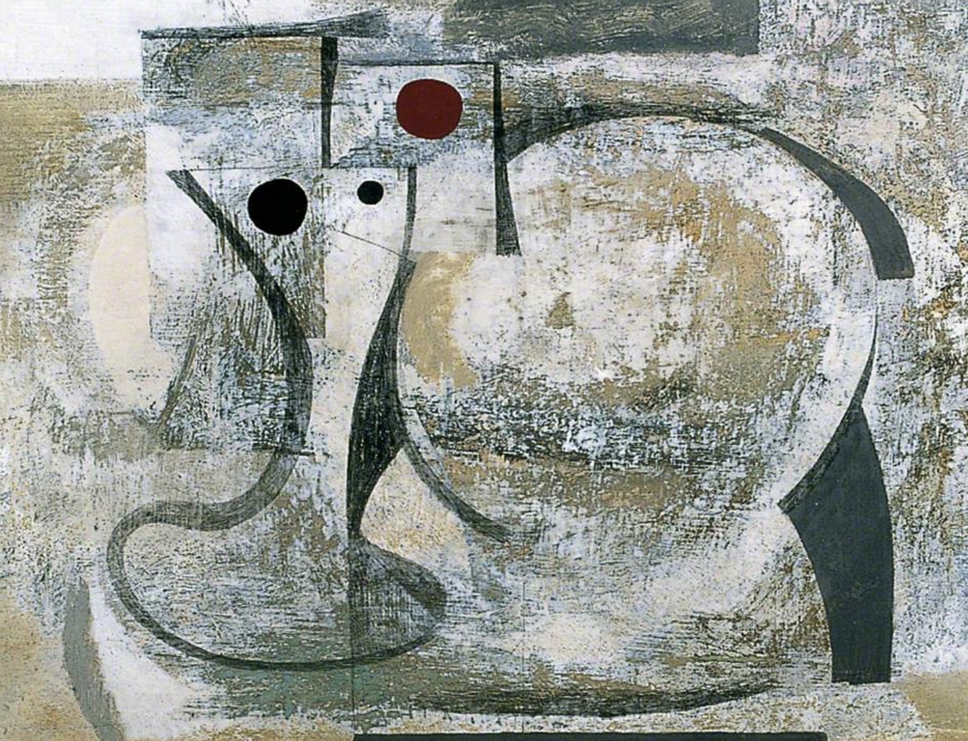
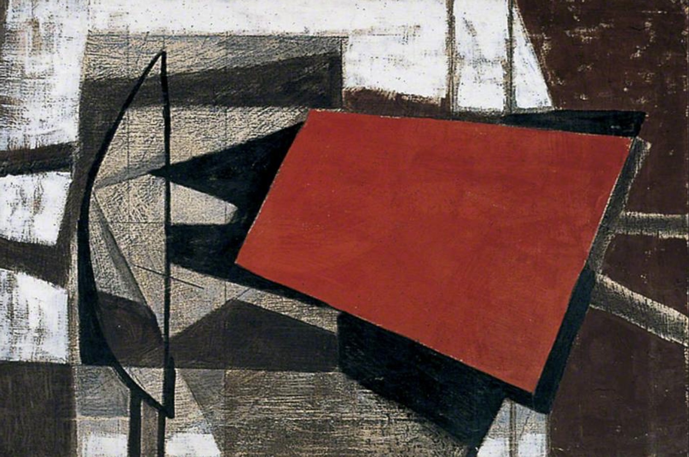
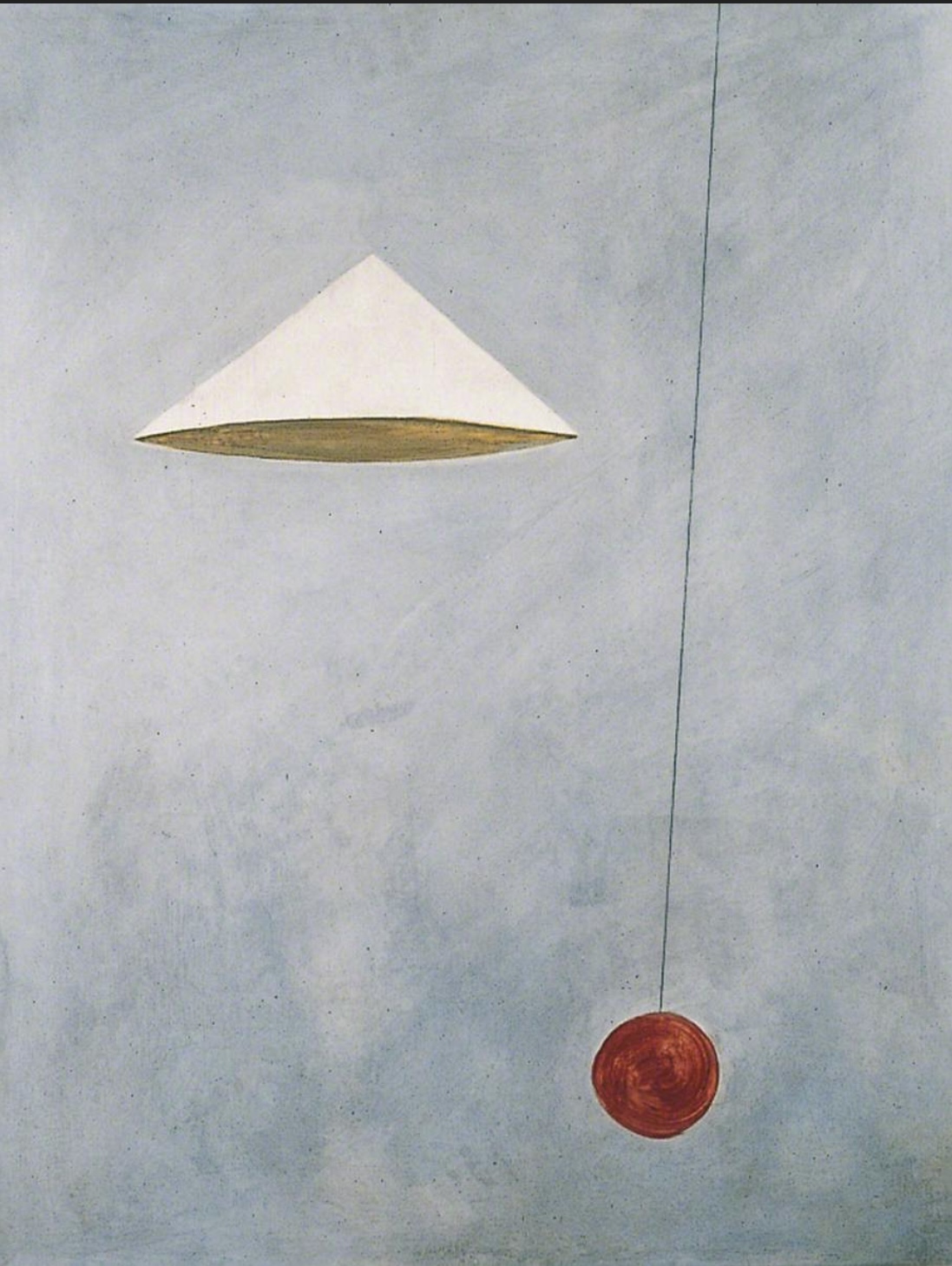
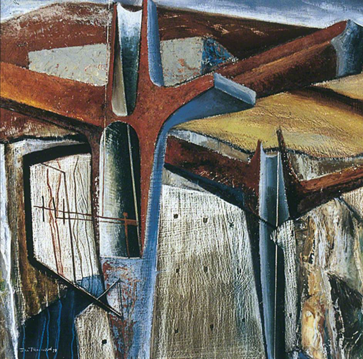
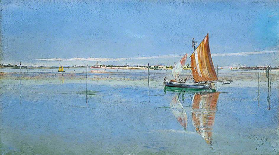
As for the rest: I would happily have stolen the Inchbold, the Tunnard seemed to approach Ignatius Riley’s “geometry and theology” criteria (although undoubtedly falling short doctrinally), and on my way back I noticed a bus going to Roundhay Park. Grimshaw lives!