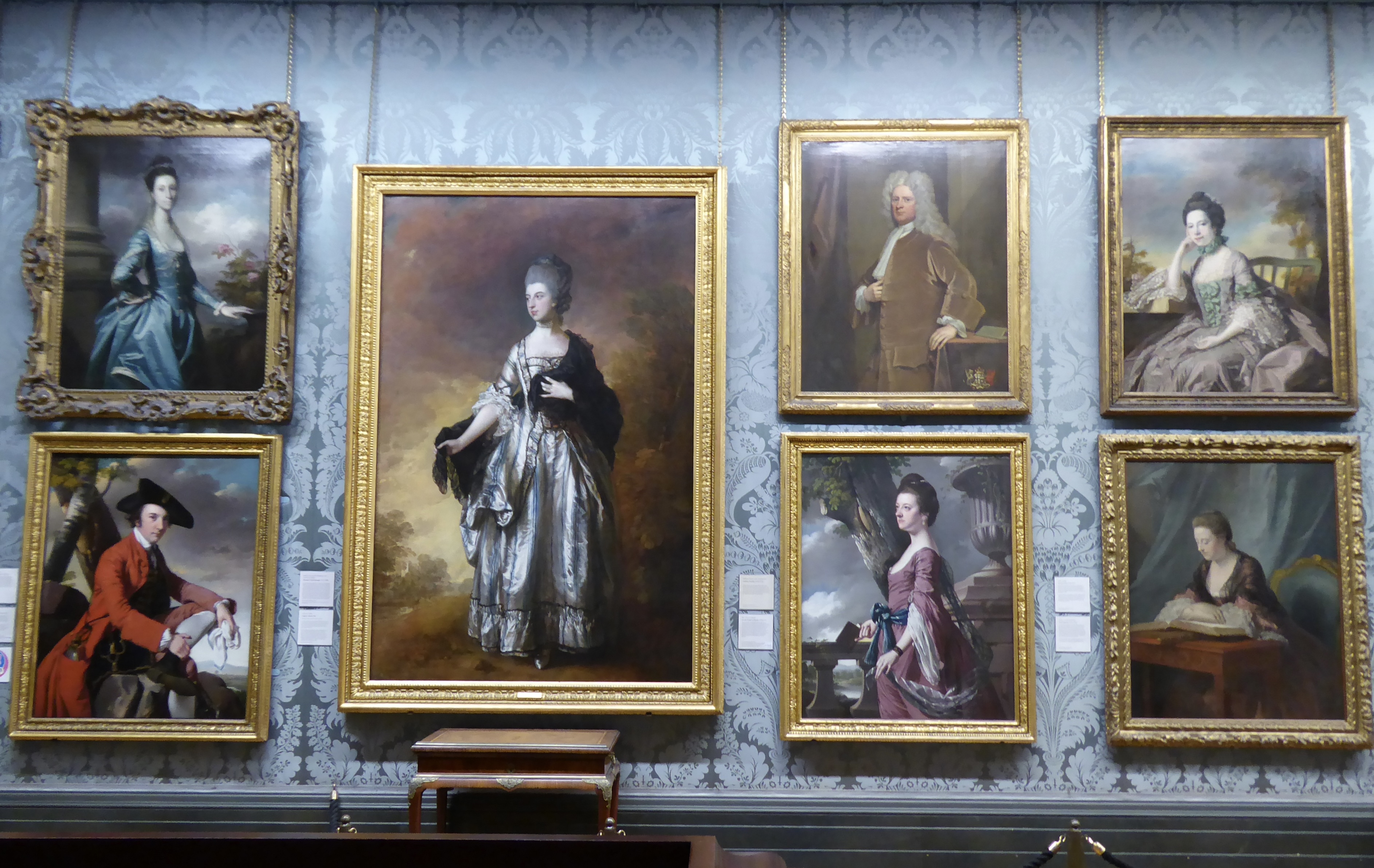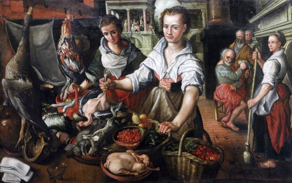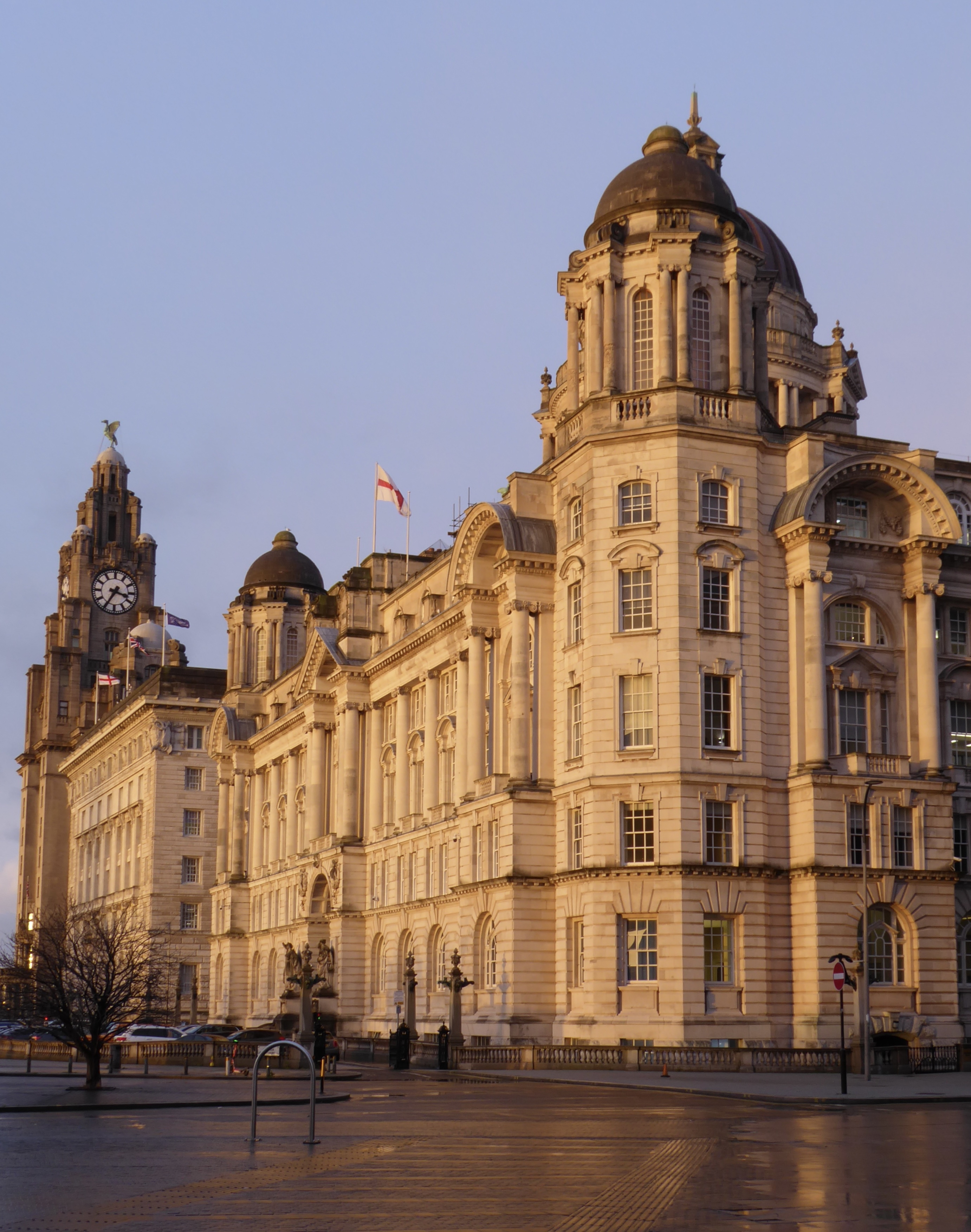
I set off for the Tate on foot and continued walking when the rain started, preferring to avoid crowds while I could for I knew the exhibition would be busy. It was indeed sold out for the day, and the cloakroom was quickly full.
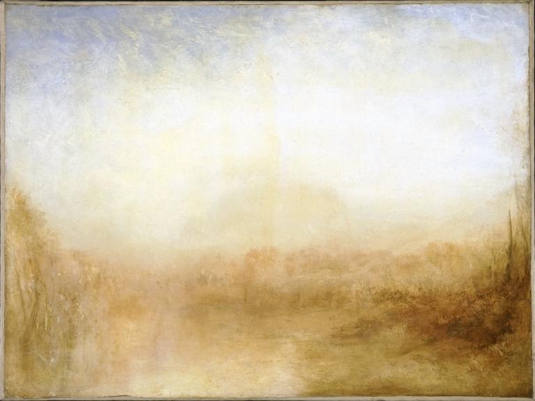
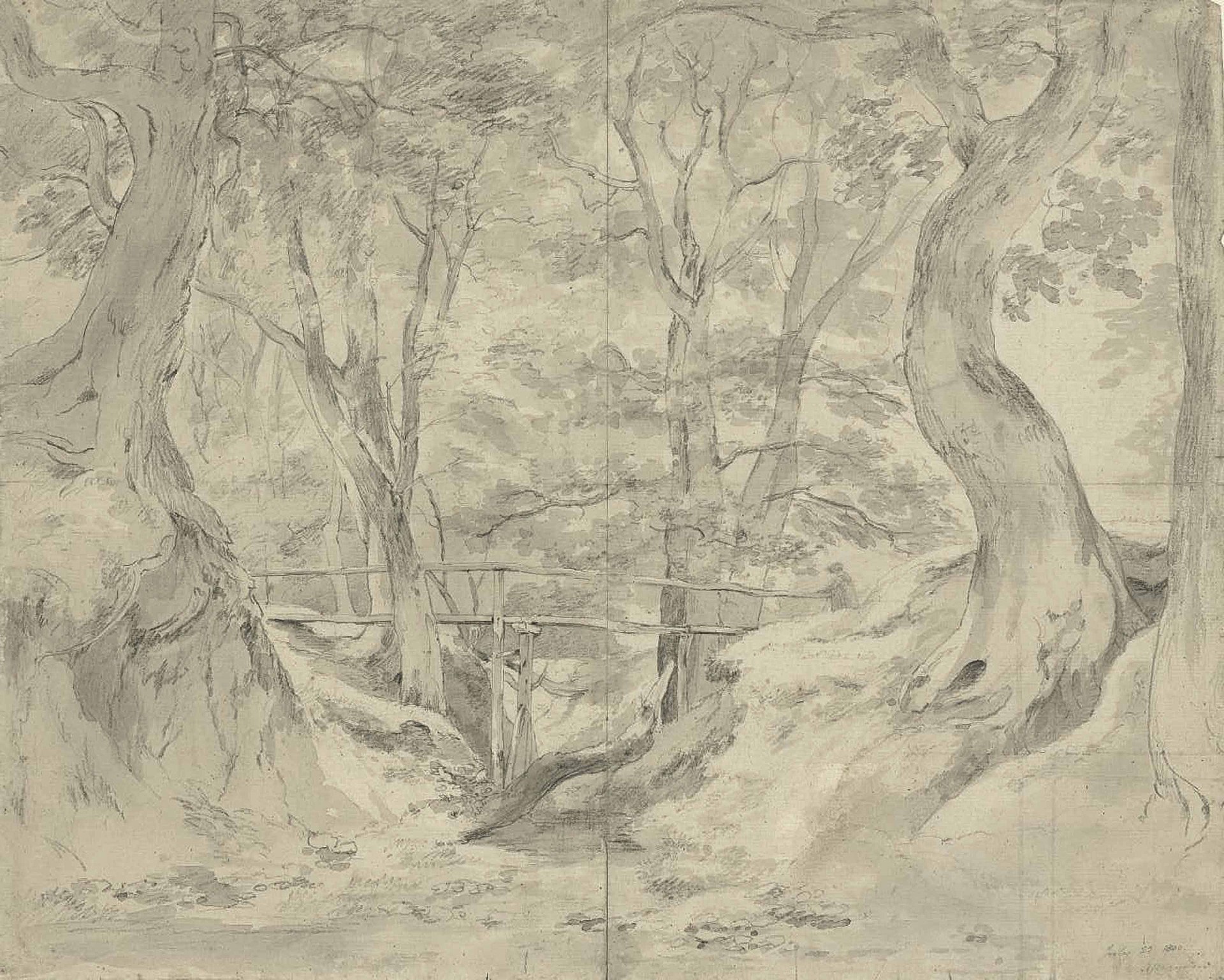
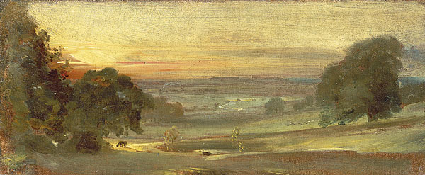
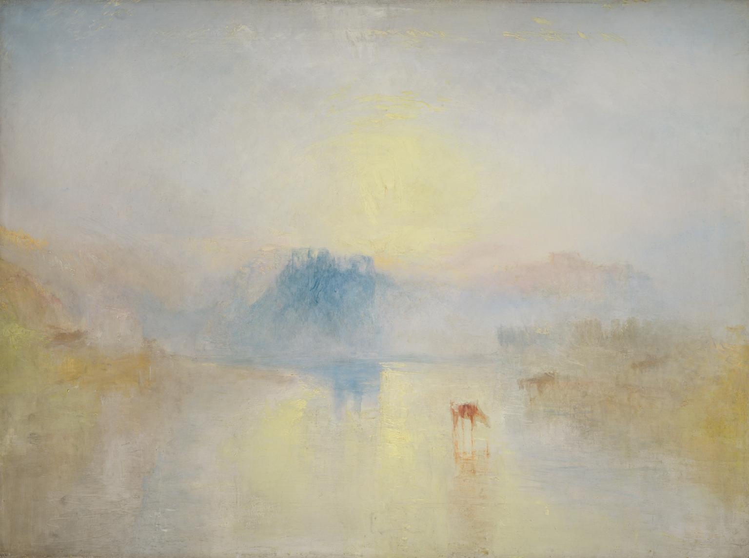
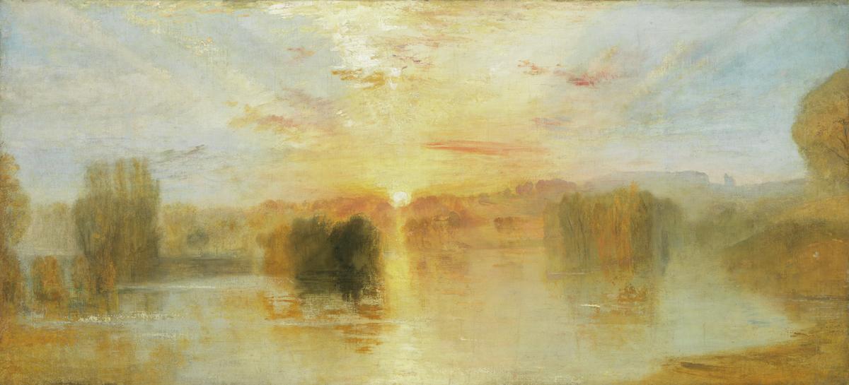
The exhibition looked at Turner (b 1775) and Constable (b 1776), comparing their works and their success (the former seen at the time as “poetic”, the latter “truthful”). Turner travelled widely, portraying the sublime and maximising income from his output through his prints; Constable painted closer to home, often out of doors, trying to capture natural features and atmospheric effects as truthfully as he could. There was a sketch of Helmingham Dell which I wanted to steal: it combined the charm of poohsticks bridge with the elemental forest scenes in Hamnet. I much preferred his smaller works to his “six-footers” – paintings designed to be noticed at exhibitions. (Turner had learned that lesson early on.) It was interesting to compare Constable’s experiments with his brushwork – usually textured (which critics had divided opinions about), but occasionally smoother.
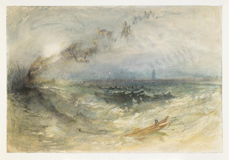
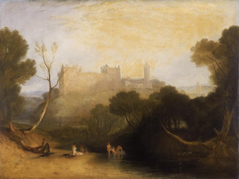
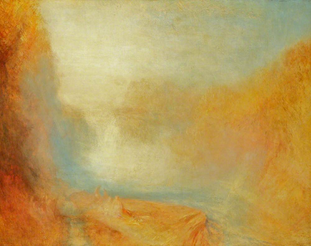
Again, I preferred Turner’s later, less finished paintings. There are only so many scenes of ravines, cliffs and castles that I can take. His unfocussed views leave more room for interpretation.
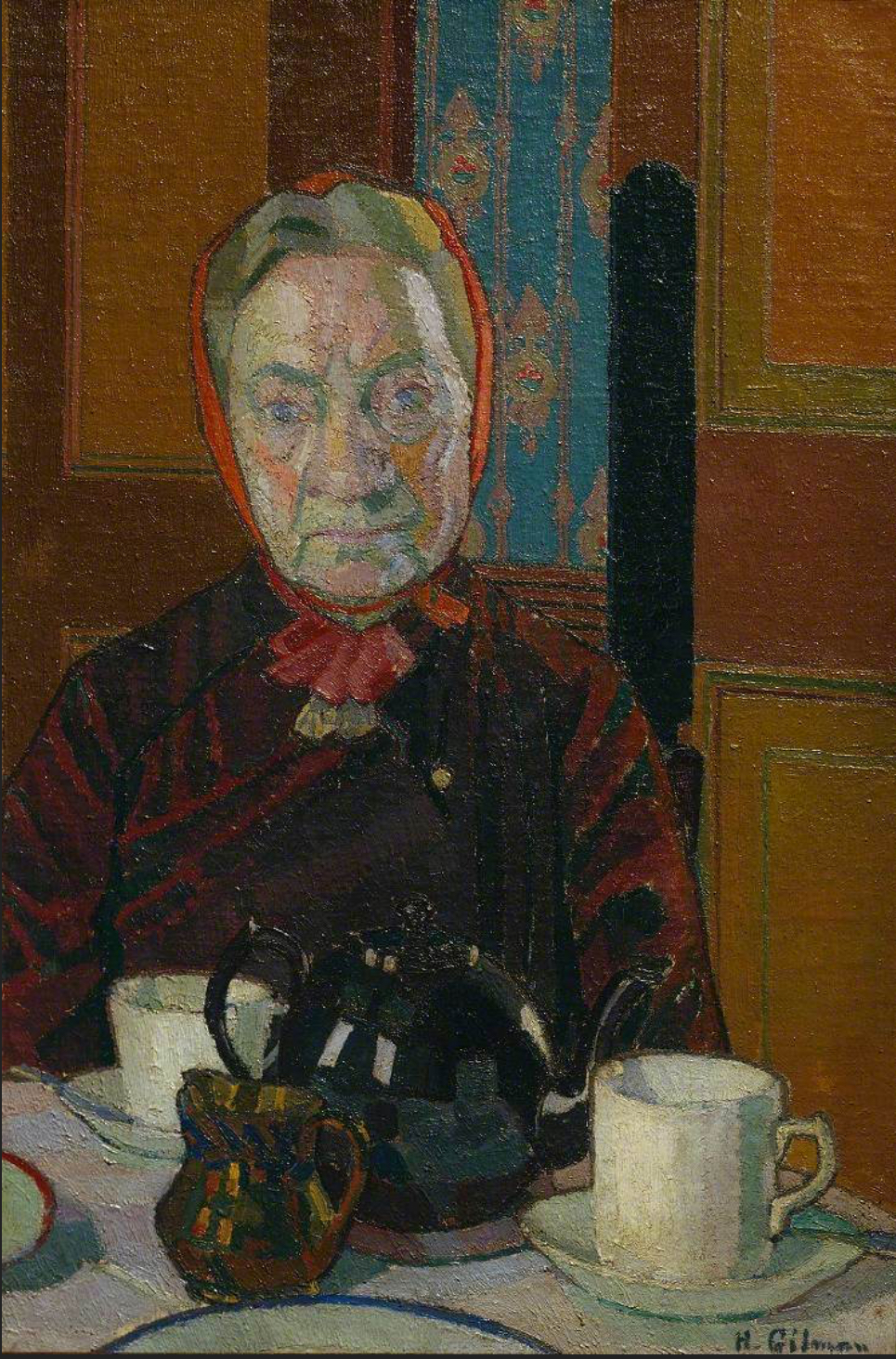
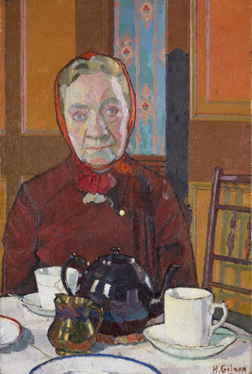
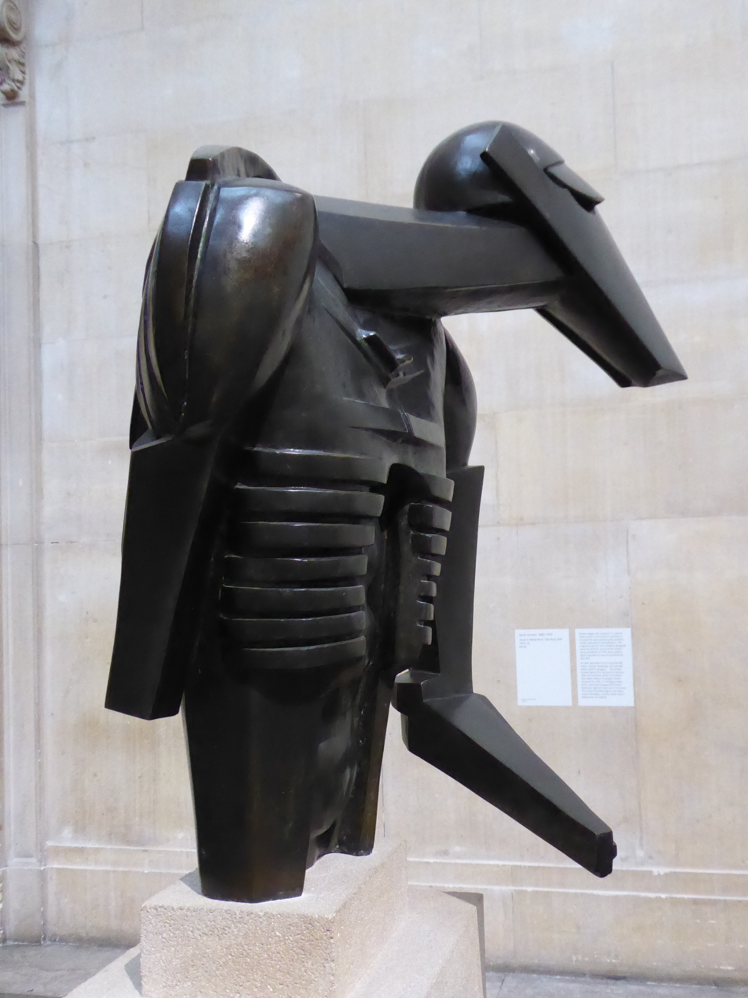
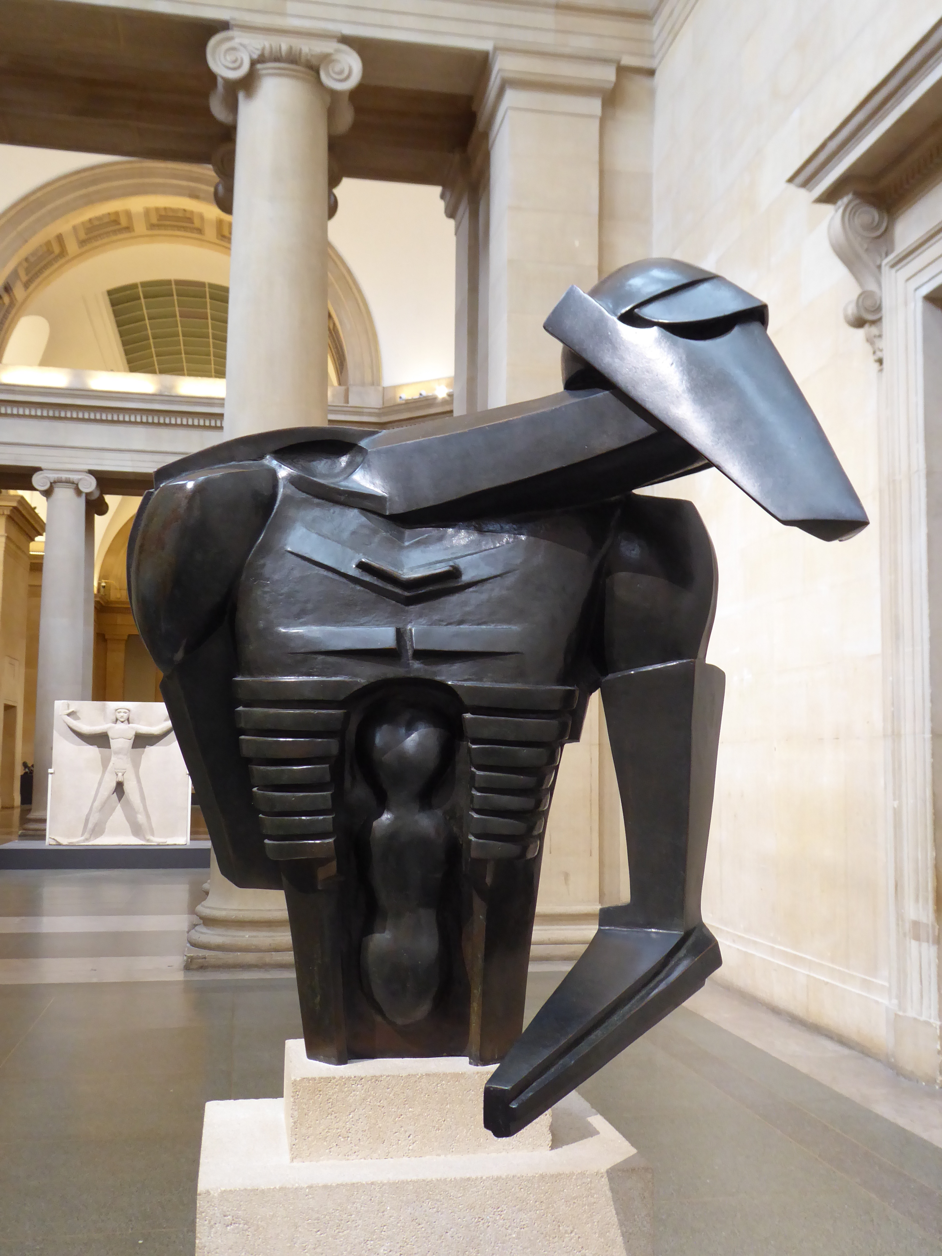
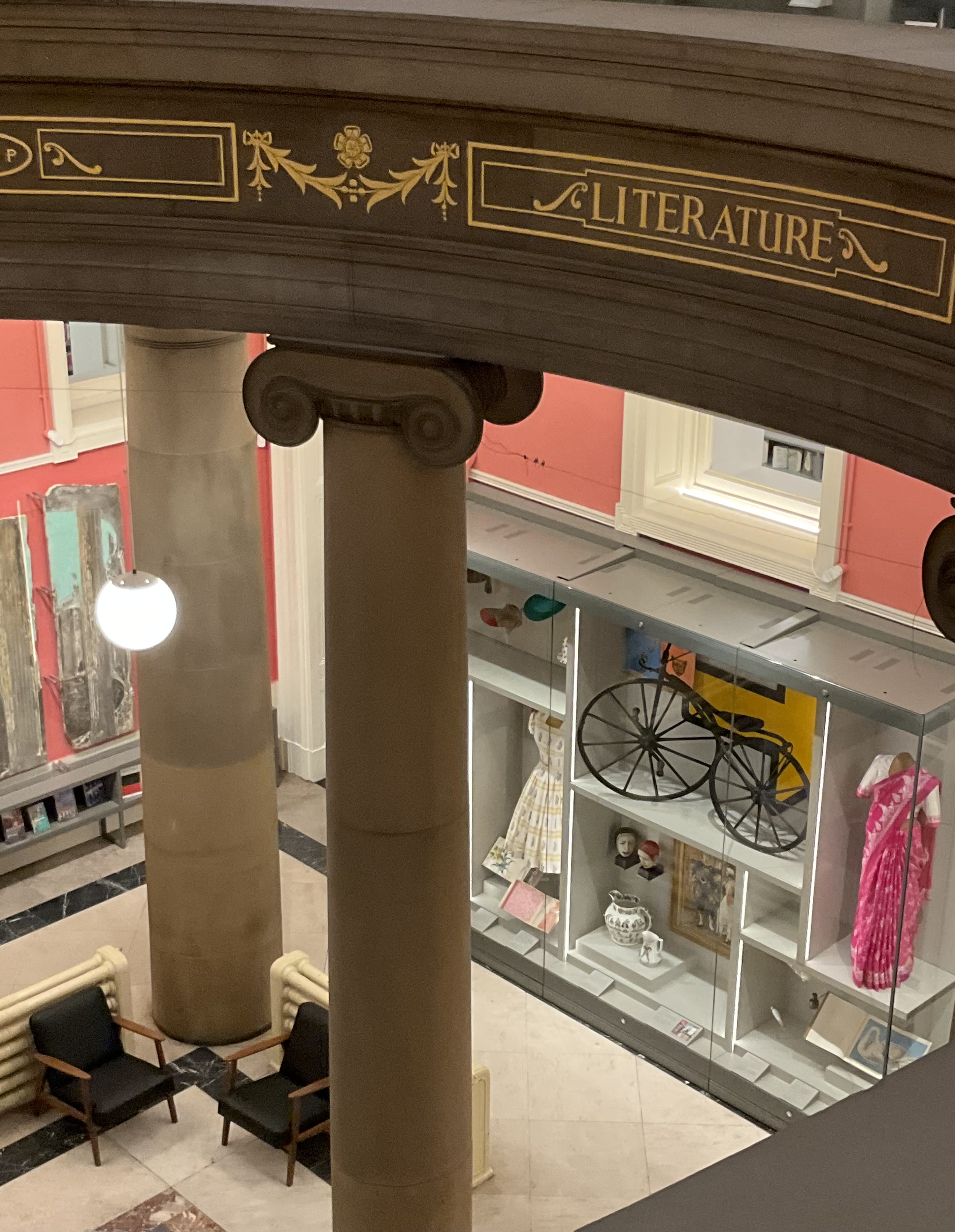
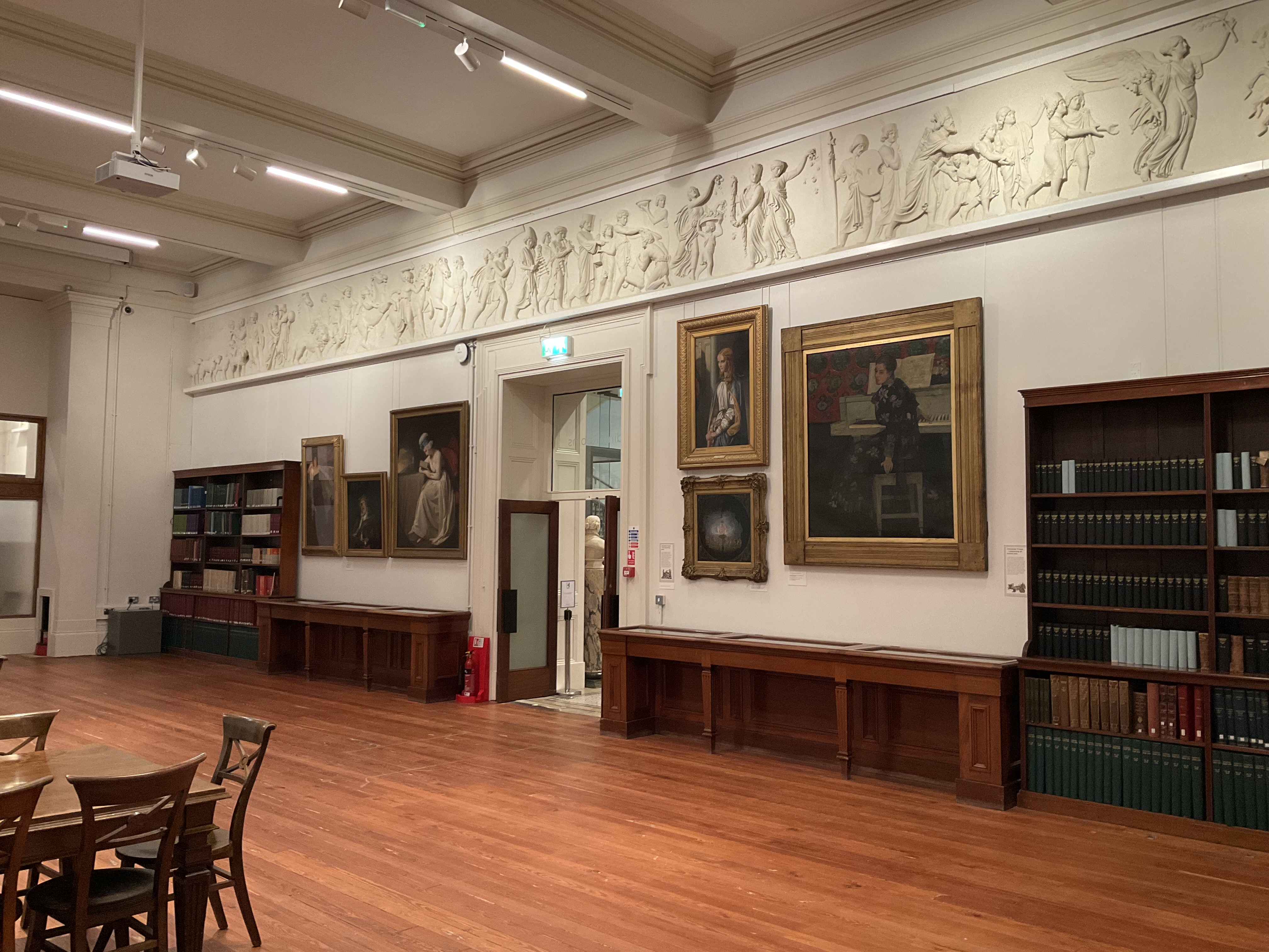
I wandered around the regular galleries too, and noted a painting of Mrs Mounter by Harold Gilman that I was sure I had seen last month at the Walker. Yes, I had – Mrs Mounter was a regular model for Gilman; I’ve even seen her in Leeds. The main hall had a selection of Jacob Epstein’s sculptures, and I was struck anew by the Rock Drill torso. Epstein changed the sculpture (originally more sinister) after WWI, amputating some of it and casting it in bronze, and the result is somehow sorrowful – almost like a Pietà with bowed head and arm reaching out in supplication.
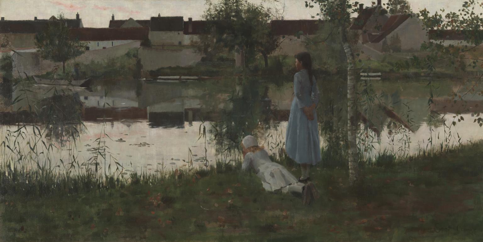
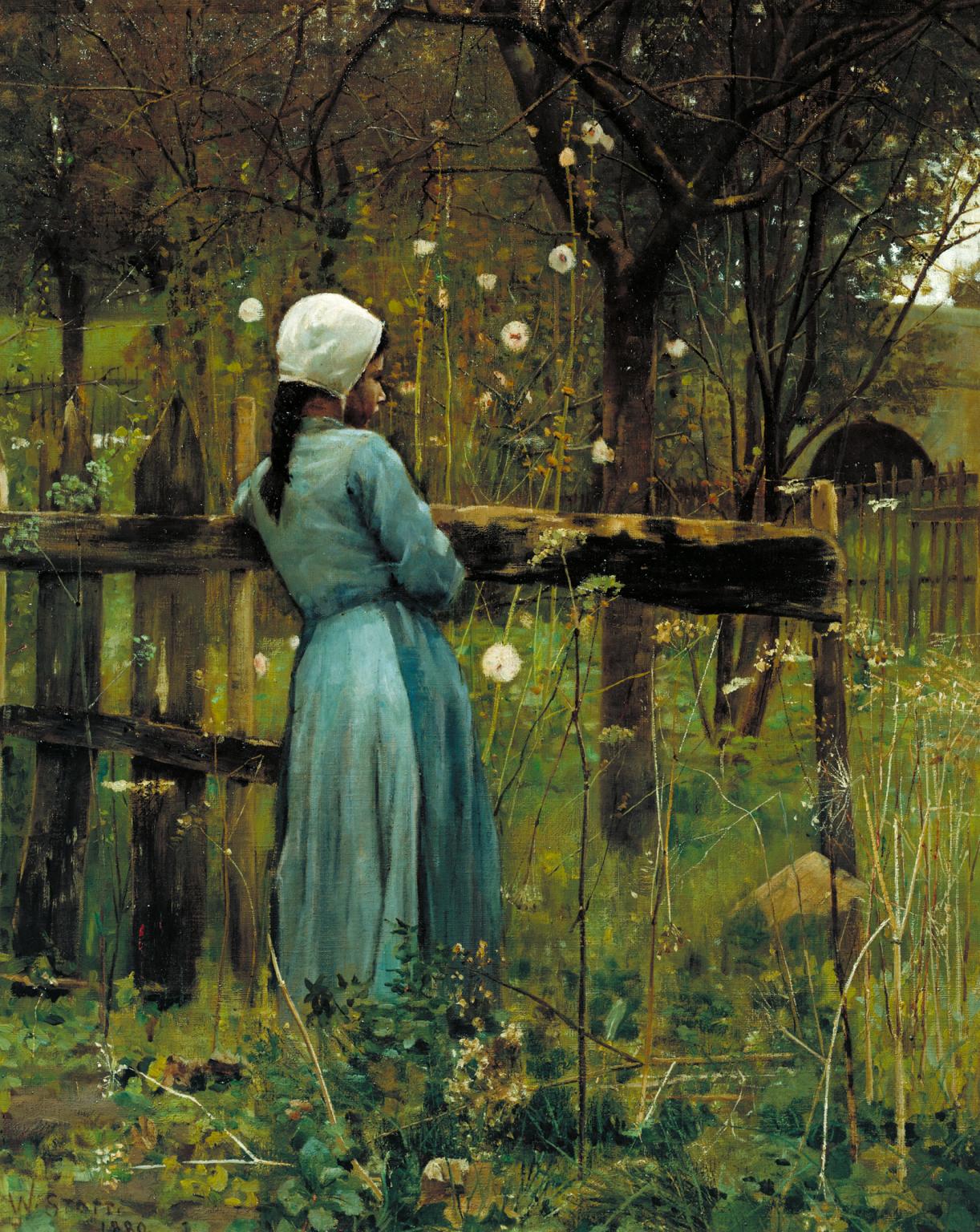
I also spent time with William Stott of Oldham. Undemanding . . . but so lovely.