Turner in Time

A very wet and windy day, but the trains were running and that was enough for me. To the Whitworth for yet another Turner exhibition. This one was of Turner’s watercolours (low status compared to oil painting) from his teens to his old age – from precision to impression. I enjoyed watching the change in style as I wandered around the room and noticed how he embraced innovation (e.g. coloured paper for his watercolours). Some scenes were already familiar, like the fall of the Clyde in Lanarkshire.

As usual, there were other small exhibitions to dip into. One on trees in art, which was rather lovely, and one on abstract art, which wasn’t. Minimalism is OK, but the “messiness” of, say, Gillian Ayres means nothing to me, Well, my loss perhaps. Included in the exhibition room were fabric and textile designs from Edinburgh Weavers and Hull Traders – abstraction tamed and tidied into repeating patterns.

Turner and Constable

I set off for the Tate on foot and continued walking when the rain started, preferring to avoid crowds while I could for I knew the exhibition would be busy. It was indeed sold out for the day, and the cloakroom was quickly full.

The exhibition looked at Turner (b 1775) and Constable (b 1776), comparing their works and their success (the former seen at the time as “poetic”, the latter “truthful”). Turner travelled widely, portraying the sublime and maximising income from his output through his prints; Constable painted closer to home, often out of doors, trying to capture natural features and atmospheric effects as truthfully as he could. There was a sketch of Helmingham Dell which I wanted to steal: it combined the charm of poohsticks bridge with the elemental forest scenes in Hamnet. I much preferred his smaller works to his “six-footers” – paintings designed to be noticed at exhibitions. (Turner had learned that lesson early on.) It was interesting to compare Constable’s experiments with his brushwork – usually textured (which critics had divided opinions about), but occasionally smoother.

Again, I preferred Turner’s later, less finished paintings. There are only so many scenes of ravines, cliffs and castles that I can take. His unfocussed views leave more room for interpretation.

I wandered around the regular galleries too, and noted a painting of Mrs Mounter by Harold Gilman that I was sure I had seen last month at the Walker. Yes, I had – Mrs Mounter was a regular model for Gilman; I’ve even seen her in Leeds. The main hall had a selection of Jacob Epstein’s sculptures, and I was struck anew by the Rock Drill torso. Epstein changed the sculpture (originally more sinister) after WWI, amputating some of it and casting it in bronze, and the result is somehow sorrowful – almost like a Pietà with bowed head and arm reaching out in supplication.

I also spent time with William Stott of Oldham. Undemanding . . . but so lovely.

London

I arrived in London early and headed to Walthamstow to the William Morris Gallery for an exhibition of Liberty fabrics by women designers. There were some lovely fabrics – thankfully not all of them florals – and it was interesting to see the changing fashions over the decades. I already had a soft spot for Lucienne Day’s designs, and here I added Althea McNish, Gwenfred Jarvis, Hilda Durkin and Colleen Farr.

Arthur Liberty founded the shop in 1875, initially importing textiles and objets d’art from Asia and the Middle East. It soon moved into designing its own fabrics and helped to popularise the new Arts and Crafts and art nouveau styles. The fabrics were all printed until 1972 at the Merton Abbey Mills, and there was some fascinating film of the designs being block- or screen-printed and then rinsed in the chalk stream by men in their shirt sleeves who had been doing that work for decades. Then came the finished garment – which no doubt cost an arm and a leg to buy. A fascinating bit of social and economic history: design opportunities for talented women (initially anonymous), manufacturing work for local companies, then the sale of the finished goods to the prosperous to adorn their homes and persons – much of that exchange also transacted between women, albeit across a social divide.

After lunch I managed to get the last ticket of the day for the Secret Maps exhibition at the British Library. (It’s the final week of the exhibition, so I was lucky.) It was good at showing the power of maps – particularly at times of war or rivalry. The Dutch East India Company tried to keep secret their world map of 1648, which showed part of the coast of Australia. Even before that, the c 1547-produced map for Henri II showed the outline of a great southern continent. Hand-drawn maps were safer, in terms of reproduction, than engraved maps. Armed or a defenceless locations could be removed from or disguised on maps (at least before aerial photography). Tiny maps or maps printed on materials like silk could be hidden (and worn). There was a wonderful hand-drawn map by T E Lawrence of his route from the Red Sea coast to the Hejaz railway. Clandestine maps of worldwide cable networks, or the chart of radio beans on the Normandy coast to assist the D-Day landings (which later influenced GPS).

The unconsidered power of maps was also revealed – as in the official map of Nairobi, which shows no sign of the vast Kibera informal settlement of perhaps 170,000 people. New rulers give new names to their colonies and territories and divide them as they wish. Certain areas/transport corridors are prioritised over others. (I note how this hierarchy is reversed when I use bike route maps: main roads are uncoloured but the route I want is a bright red line across the page.) People have not always wanted their areas to be mapped – preferring to remain under the official radar or fearing what easily accessible knowledge may bring to their land.

More personal maps: the 1930s London map which showed public toilets that were used as meeting places for gay men. Charles Booth’s 1889 map of London which marked each street on a poverty-prosperity scale. Then came GPS and all the data which can be gathered (as in the routes run by American soldiers using Strava that gave away locations of their bases in Afghanistan ) or routes that can be used by asylum seekers to cross vast distances with an encryption messaging app.

I’m glad I got the last space.

Anna Ancher and London

It was such a nice day and I was ready so early that I decided to walk towards the river and pick up the train somewhere en route. After yesterday’s crowds around Covent Garden, I opted for Gray’s Inn Road and Holborn, which I was sure would be deserted. I’m still infected by the locations in Hidden City; walking stirred memories of what I know about London – my own experiences (here I used to cycle, there I attended someone’s Call to the Bar) and what I have read (fact and fiction). I stopped to photograph Holborn Viaduct not only because of Hidden City but also because I recalled a line from a novel:

‘Of course I don’t expect you to come. You’ll do as you like. But I believe the Pont du Gard -’

‘My dear, I’ve seen the Holborn Viaduct. Life can hold no more . . .’

I chose a restaurant for lunch because it had an elevated view of the river and St Paul’s – and, yes, there was the needle spire of St Bride’s Church from the film. On my way back I stopped at a former telephone exchange and noted the phone-like decorations on the front.

‘This music crept by me upon the waters’
And along the Strand, up Queen Victoria Street.
O City city, I can sometimes hear
Beside a public bar in Lower Thames Street,
The pleasant whining of a mandoline
And a clatter and a chatter from within
Where fishmen lounge at noon: where the walls
Of Magnus Martyr hold
Inexplicable splendour of Ionian white and gold.

None of this was the aim of my day: I was going to Dulwich Picture Gallery for an exhibition on Anna Ancher (1859-1935), a Danish artist from Skagen, right on the northern tip of Denmark. Skagen was something of an artists’ colony, but Ancher was born and lived there all her life. She was admired for the way she painted light – and, certainly, some of her paintings were utterly delightful. It wasn’t just the depiction of light but also the colours.

My head was buzzing with other images by other artists, and once I had spent time with Ancher’s paintings I sat down and tried to separate them out. The little girl made me think of Philip Connard in Southport; the doorway of Gwen John’s corners of rooms (although more vibrant); there was something of Vermeer – and almost something of Rembrandt in an early portrait. There was something of the Glasgow Boys too, but with more sunshine. She painted local and domestic scenes of people she knew: her travels were to study other artists.

An enjoyable day all round.

Liverpool

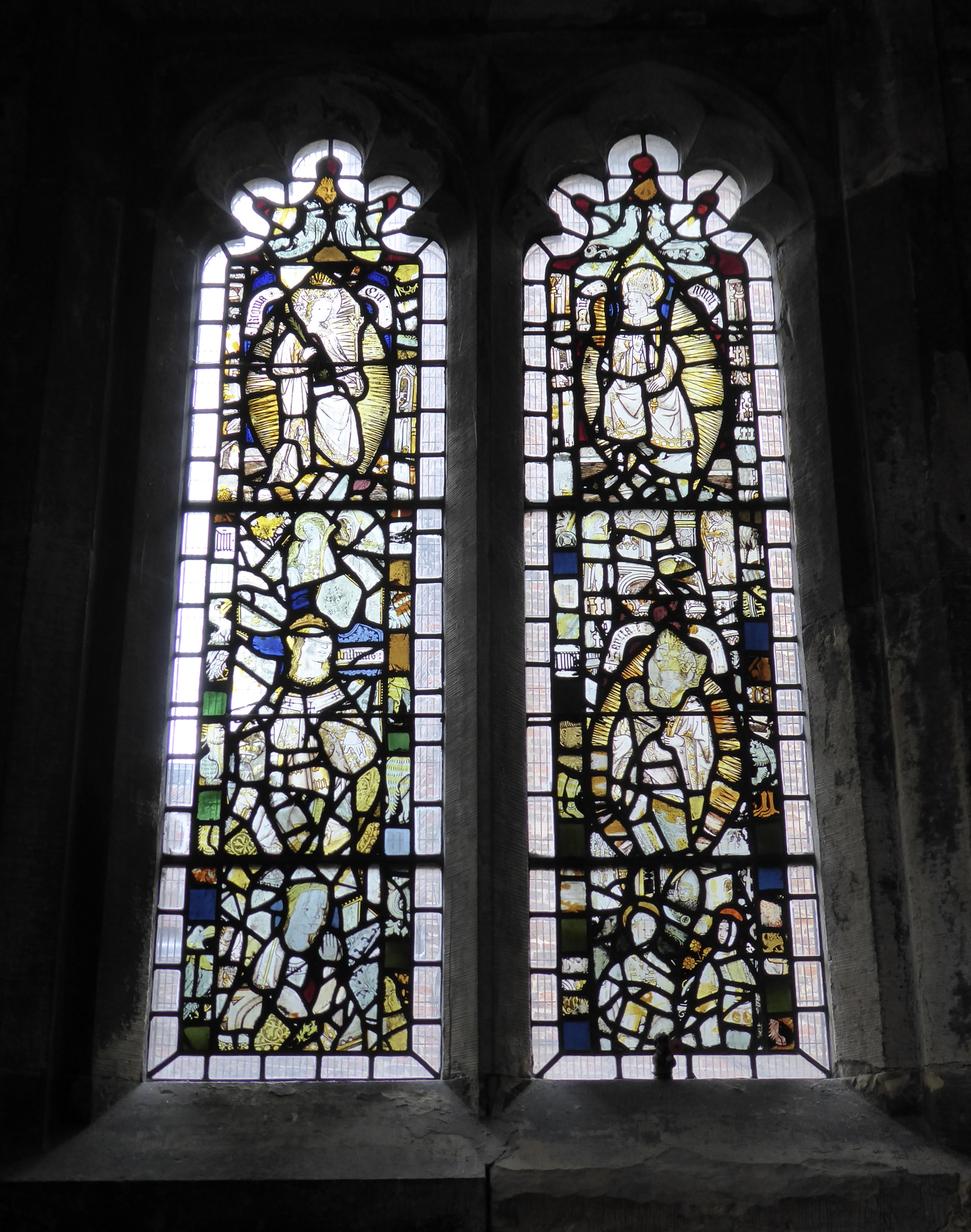
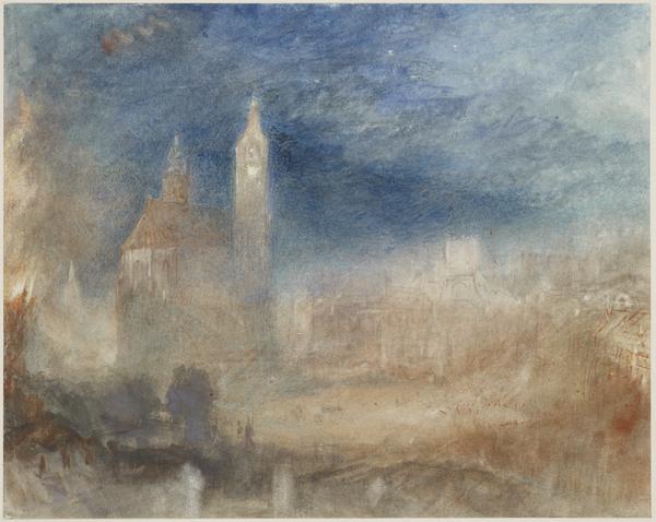
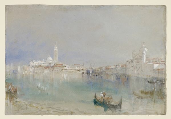
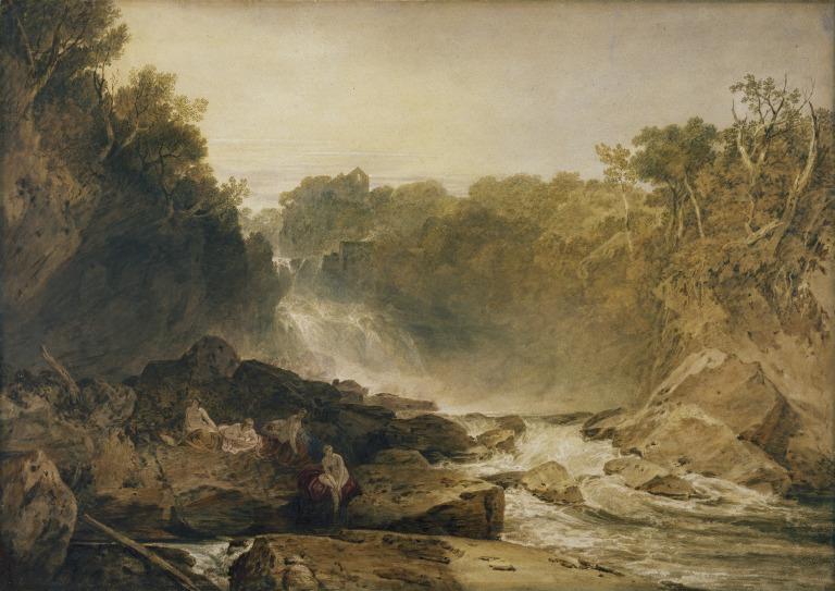
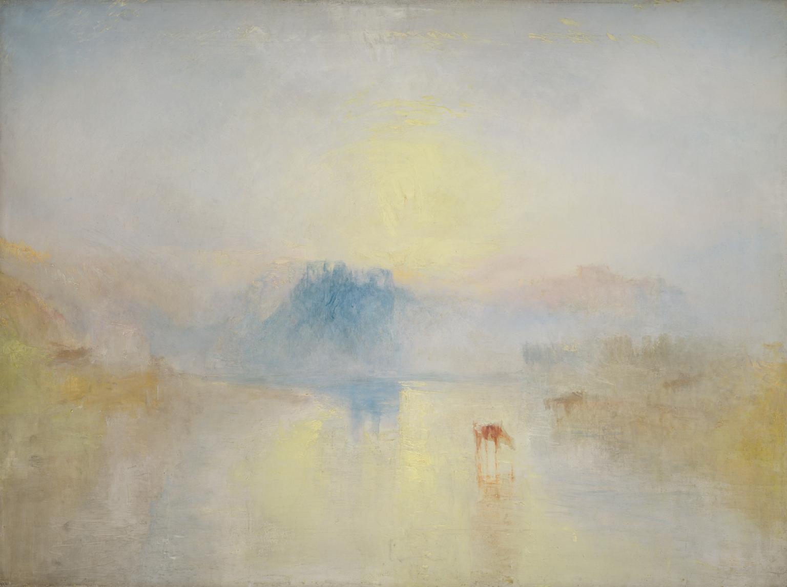
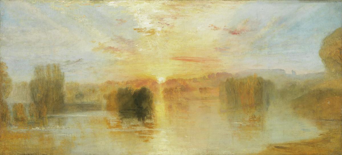
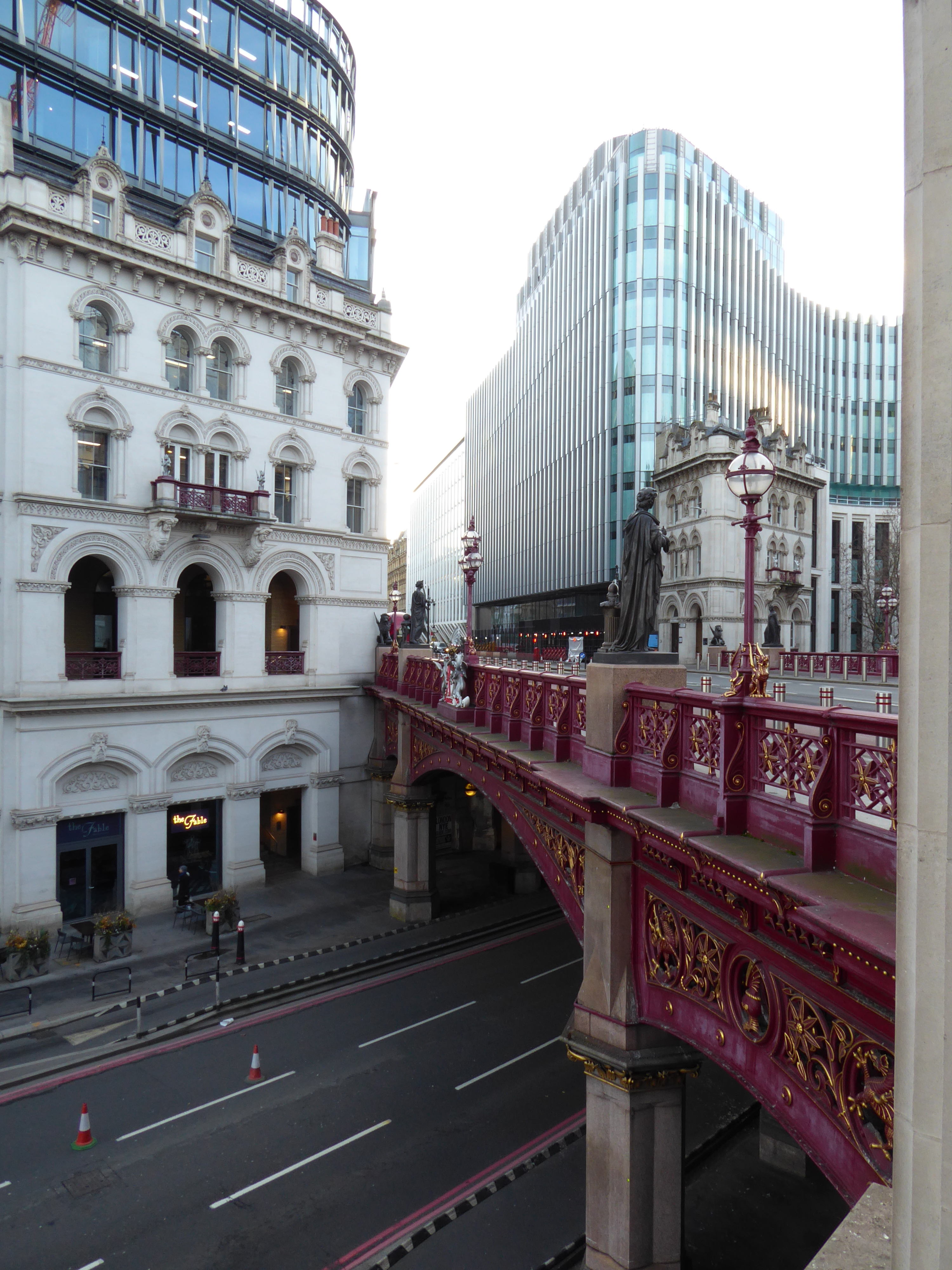
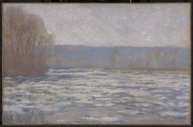
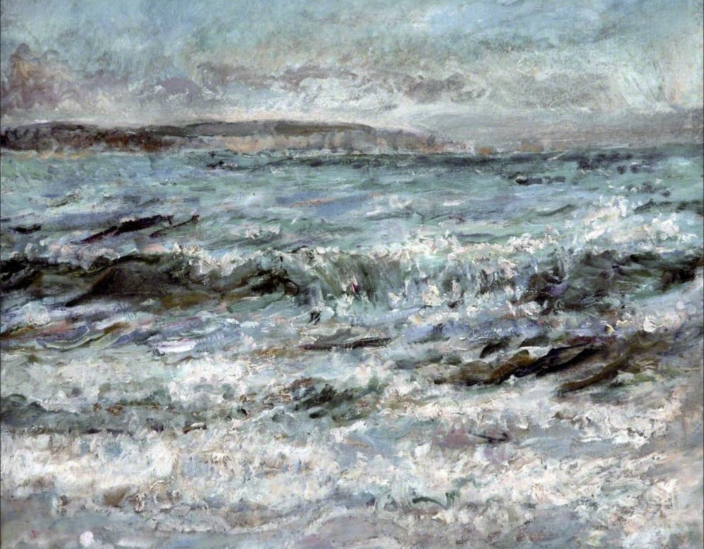
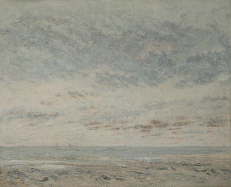
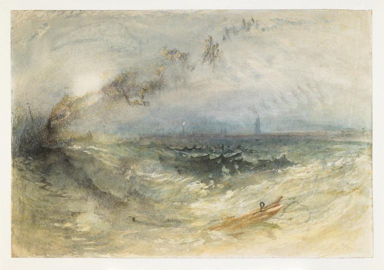
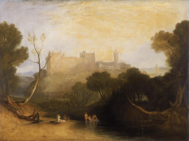
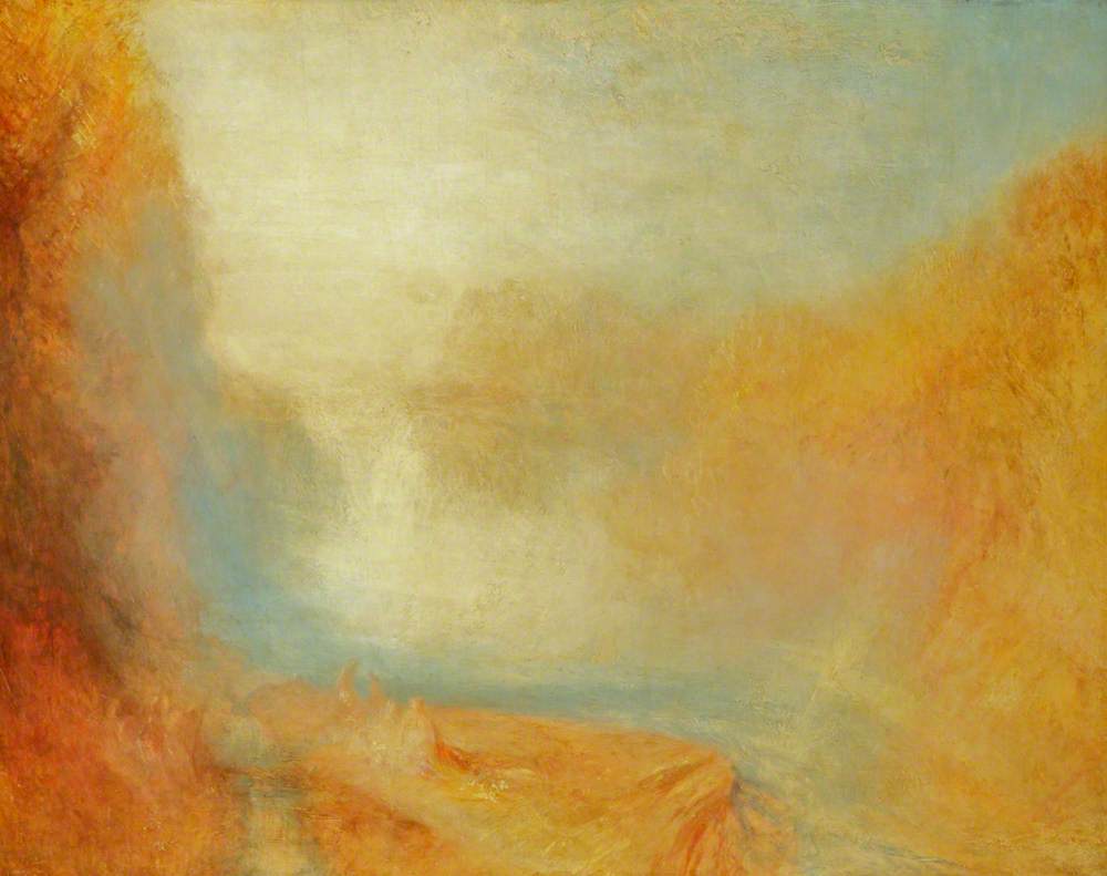
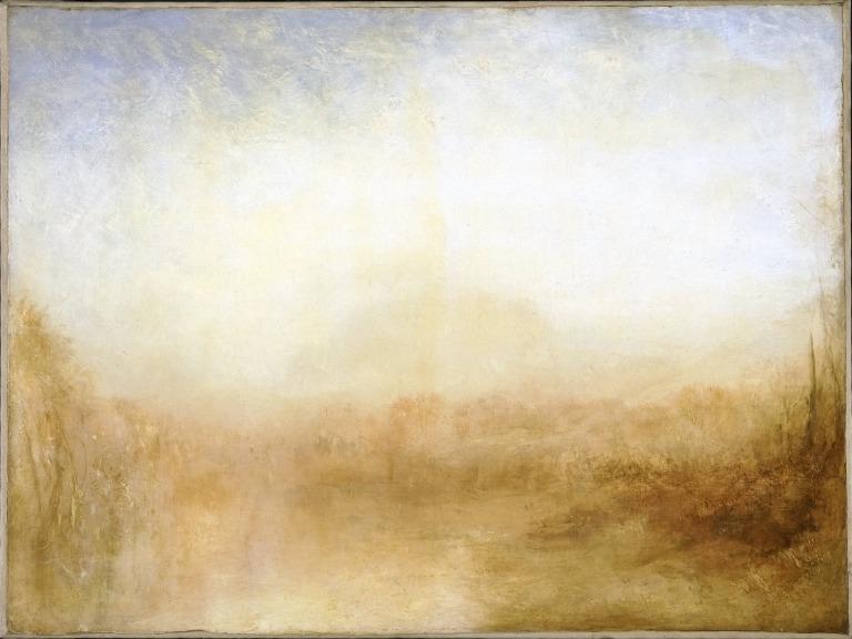
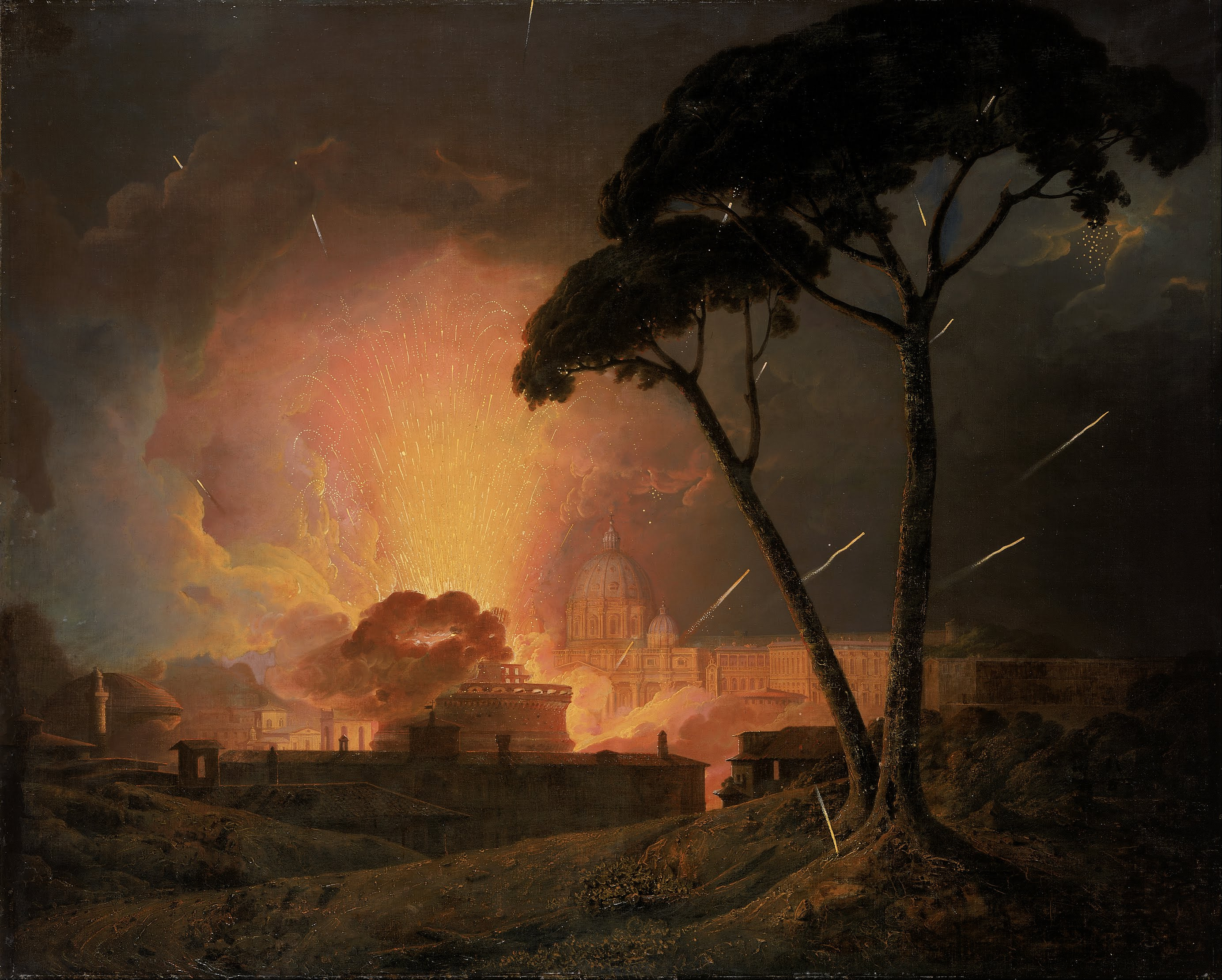
I went to see the “Turner: Always Contemporary” exhibition at the Walker, which was very good. Liverpool’s Turners have been brought together and exhibited with later 19th century and modern artists. The modern art link was a bit hit and miss; I smiled as the gallery attendant regularly asked people to stay outside the floor-taped cordon sanitaire around Damien Hirst’s formaldehyde-encased “Two Similar Swimming Forms in Endless Motion” as if she were part of some performance art. What was more interesting was comparing Turner to water scenes by Monet, Courbet and Ethel Walker. Their pictures seemed so lifeless and stilted beside Turner; somehow the mistiness of his work kept the images in motion as they came in and out of focus. I don’t think it was just a matter of fewer straight lines.

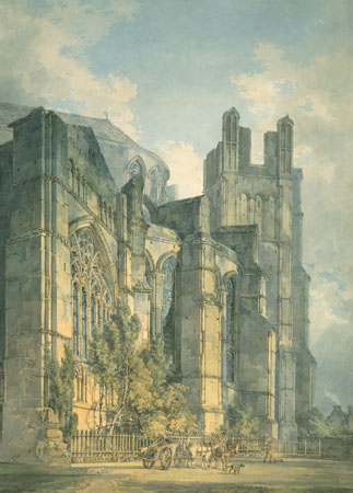
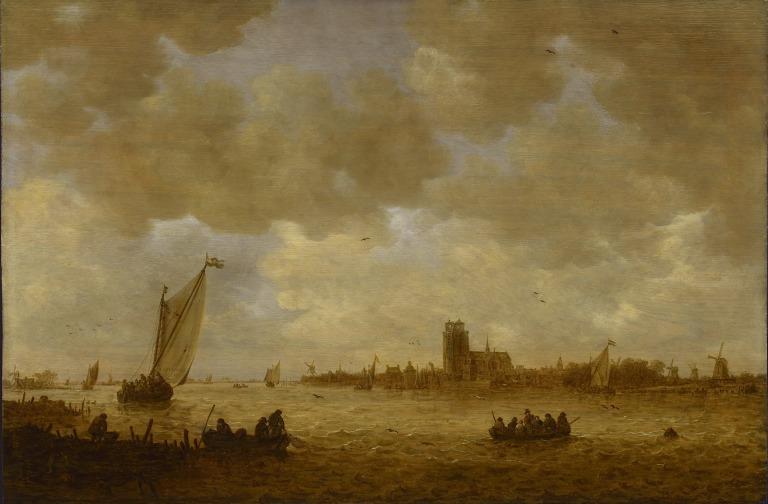
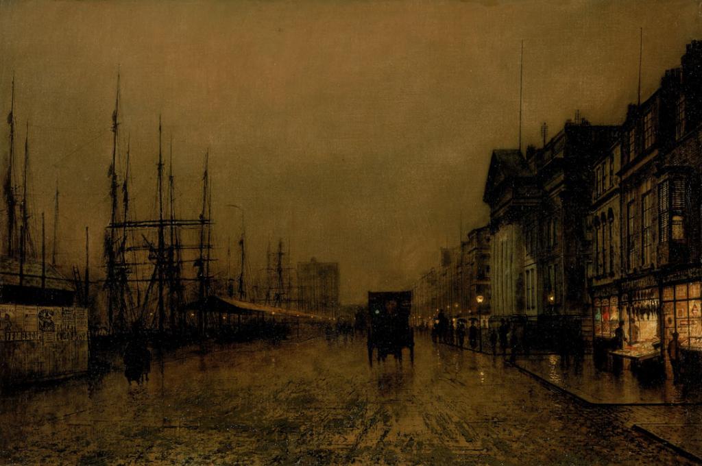
Serendipity: amongst the non-Turner paintings was one of Dordrecht, which reminded me of waterbus journeys to Rotterdam. (Turner learned from older paintings.) You could follow his move from representational landscapes (albeit ones where features were re-arranged for greater artistic impact), through his “mass” prints in the Liber Studiorum (some of which I saw in Manchester) to his later quasi-abstract paintings. J Atkinson Grimshaw also secured a spot with his paintings of Liverpool’s Custom House on the front; they are indeed wonderful, and you can see the build-up of paint in the foreground like mud on the cobbles.

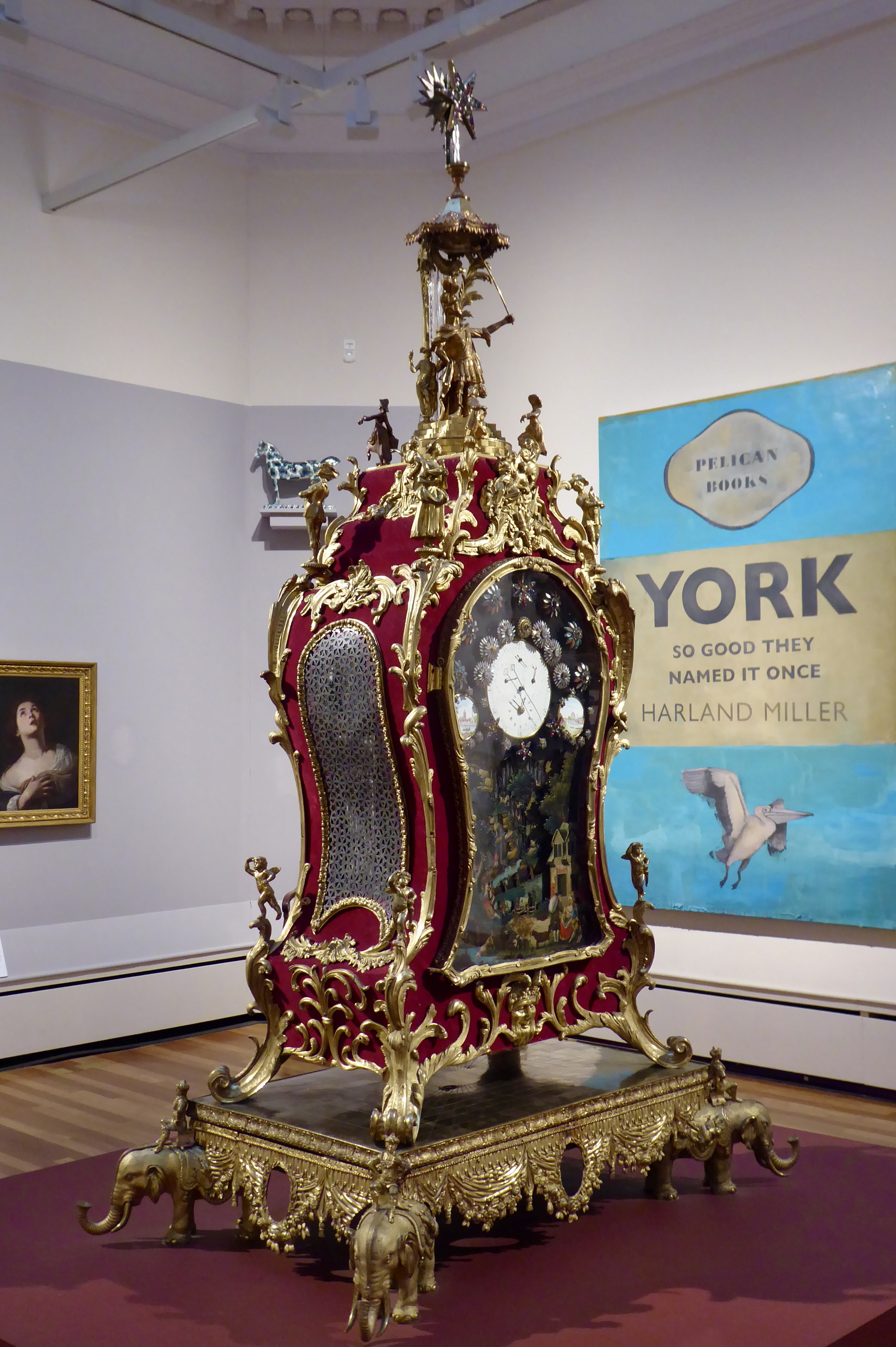
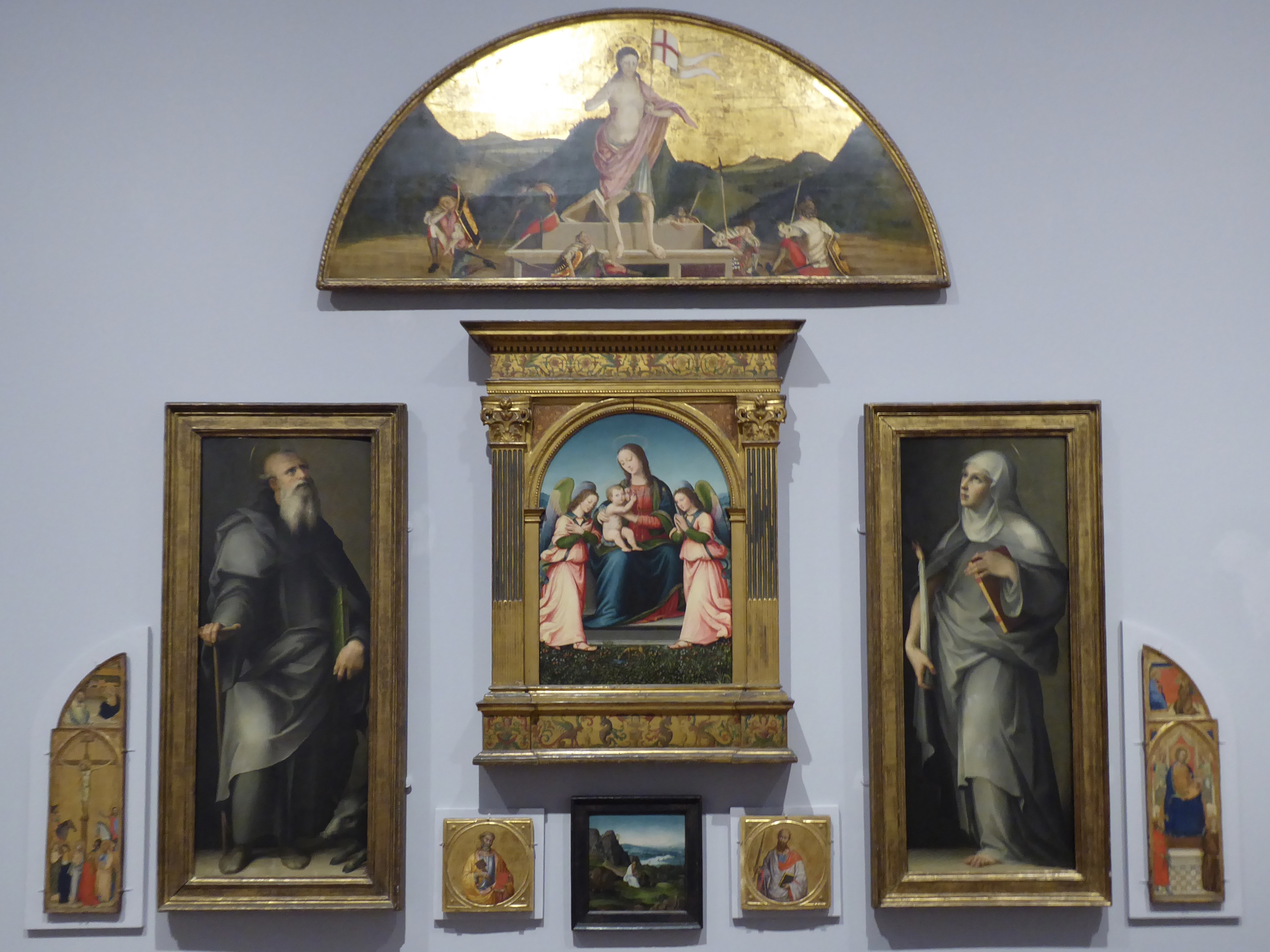
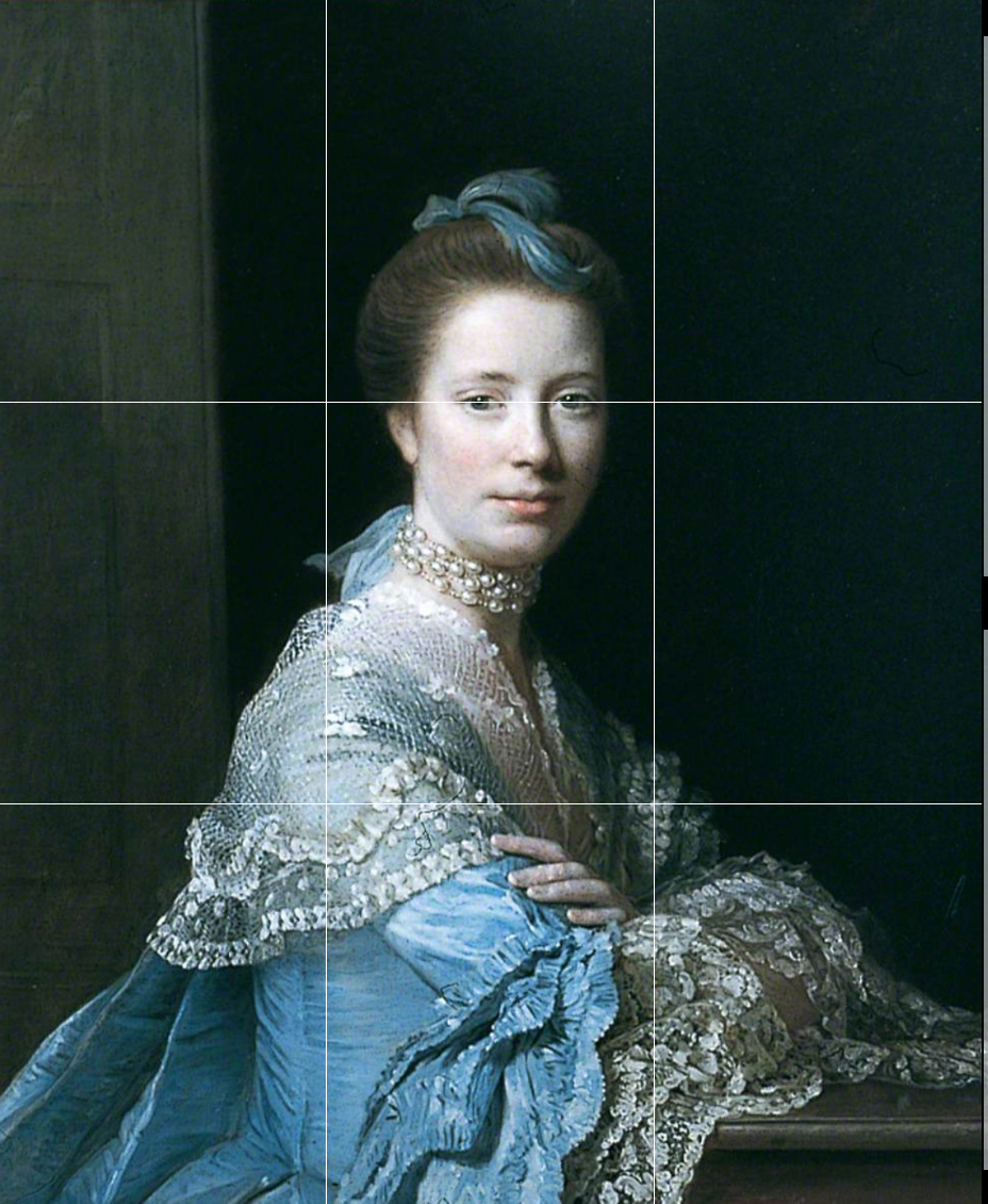
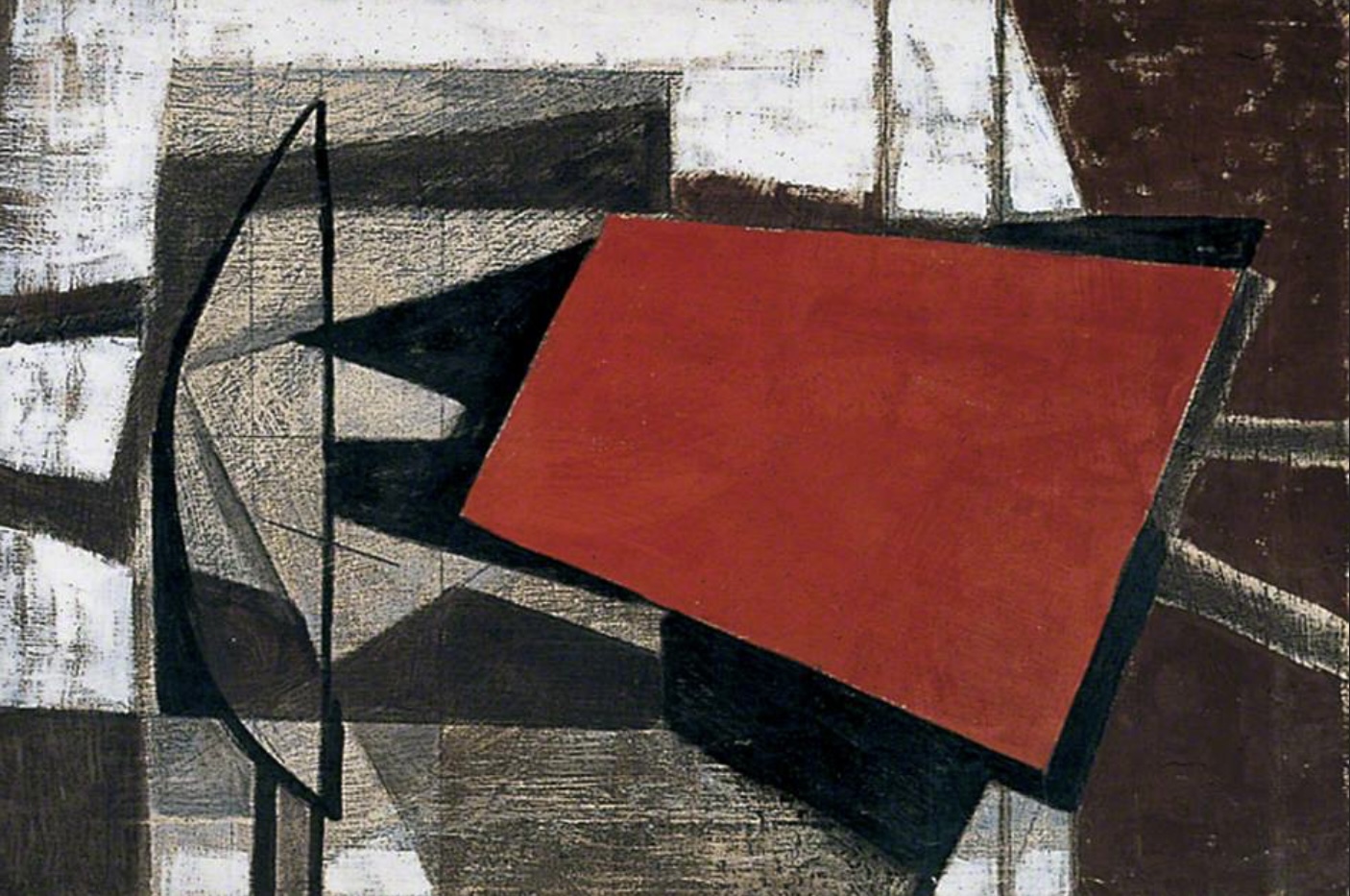
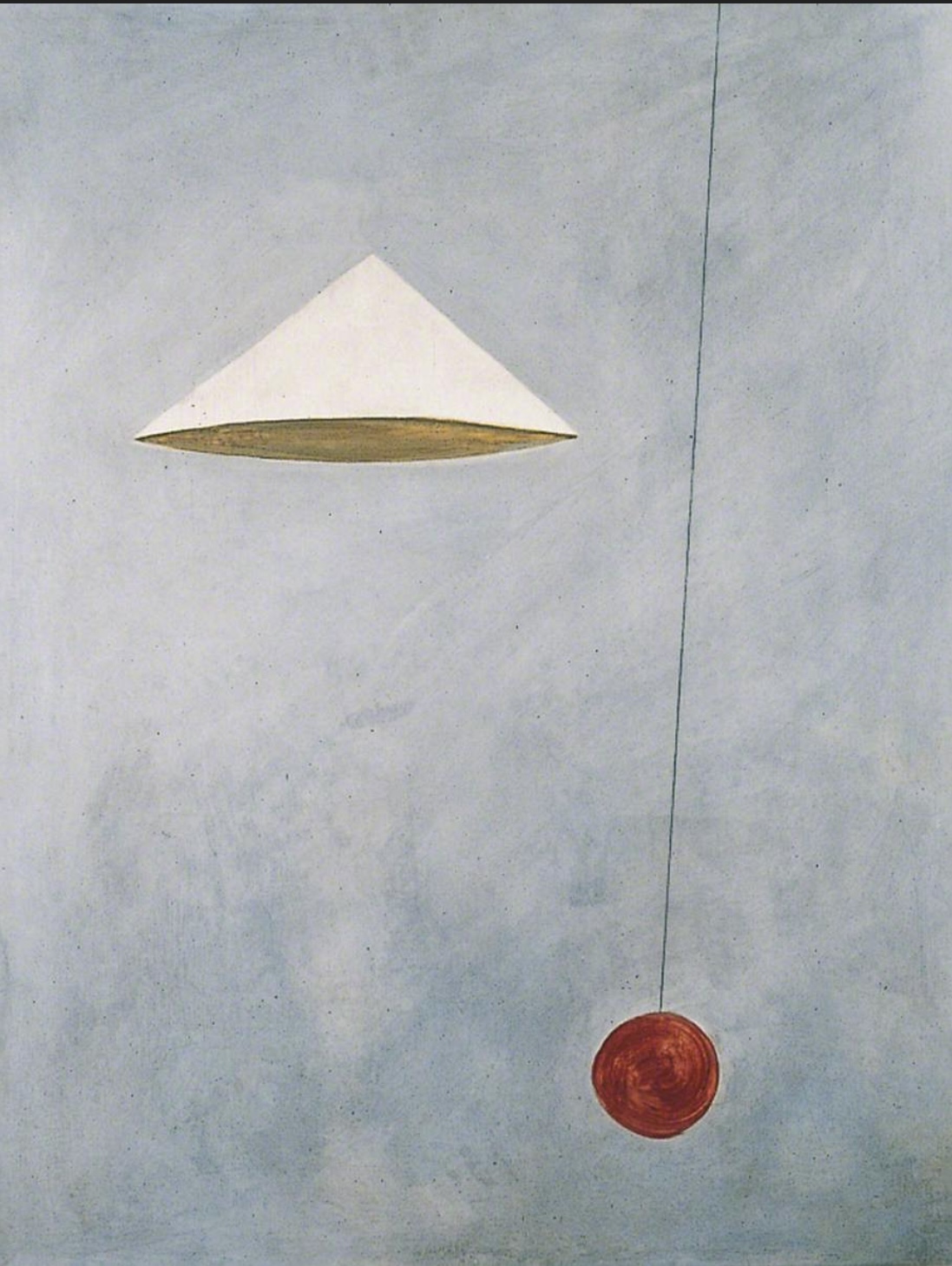
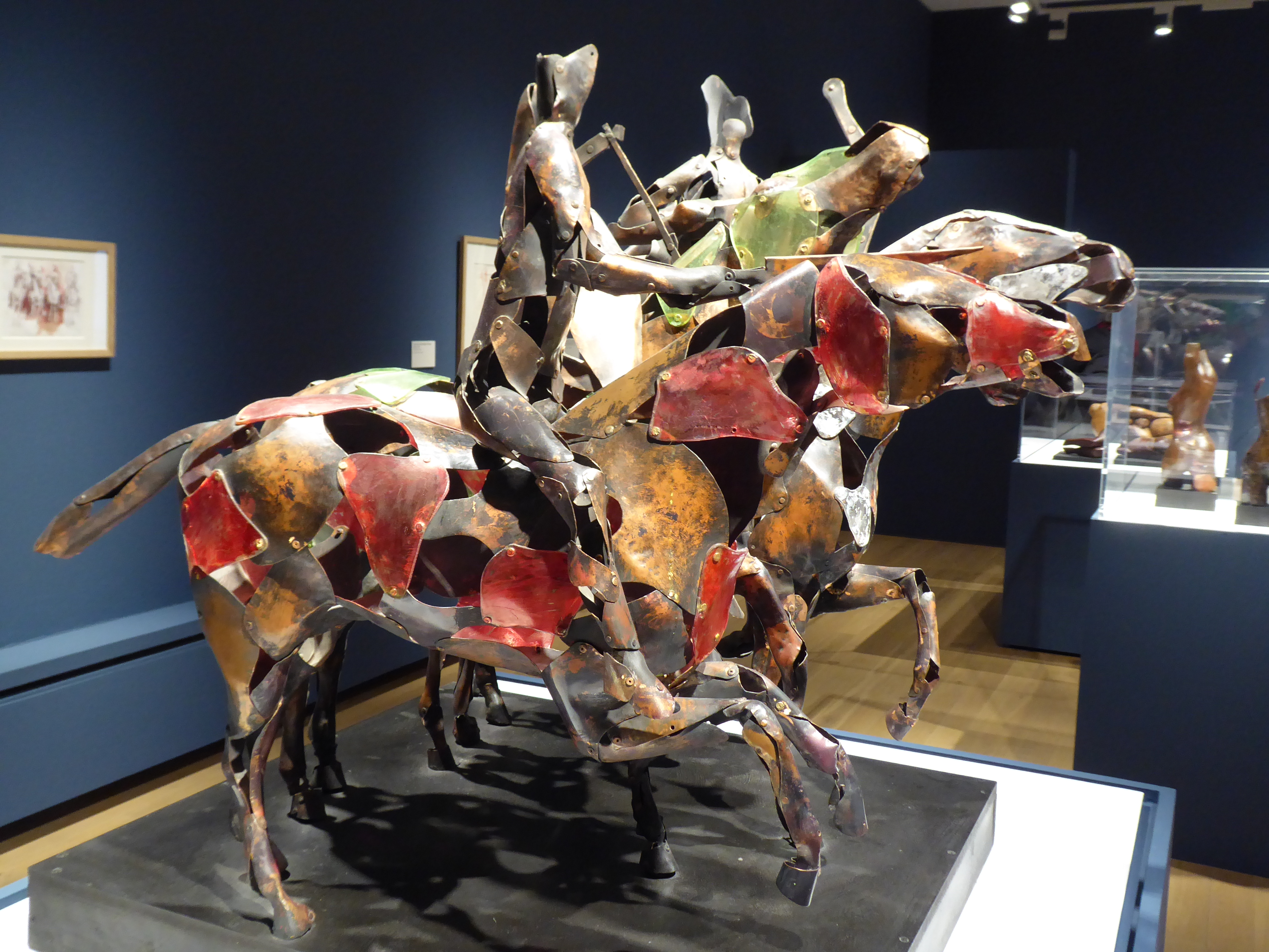
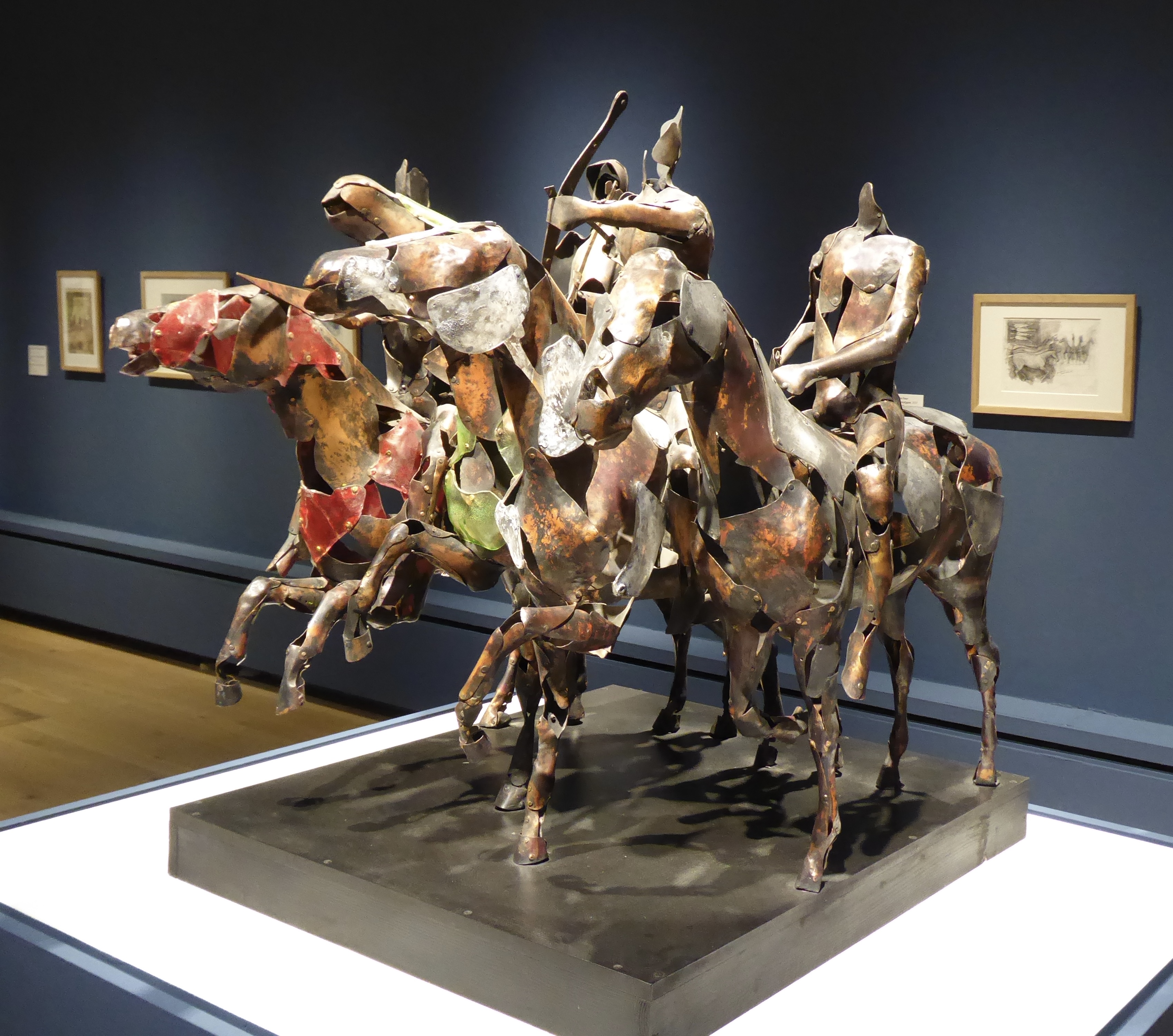
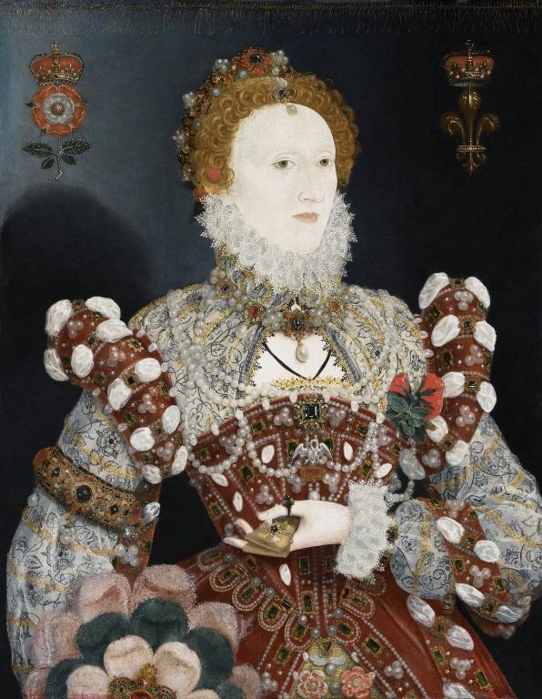
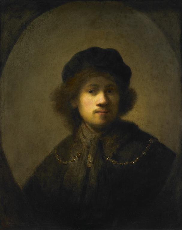
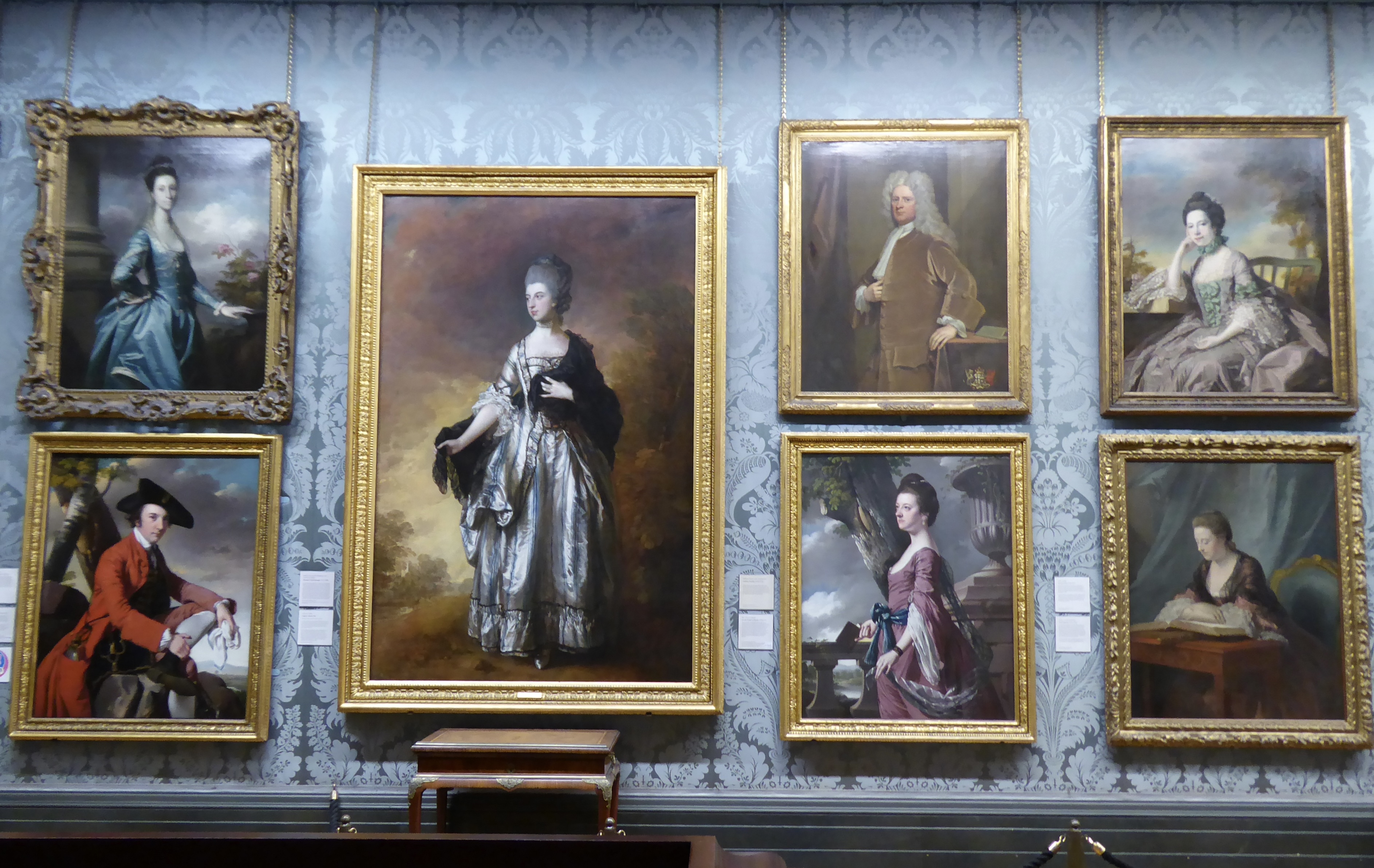
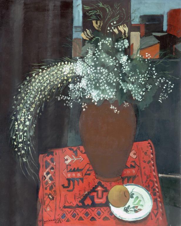
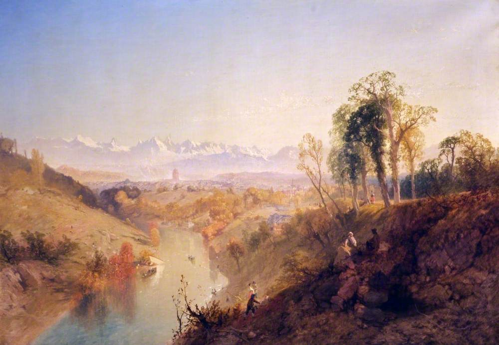
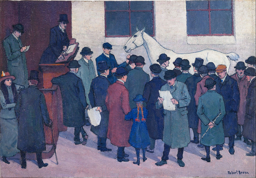
Then I wandered around the rest of the Walker, venturing into galleries I barely recall visiting before. Elizabeth I by Hilliard, comparisons of Flemish and Italian Madonnas, a Rembrandt, wall after wonderful wall of 18th-century ladies and gentlemen that I didn’t have the headspace to look at individually, a Nocturne by Marchand, a view of Berne by a follower of Turner (I wonder why he didn’t make the exhibition?), and a horse painting that looked like one I had seen before.

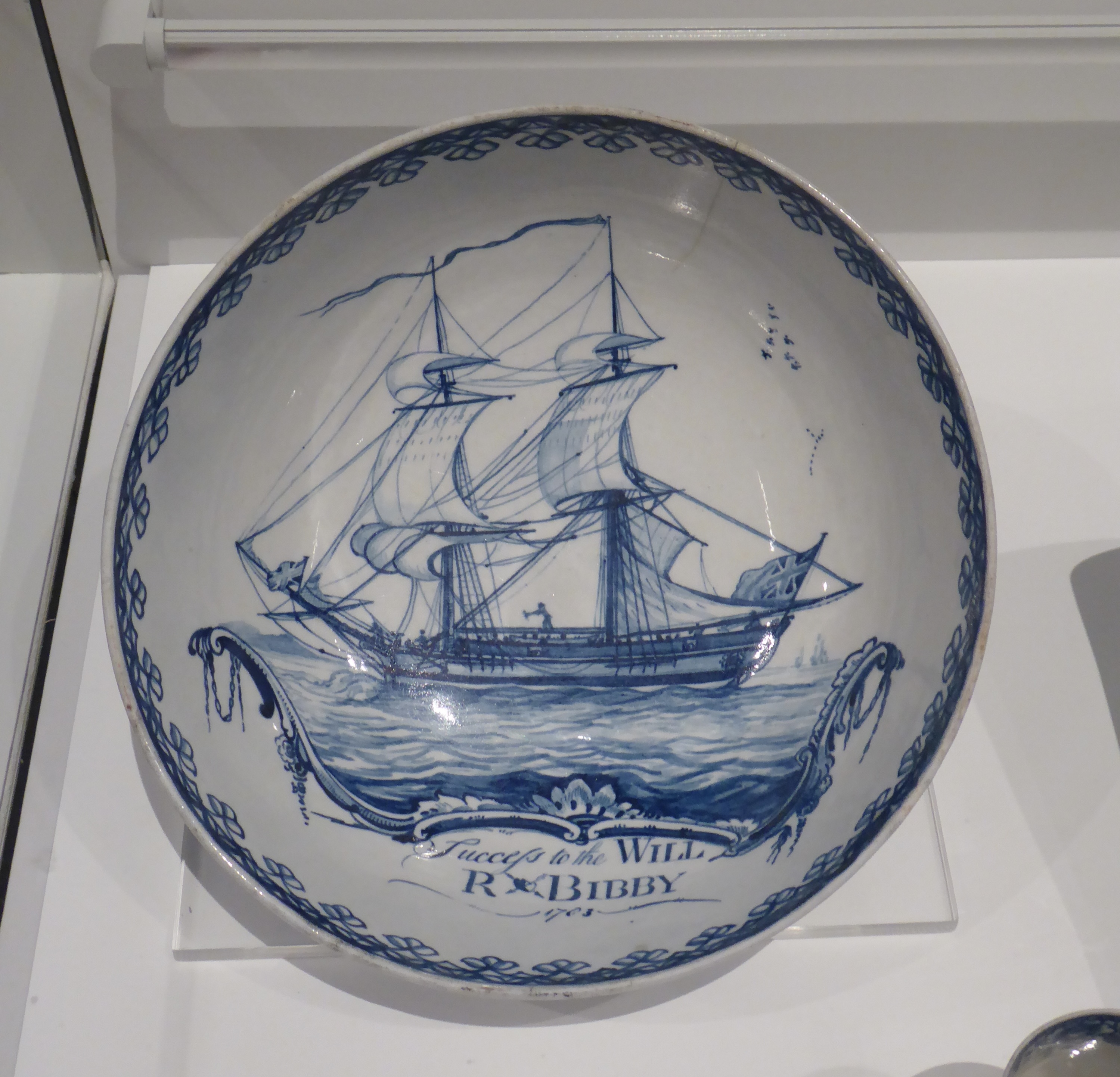
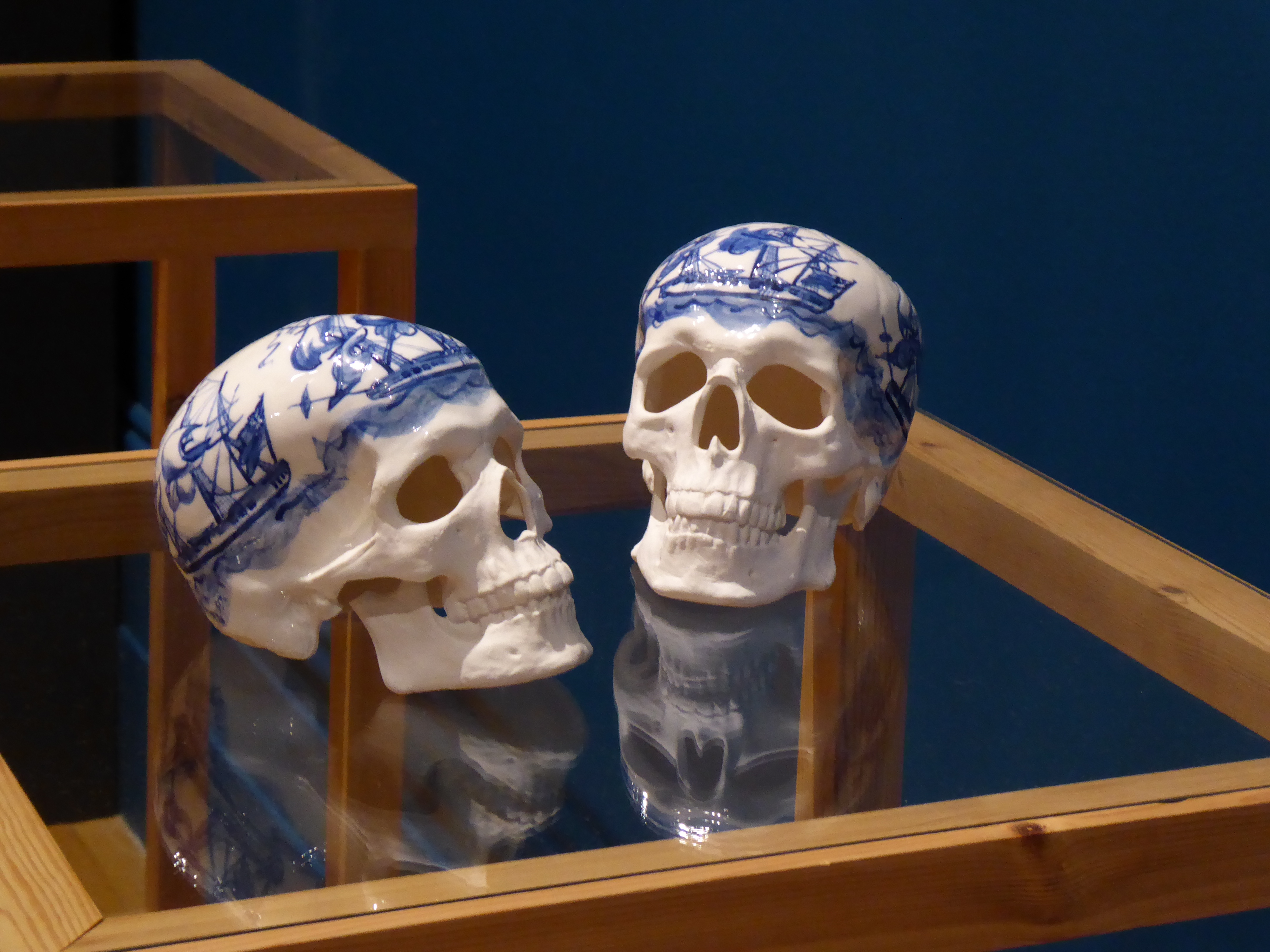
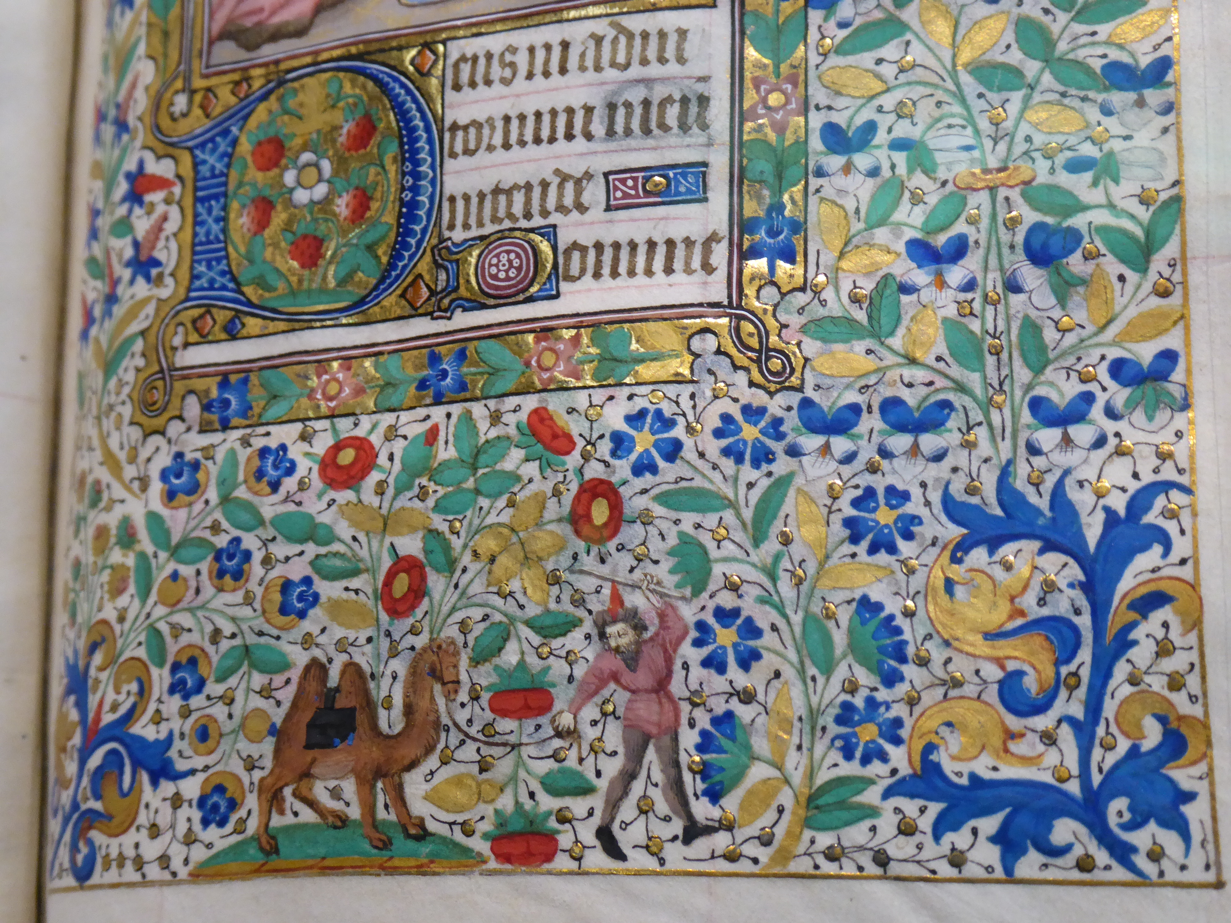
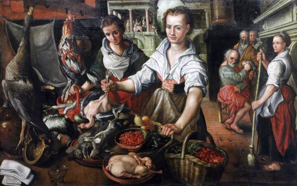
Other things before I forget: a 1783 ceramic dish with a painting of a slaving ship, “Success to the Will”, was referenced in a modern work, “English Family China”, from 1998. They are cast from real skulls (never have the words “bone china” sounded so sinister) and implicitly comment on the link between wealth and horror. There was a painting by Joseph Wright of Derby, which, unsurprisingly, made neither the National Gallery nor this exhibition. I gazed at a lovely 15th-century Book of Hours and clocked another Beuckelaer. He must have churned them out.

The Christmas market was set up in the square outside and I contemplated a ride on the big wheel – but it was raining steadily and there was no inviting movement from the wheel, so I headed off for lunch instead.

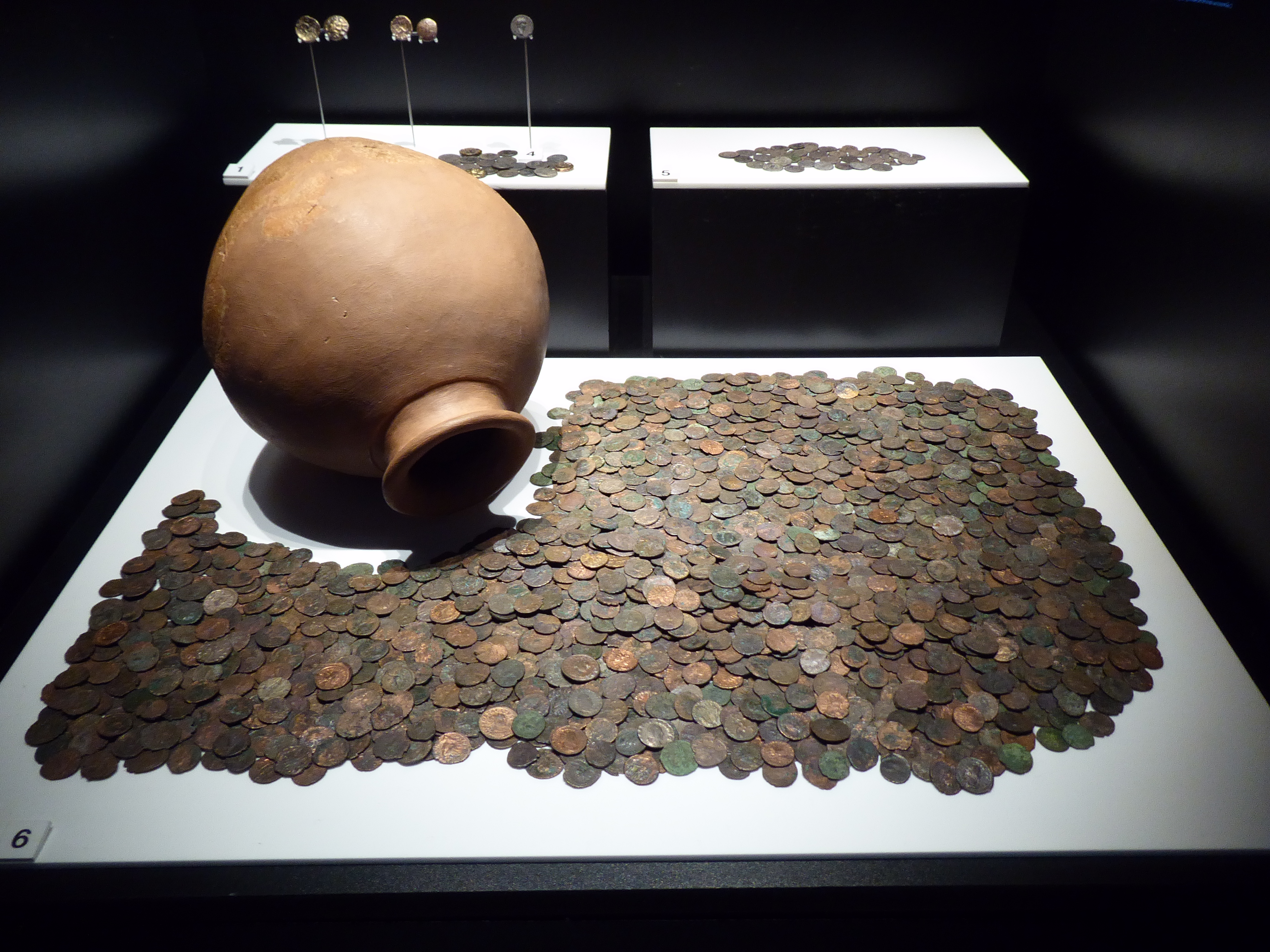
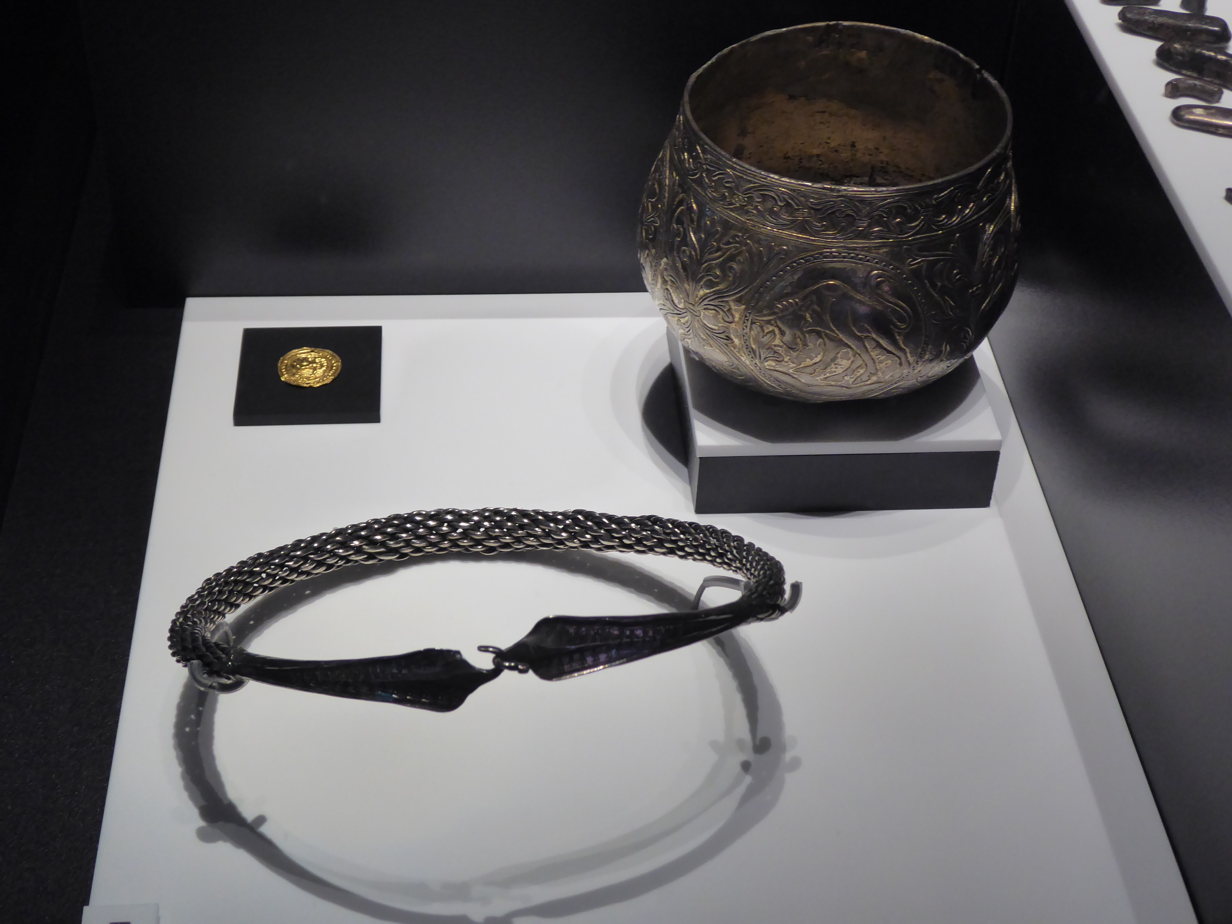
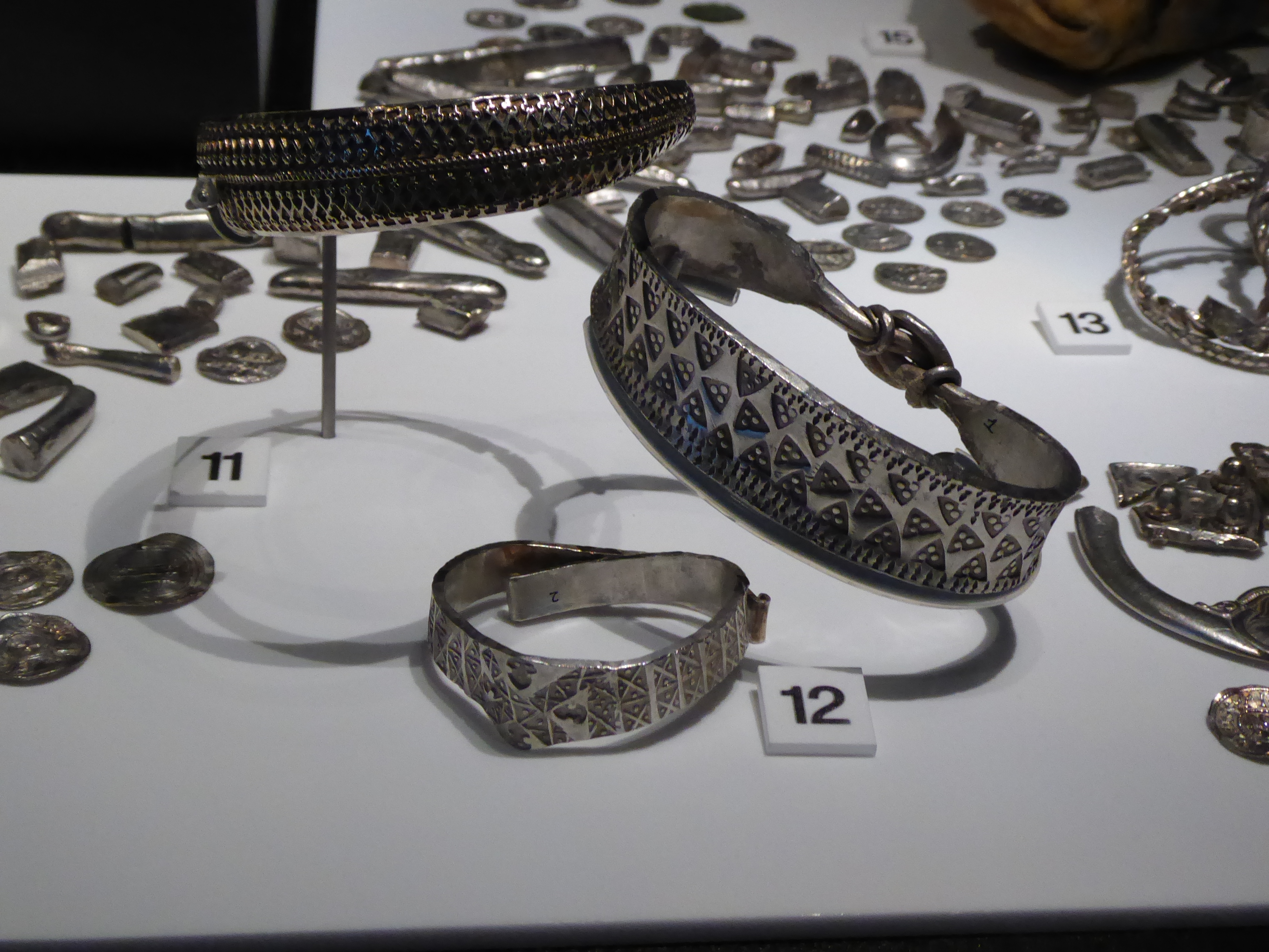
Then the Museum of Liverpool for an exhibition on treasure unearthed in Wales and the north west of England. (A magnifying glass would have been useful.) Some of it was indeed treasure – gold or silver – but some had little value even at the time. The third-century Agden Hoard, for example – c 2,500 Roman copper alloy coins (“radiates”) from a time when galloping inflation made them almost worthless. There was also the golden Mold cape, which I have seen at the British Museum.

The sky was brighter as I left, but the big wheel was still static so I caught my train instead.

Wayne Thiebaud

Each era produces its own still life

Sometimes I am not sure what will grab me and what will elude me. I quite like being surprised by myself. And – for some reason – this small exhibition of a particular section of Thiebaud’s work grabbed me. The introductory panel with Thiebaud’s own quotation set me up: I couldn’t deny what he said, and it was enough to open my mind to his work. Without it I could just as easily have come away thinking that, like Lichtenstein, he had found his schtick and stuck to it. The exhibition reminded me of a book I had to read (“plough through”) for an OU course: Gombrich on the beholder’s share when looking at a work of art. It made sense in front of Thiebaud.

As a graphic artist, he knew how to make an impression. Things I noted:

  • The muddiness of his early Meat Counter painting. Rather nasty colours and textures – unless his aim was to convert you to vegetarianism.
  • Abundance/scarcity – the empty trays on the delicatessen counter. It reminded me of the shock of seeing reduced food availability during Covid. That balance in the modern world of having everything under the sun available to buy . . . but empty shelves are never far away.
  • His still lifes are of everyday objects – nothing exotic or hot-housed here. They are cheap and mass-produced, painted so thickly that you can feel your teeth ache with the sweetness.
  • My steal was the Boston Cremes. They seemed to be float like moored yachts or even like ice shards on Friedrich’s Das Eismeer. Choreographed by Busby Berkeley.
  • Cakes made me think of the cake/doughnut counter at Leeds station. I have always regarded it with a detached and puritanical eye – all that sugar! – but now I shall look at it anew. Walking back, I passed another such counter and had to acknowledge how attractive it was in a garish fashion. (Now that I have aged into an appreciation of The Savoury, I can be judgemental about and ignore the attractions of The Sweet – hypocritcally obliterating from my memory the delicious sugar cubes I used to steal from the larder.)
  • I took a photograph of Cakes above the heads off people sitting on the bench, when really I should have included them. They would have complemented the palette perfectly – him in pale blue jeans and her in a pastel pink top.
  • Thiebaud referred to Cezanne and Chardin – and I could see that his perspective echoed Cezanne and his simplicity Chardin.
  • The impasto: it worked perfectly on the food, but he also layered the paint thickly on the smooth surfaces of the counters and trays. He wasn’t trying to be that representational.
  • Picture captions pointed out that, despite the seeming repetition of, for example, his slices of pie, each one was subtly different. And later I went for a coffee and noticed the cakes under their glass cases: they were indeed all slightly different, and had I had a cake I would have been silently willing the server to choose this one rather than that one.
  • It was all utterly trivial – cakes and toffee apples, for goodness sake! – but somehow utterly wonderful.

Joseph Wright and Cecil Beaton

After two exhibitions in one afternoon, I thought that what Joseph Wright of Derby (the “of Derby” to distinguish him at that time from another painter of the same name) and Cecil Beaton had in common was creating their own distinctive worlds. One serious and one frivolous. The Wright exhibition was small, containing only a few large canvasses (but what canvasses!), some mezzotints (Wright had an eye for wider consumption), a couple of related exhibits (e.g. an air pump and an orrery) and a rather wonderful self-portrait in pastel. I had thought of him as painter of the new “scientific” age – casting new discoveries in a mould usually reserved for the heroic or biblical – but his range was broader than that. There were little tics: hidden light sources, glowing red tones. He certainly casts J Atkinson Grimshaw into the shade.

And then Cecil Beaton. The Wright exhibition was compact, and the Beaton one would have benefited from the same treatment. At times it felt like one perfect epicene profile and slicked-down hairstyle after another: the appeal of glamour (which is great) had dwindled to a yawn by the final rooms. His photographs, though – like Wright’s painting – do conjure up their own world, a mix of Brideshead Revisited and Hollywood floating in an atmosphere of superficiality and what would now come across as snobbery. There was the hiatus of WWII in all this gaiety; it killed Rex Whistler, Beaton’s friend, and sent Beaton around the UK and the world for the Ministry of Information. The Royal Family, Vogue, theatrical design . . . ah, good, the exit.

But it did send me up to room 24 afterwards to look at Augustus John’s portrait of Lady Ottoline Morrell, described by Beaton as presenting her with magenta hair and fangs. And it does!