Manchester

The art gallery is fairly unchanging at present, so I just popped in for a coffee and a quick look at old favourites. Then to the Whitworth, which is constantly changing, and another coffee.

Current (small but perfectly formed) exhibitions at the Whitworth include 1960s textiles by Shirley Craven for Hull Traders. My view hovered between “bold” and “over-emphatic”, but there was no denying the exuberance of the designs. They shaded into gimmick and tackiness with the tomotom furniture of her husband, Bernard Holdaway – but you could still sense the crater left by that blast of creativity all those years ago. I may have dwindled into neutrals with age, but I still recall the wonderful arrival of vivid colours and big patterns during my childhood.

Another exhibition was “The ‘death’ of the life room”, looking at the changes since the 1950s in life drawing classes as part of formal art education. Life drawing had come to be viewed as a barrier to innovation and experimentation and was dropped. “Something’s lost and something’s gained” and the world probably doesn’t need any more meticulous recreations of plaster casts of ancient statues . . . but I couldn’t help comparing drawings by Barbara Hepworth and Henry Moore with one I’d seen at the Tate exhibition by Minnie Hardman.

Courtauld

To the Courtauld to look at the London street photographs of Roger Mayne from the 1950s. They were great in capturing the texture of life at that time, but it was that context that made them so engaging. I found his other photographs of family and Spain very dull – they lacked the charge of say, Chris Killip, or the compositional mastery of Vivian Maier.

There was also a small exhibition of works by Vanessa Bell, including designs for the Omega Workshop. She was also included in yesterday’s exhibition at the Tate; I still don’t “get” her any more than I do Paula Modersohn-Becker – the colours are too muddy and the shapes too blobby. But what do I know?

With the shift in mood caused by the arrival of summer, I was inspired to photograph little things to represent how that feels to me. Shadows, sunlight, blue sky – that kind of thing. What I would also like to include – but obviously can’t – are jumbles of tattoos on arms and legs now that skin is exposed. Some of them are a random collection of inkings, as if they’ve had one done after the other without regard to the overall effect. The effect is bit like an old haversack that you stitched badges onto each time you went somewhere new.

William Morris Gallery

On the tube back from Pimlico I noticed that the Victoria line went all the way to Walthamstow . . . which set me to thinking of the William Morris house there, which I had kind of assumed was difficult to get to. Wrong.

So off I went. It was once the Morris family home and has an enormous collection of all things Morrissy. The usual stuff – designs, furnishings, paintings, printing press, socialism – well presented and explained. Frank Brangwyn popped up again: he was one of the founders of the gallery and donated much of his collection to it.

The current non-Morris exhibition is on Mingei – the Japanese term for folk craft. The term was first used in 1925 by Yanagi Soetsu as a kind of reaction to Japan and Korea’s industrialisation and westernisation. It looked with new eyes at everyday objects created by nameless craftsmen using natural materials, and a movement towards simplicity, informed by Zen Buddhism and even the Arts and Crafts Movement, grew in contemporary crafts. The objects on display were simple and beautiful – even the ragged patchwork (boro), which spoke of poverty and the need to recycle everything. (There were as many layers of irony in the exhibition as fabric in the patchwork.)

The gallery was not exactly what one might expect in Walthamstow. The area is more urban than the urbane Islington I walked around yesterday. It reminded me of living in bedsits with shared bathrooms a couple of lifetimes ago around Finsbury Park, and I realised that I was quite content with my surroundings at the time. They were good enough: my wish to go to other places was not to escape but to explore.

Now you see us: women artists in Britain 1520-1920

To Tate Britain for this exhibition, which covered old and new ground for me and slotted in satisfyingly with recent thoughts. I think this makes the third exhibition solely by women artists I have seen in the past couple of years, so it’s obviously still A Thing. Some of the paintings were really not that good, but visiting the exhibition was like reading Dorothy Whipple: the insights and perspectives it afforded me had my head spinning and far outweighed any lapses.

Lots of women artists have just disappeared into the past or their work has not been attributed to them. There was a painting from the 17th century by Artemisia Gentileschi of Susanna and the Elders that has been misattributed to male painters a number of times during its existence. Nothing by Susanna Horenbout (16th century) is known to have survived, even though she was admired by Dürer.

Many of these women painters were not originally from Britain: Angelica Kauffman, Gentileschi, Horenbout, Levina Teerlinc, Maria Verelst, Mary Moser. And most of these were from families of painters/craftsmen – so perhaps these highly marketable skills pulled people across Europe in search of patrons and commissions and were worth passing on even to daughters.

Suitable subjects for women painters were, of course, portraits (particularly of other women or children) and flowers. History painting was beyond their imagination so they’d best stick to recording real life. Painters like Kauffman kicked against these restrictions, and she produced biblical and literary scenes, sometimes with the woman as the more active figure. A score settled – even though the finished product could be a bit blah.

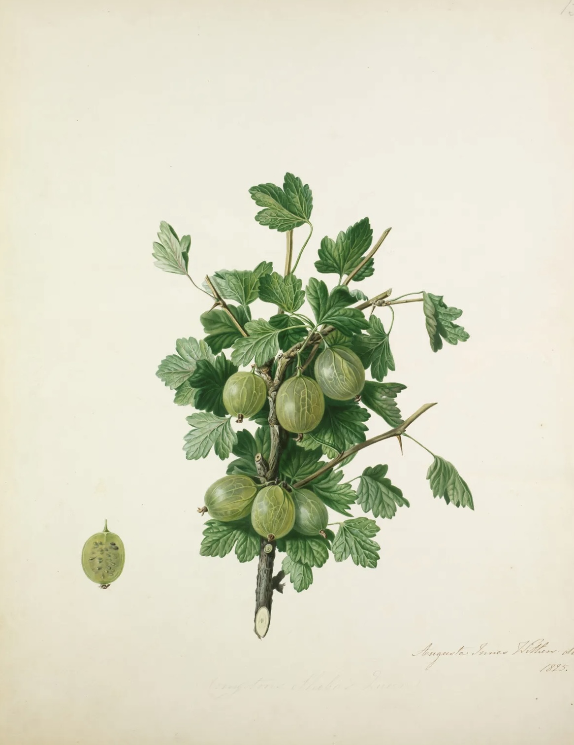
Actually, my favourites among the earlier works were indeed the flowers! I really couldn’t tell that Mary Delaney’s raspberry was a collage. As for the gooseberry . . .

Joshua Reynolds had a sister, Frances – which immediately set me to thinking of “A Room of One’s Own”. Frances kept house for Joshua and learned to paint by copying his works – a more respectable outcome than for Shakespeare’s hypothetical sister.

The Society for the Encouragement of Arts, Manufactures and Commerce (the Society of Arts) was founded in 1754 and offered cash prizes and medals in many categories, including the ‘polite arts’ – e.g. patterns for embroidery, copies of prints, drawings of statues and of ‘beasts, birds, fruit or flowers’, as well as landscapes. Some prizes were specifically intended for young women and could lead to a career.

And a career was possible: Mary Beale and others had already proved that. Some of it does look a bit churned out – Joan Carlile’s re-used silver dress, for example.

The Royal Academy was founded in 1768 (with Kauffman and Moser amongst the founders) for the really serious stuff and showed work by women artists. Materials mattered. Oil paint took a long time to dry (I remember Mary Beale’s husband experimenting with ways of getting it to dry faster to speed up the production line) , but more malleable media were frowned on. Reynolds was very dismissive of pastels, and traditionally domestic crafts such as needlework were beyond the pale.

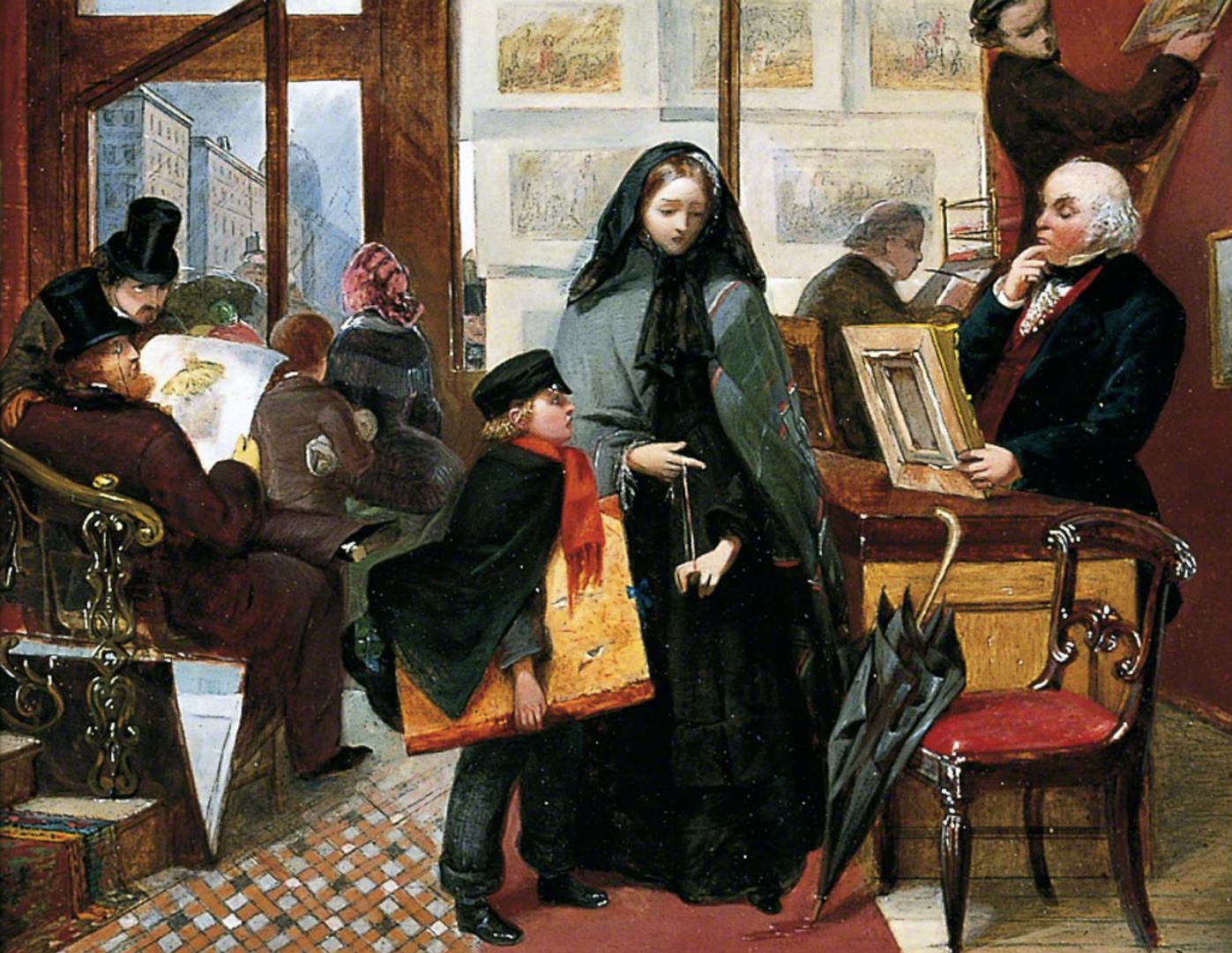
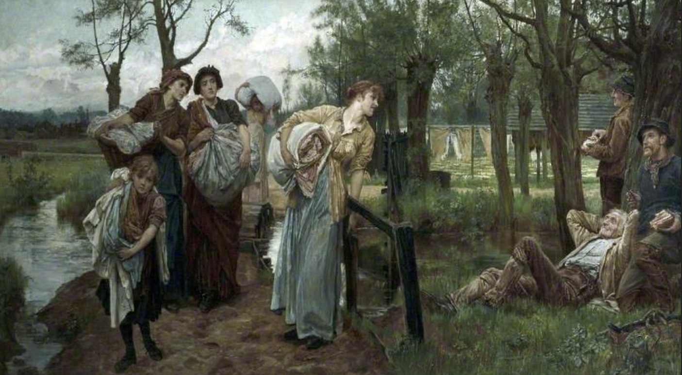
Florence Claxton’s “Women’s Work” was a brilliant dissection of the female role: essentially man’s servant, but some at the margins were plotting their escape. It put me in mind of Ford Madox Brown’s “Work” in its shape and packed social commentary.

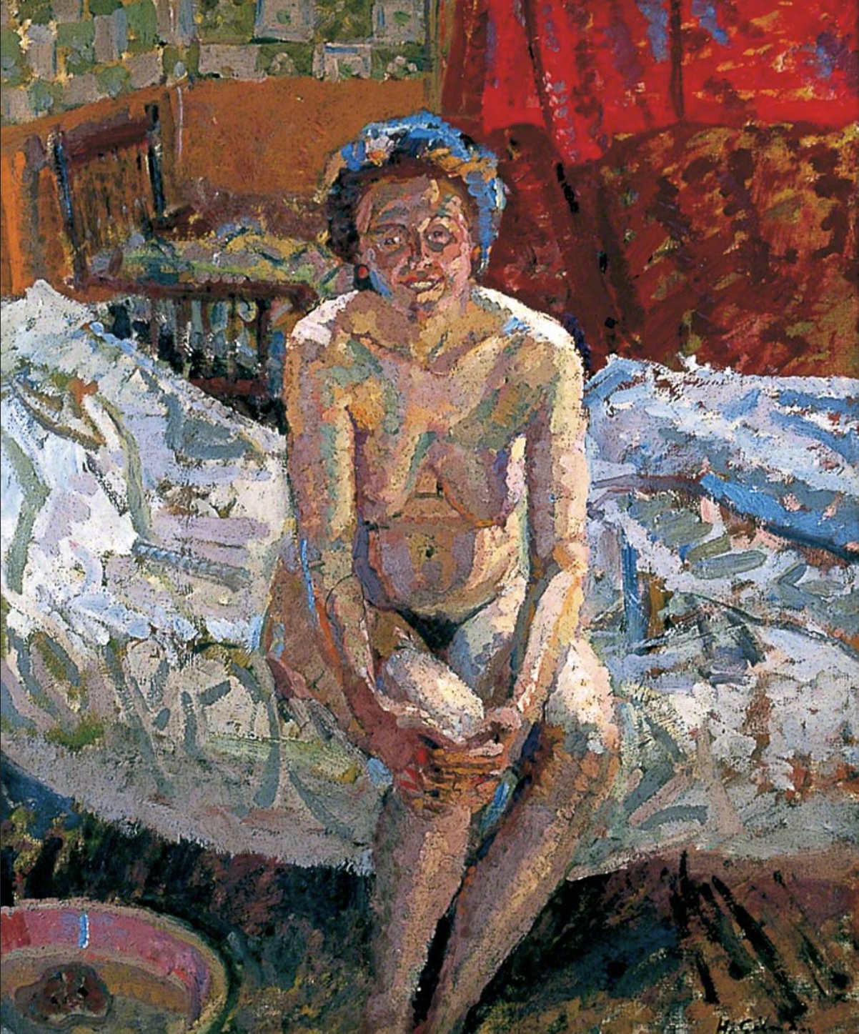
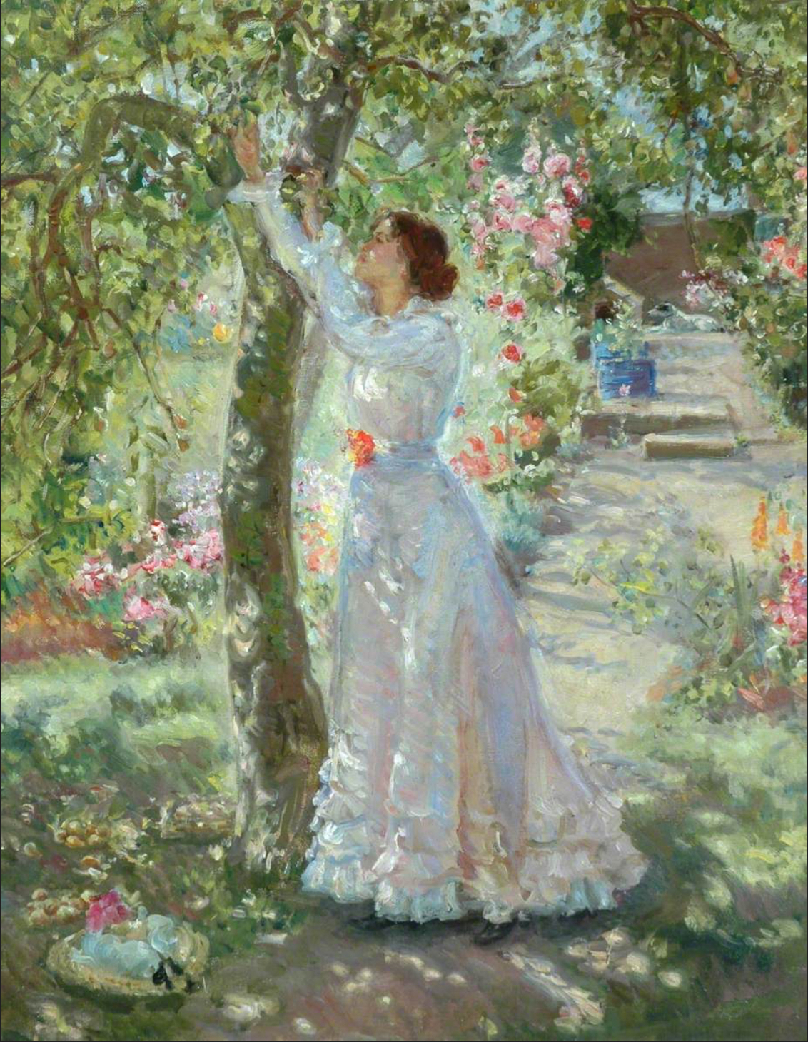
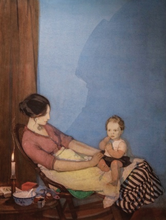
Once women were able to study art (but not life drawing until 1893), things changed. They could paint out of doors (if not à la Caspar David Friedrich, then at least in gardens and orchards), join artistic communities and even paint female nudes. The first woman was admitted to the Royal Academy Schools in 1860, and with the founding of the Slade School in 1871 women were offered an education equal to men’s.

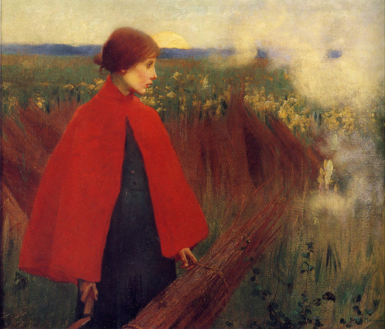
Another blob of red in “The Passing Train”. The way the pattern dominates everything in “The Deceitfulness of Riches”. Too many Ethels though: Wright, Walker (I saw “The Garden” at the Laing, I believe) and Sands.

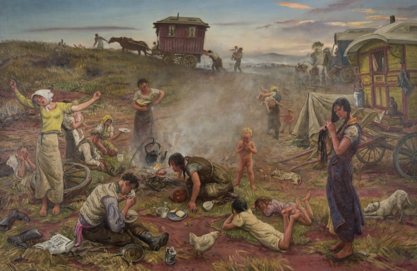
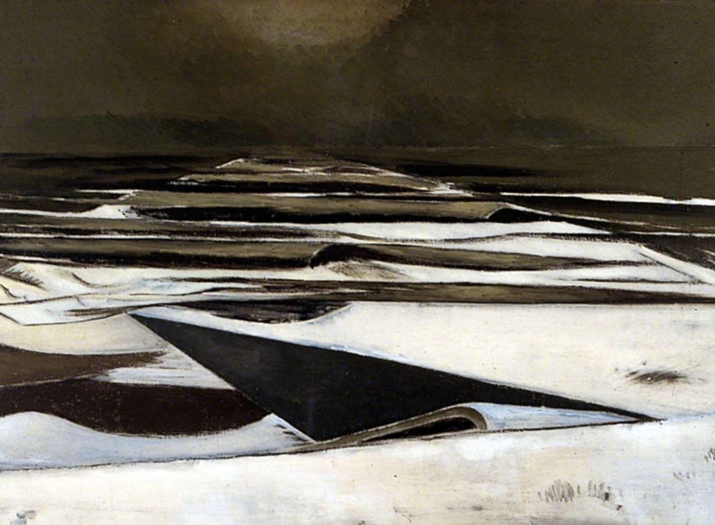
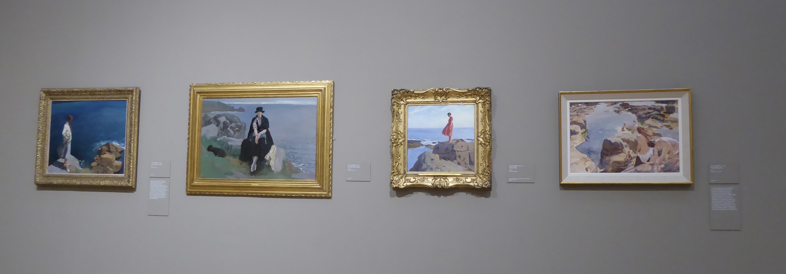
There was a row of paintings by Laura Knight of women in coastal scenes, which were illuminating. In the watercolour the bathers seemed to blend into the landscape like nereids, but in the later paintings the female form is more dominant. The absence of a horizon in “At The Edge of the Cliff” turns it into a brooding scene.

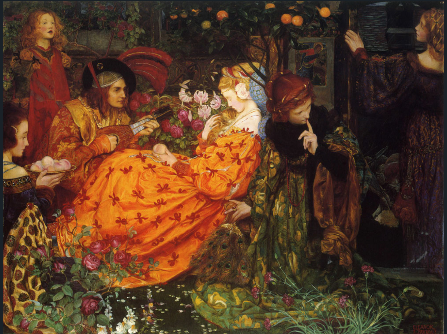
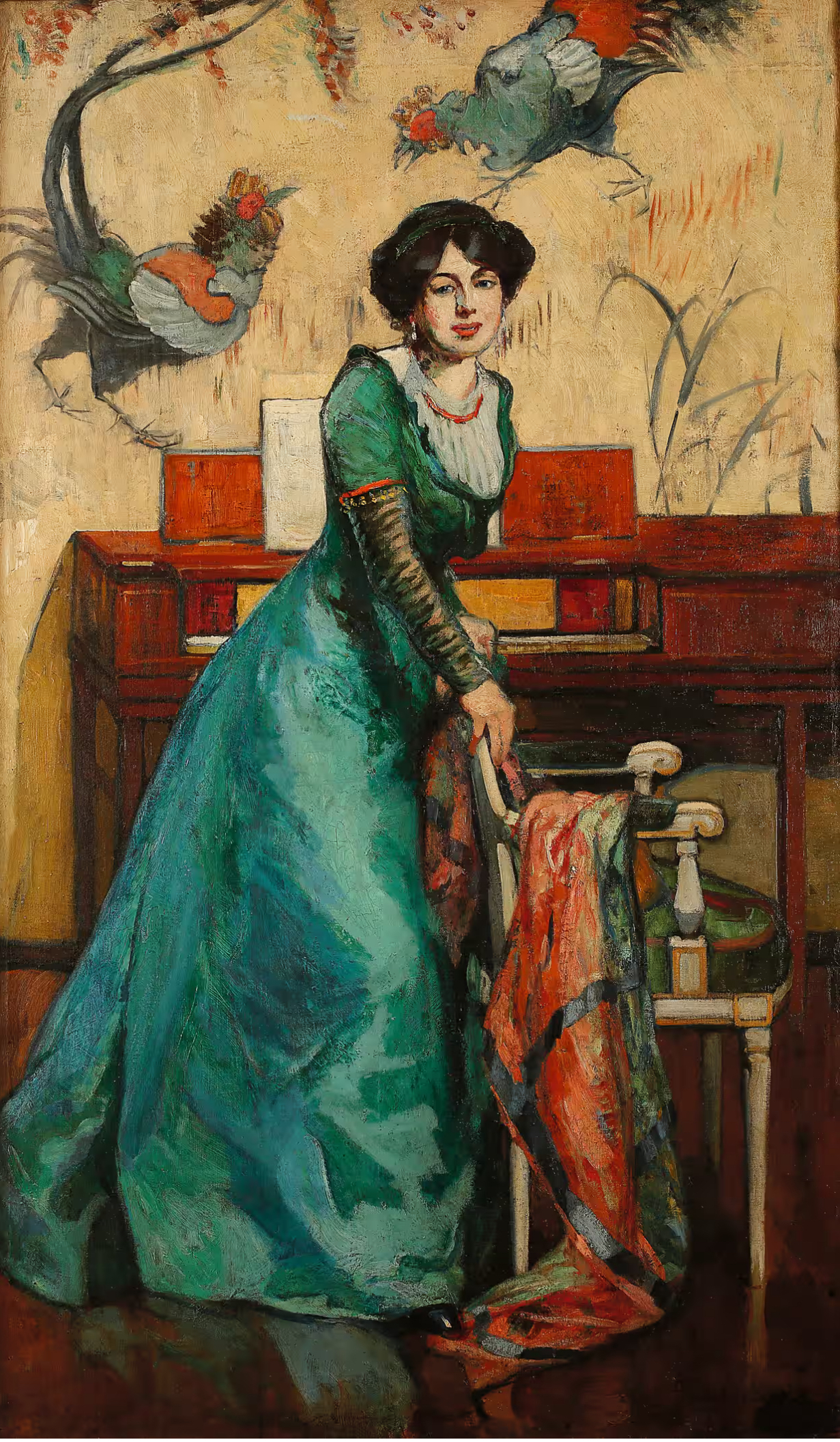
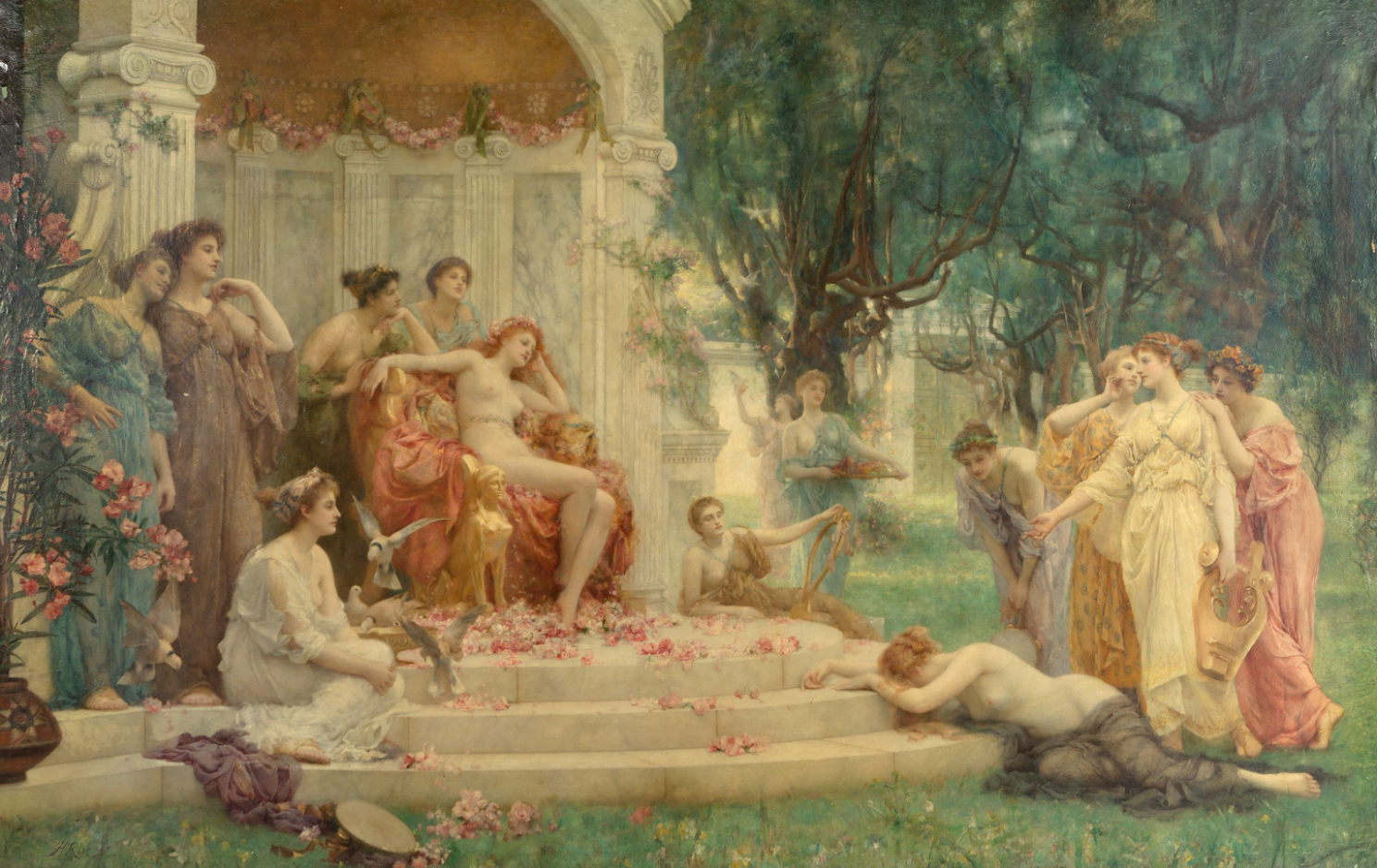
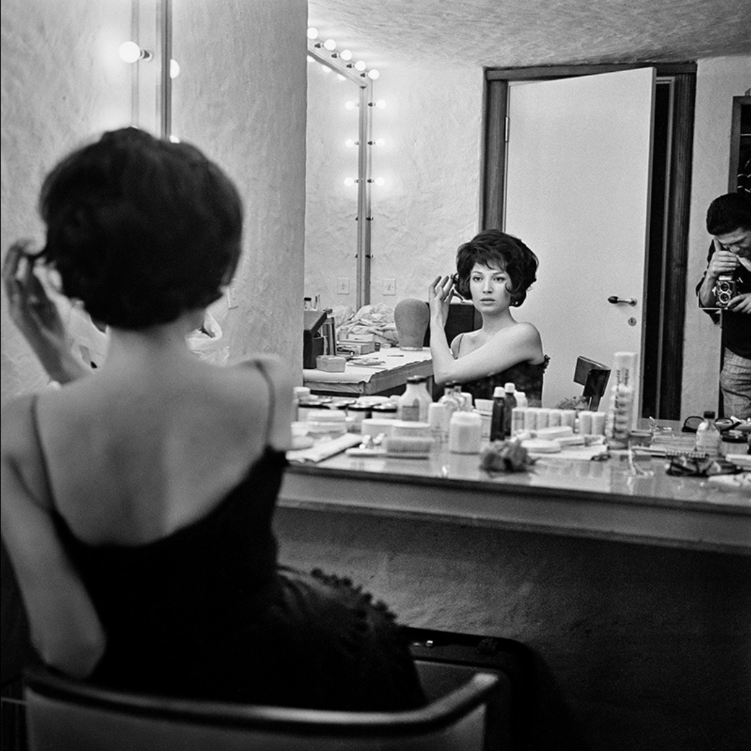
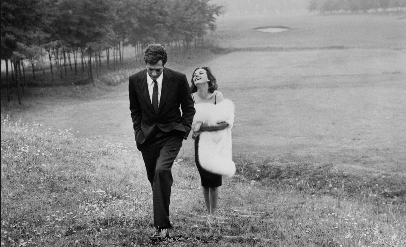
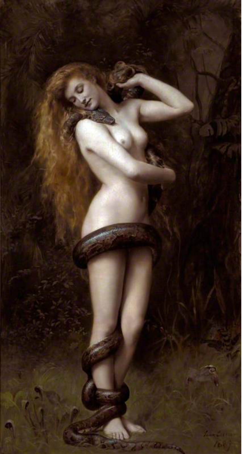
Oh, the significance of a slipped shoulder strap! (John Singer Sargent’s original “Madame X”, Monica Vitti yesterday, and today “A Modern Cinderella”. Shocking . . . apparently.) And the male gaze again. I’m not sure the theory always holds up: I really couldn’t see any difference between the “gaze” of “Psyche Before the Throne of Venus” and anything by, say, J W Waterhouse or Lord Leighton.

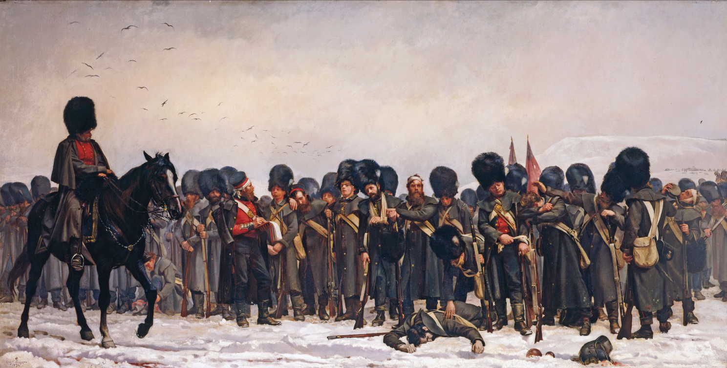
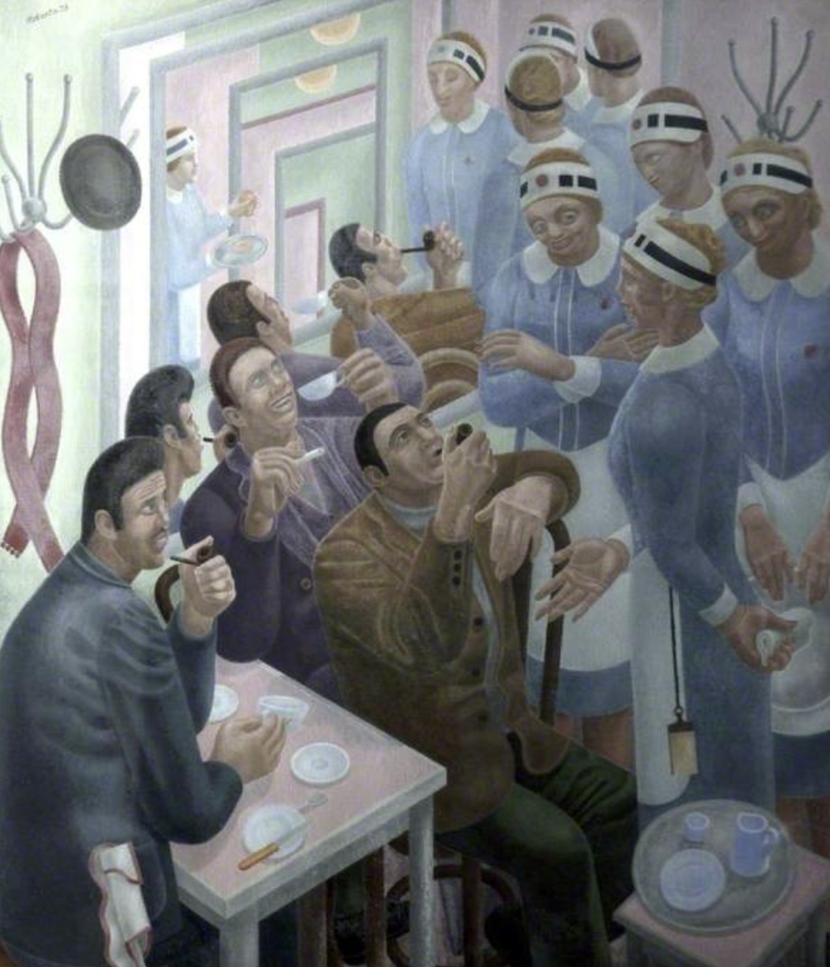
And then more paintings that show that a woman artist is no more pin-down-able than a male artist. After all, what do Elizabeth Butler and Gwen John have in common?

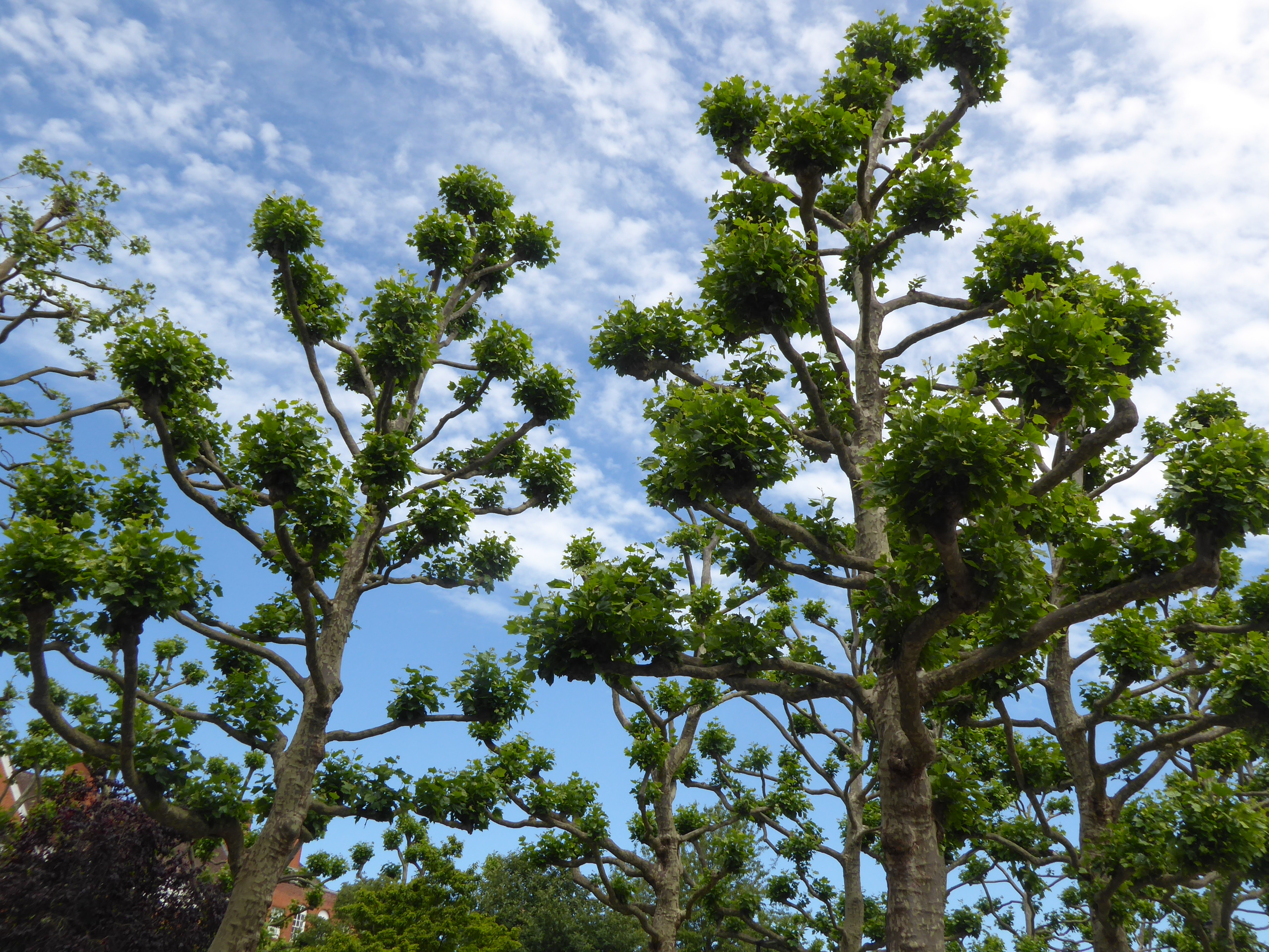
And, finally, the plane trees outside the Tate have been severely pruned as if they are topiary.

Sergio Strizzi: The Perfect Moment

An exhibition at the Estorick Collection of film stills and other photographs by Strizzi (1931-2004). He captured, amongst others, Monica Vitti and Marcello Mastroianni in their Antontonioni/Fellini days. And how beautiful Alain Delon was!

Various things came to mind as I browsed. How Italy personified modernity, beauty and style in the 1960s (Vitti looking sultry at the top of the Torre Galfa in Milan). The “male gaze” thing we’d been talking about in the film session. (Spaghetti straps for her, smart suit for him.) An astonishing photograph from 1954 of Sophia Loren signing autographs for fans (nearly all of them male) that made me think of the scene in “L’Avventura” when the American actress is besieged by men or Anita Ekberg in “La Dolce Vita”. Those scenes have always seemed akin to human sacrifice to me, but perhaps they weren’t overdone at all.

And now I want to watch all these films again!

Southport

To Southport on a whim. Another one of those railway stations that was designed for more passengers and bigger trains than it receives today. (Skegness is my go-to station for that.) I’m not even sure what the front of railway station looks like, for there was an entrance to Marks and Spencer immediately beyond the ticket barrier and that was how I entered the town centre.

All towns look tatty these days; it’s particularly noticeable in places that were built for the prosperous in prosperous times. Their grand Victorian and Edwardian buildings require constant maintenance, and how can grand hotels survive in an age of Airbnb? I looked at the Venetian Bridge over the artificial lake . . . and read how popular it was in the years before the war with fancy dress and lights and gondolas. Such a disconnect with what I saw on this dull, damp day.

Fortunately The Atkinson – an all-purpose gallery, museum, library, theatre and café – has recently been refurbished and is great. I wandered round the gallery, noting the Laura Knight ballerinas that I’d seen at the Milton Keynes Gallery – and surely I’ve seen that Pygmalion somewhere? It was mostly traditional art – which was fine by me when the contemporary world was represented by a Tracey Emin neon scribble. There was so little to “unpack” there. Whereas “Lilith” . . . oh, my goodness!

There was also an exhibition of paintings by Southport-born Philip Connard – impressionist, WWI artist, decorator, teacher. His dates are 1875-1958, which brings me nicely to the book I am reading at the moment: “The Horse’s Mouth”. (Fourth or fifth attempt, although I sailed through “Herself Surprised” thirty-odd years ago.) The fictional Gulley Jimson is of a similar era – although it would be libellous to suggest that Connard resembled Jimson in any other way. Connard’s paintings were a bit “blah”, but he could capture light on flowers beautifully – and he was certainly versatile.

There was also a small exhibition of Connard’s contemporaries, including Sickert, Cadell and Fergusson. I added to my collection of Glyn Philipot paintings too, along with one by Frank Brangwyn which made me realise how sensitised I have become to current preoccupations. I am so used to being lectured by gallery labels on the out-of-date mindsets and values behind so many works of art that it was quite a shock to come across Brangwyn’s painting of a slave market without any commentary. And I realised that I did indeed find it shocking: I thought it needed some context for a younger viewer – which was perhaps a bit patronising of me. (I also rethought my reaction to an earlier Brangwyn painting of the same name, which was an exercise in self-reflection.) I wasn’t even sure if it was a real scene or something conjured up from an overwrought Victorian imagination – like “Lilith” again. (It did rather amuse me that most of Napier’s output on ArtUK are portraits of Victorian worthies – with the occasional nude offering a possible peek into what went on beneath those top hats and bushy beards.)

There was more information on the painting of the Village Belle, which at first glance looked like a pretty girl chatting with the village boys. Unsurprisingly it wasn’t that simple: there had been another painting showing the same girl, now clutching a child and leaving the village under a cloud. Another insight into the Victorian mindset – and/or a warning to pretty village girls everywhere.

Lighter-hearted images were also available, as there was a Bill Tidy exhibition in the gallery. This was my steal, along with “The Nosegay” and Hawksley.

German Expressionists: Der Blaue Reiter

It’s bizarre to realise that John Singer Sargent was only ten years older than Wassily Kandinsky, for a whole era seems to divide their styles of painting and their conception of what art is. Sargent continued a certain figurative tradition, enhanced by the influence of the Impressionists. Der Blaue Reiter looked to a new world where art expressed emotion and spiritual feeling; it embraces abstraction, symbolism and “folk art” from around the world. Its members theorised, wrote, experimented and published: it was art with spiritual significance. From their 1912 “Der Blaue Reiter” prospectus:

Blue Rider . . . will be the call that summons all artists of the new era and rouses the laymen to hear… The first volume . . . reveals the subtle connections between Gothic and primitive art, with America and the vast Orient, with the highly expressive, spontaneous folk and children’s art, and especially with the most recent musical movements in Europe and the new ideas for the theatre of our time.

. . . In our case the principle of internationalism is the only one possible . . . The whole work, called art, knows no borders or nations, only humanity.

In brief, the more wholesome, new-agey alternative to Die Brücke expressionism. Incidentally, I was a little surprised how “old” (i.e. 40s) some of the artists were when they formed their movement (already seeded by the earlier Neue Künstlervereinigung München).

This exhibition is largely the Lenbachhaus’s greatest hits dropped into Tate Modern. (Munich got some Turners in a swap.) It’s little more than a year since I visited Munich, so I remembered most of the works well (except for the Bavarian reverse glass painting, which is a good example of the all-inclusive nature of Der Blaue Reiter). This exhibition takes in modern ideas such as the pigeon-holing of women, gender fluidity and animal theory and skips lightly over old ideas such as Theosophy.

It was interesting to compare two portraits of Marianne Werefkin – one a self portrait and one by Gabriele Münter. Each artist had their favoured shades: I prefer the clarity of Münter, Franz Marc and Kandinsky’s colours to the slightly muddy tones of Werefkin and the washed-out pastels of Maria Franck-Marc.

My steal from the exhibition would be Münter’s portrait of Alexej von Jawlensky listening. I’m not sure if she meant it to be comical, but the way the sausages seem to extend all the way from the plate to the top of his head certainly made me smile.