Turner in Time

A very wet and windy day, but the trains were running and that was enough for me. To the Whitworth for yet another Turner exhibition. This one was of Turner’s watercolours (low status compared to oil painting) from his teens to his old age – from precision to impression. I enjoyed watching the change in style as I wandered around the room and noticed how he embraced innovation (e.g. coloured paper for his watercolours). Some scenes were already familiar, like the fall of the Clyde in Lanarkshire.

As usual, there were other small exhibitions to dip into. One on trees in art, which was rather lovely, and one on abstract art, which wasn’t. Minimalism is OK, but the “messiness” of, say, Gillian Ayres means nothing to me, Well, my loss perhaps. Included in the exhibition room were fabric and textile designs from Edinburgh Weavers and Hull Traders – abstraction tamed and tidied into repeating patterns.

Turner and Constable

I set off for the Tate on foot and continued walking when the rain started, preferring to avoid crowds while I could for I knew the exhibition would be busy. It was indeed sold out for the day, and the cloakroom was quickly full.

The exhibition looked at Turner (b 1775) and Constable (b 1776), comparing their works and their success (the former seen at the time as “poetic”, the latter “truthful”). Turner travelled widely, portraying the sublime and maximising income from his output through his prints; Constable painted closer to home, often out of doors, trying to capture natural features and atmospheric effects as truthfully as he could. There was a sketch of Helmingham Dell which I wanted to steal: it combined the charm of poohsticks bridge with the elemental forest scenes in Hamnet. I much preferred his smaller works to his “six-footers” – paintings designed to be noticed at exhibitions. (Turner had learned that lesson early on.) It was interesting to compare Constable’s experiments with his brushwork – usually textured (which critics had divided opinions about), but occasionally smoother.

Again, I preferred Turner’s later, less finished paintings. There are only so many scenes of ravines, cliffs and castles that I can take. His unfocussed views leave more room for interpretation.

I wandered around the regular galleries too, and noted a painting of Mrs Mounter by Harold Gilman that I was sure I had seen last month at the Walker. Yes, I had – Mrs Mounter was a regular model for Gilman; I’ve even seen her in Leeds. The main hall had a selection of Jacob Epstein’s sculptures, and I was struck anew by the Rock Drill torso. Epstein changed the sculpture (originally more sinister) after WWI, amputating some of it and casting it in bronze, and the result is somehow sorrowful – almost like a Pietà with bowed head and arm reaching out in supplication.

I also spent time with William Stott of Oldham. Undemanding . . . but so lovely.

V&A East Storehouse

Another whim. I’d never been to the Queen Elizabeth Olympic Park, despite years of going past it on the train to Manningtree and Harwich and watching the site being developed for the Olympics, so getting off at Stratford International was a first. It’s a fairly unlovely place – the River Lea is brown and the architecture bland – but on a fine day it didn’t matter.

The V&A Storehouse is indeed a storehouse – similar to the Boijmans van Beuningen Depot in Rotterdam but without the exterior wow-factor. You wander around as you wish; there are a few labels, some QR codes and heavy large-print catalogues. It’s very Instagrammable from certain angles, but I confess – much as I was charmed with it – I did come away with the impression that the V&A could have a clear-out. I appreciate that you’d have to hang onto a piece of Chinese tapestry-woven silk (1368-1644, which is quite a range), and a bit of the façade of the now-demolished Robin Hood Gardens tells its own story . . . but the moth-damaged vintage Harvard trucker baseball cap, date, location and maker unrecorded? Really?

While looking for somewhere for lunch, I passed the old Daily Telegraph building in Fleet Street and noticed above the door the mirror images of Mercury taking messages east and west, which reminded me of the image above the entrance to the Radio Kootwijk transmitter building.

Hamnet

Director Chloé Zhao with Jessie Buckley and Paul Mescal

I have a prejudice towards films about real people: it seems to me a trespass and condescension to assume you can portray the inner life of another person. It’s a bit ridiculous of me, and I frequently put it aside (quick check to see how many biographical films I have watched over the past couple of years). And – be reasonable – it’s not like everyone has the option to make autobiographical films like The Long Day Closes. Besides – Hamnet is a film with William Shakespeare, who surely sent Richard III spinning in his grave(s), and so little is known of his life – not to mention his wife’s – that there is fertile ground for speculation.

I enjoyed Zhao’s last film, and there were continuities with this one: strong female lead, nature, joy, kindness, hardship, dirt, earth. Agnes barely moves horizontally in this film (just once to London); her plane is vertical, from planting in the ground with her bare hands to soaring with her hawk. It’s a powerful film: I was a bit resistant to the obvious emotional wave of the acting and musical score at its height but it was undeniable. The attraction between Agnes and Will is immediate and practically wordless; of the two, she has the greater power of the spoken word with rhymes and chants learned from her mother and her own self-expression. The “great man” is often peripheral to the story, for this is seen through women’s eyes: Agnes and her mother-in-law are the protagonists here. (Lots of incidental ironies: if this had been made in Shakespeare’s time, they would have been played by men.) The modern dialogue and sensibility (which jarred slightly) are offset by the dirt and hardship of sixteenth-century life. Birth and death were definitely not anaesthetised or antiseptic.

I am ambivalent about it. My critical voice was on speakerphone while I watched it, telling me that it was too obvious in its emotional weight – but, on reflection, the themes of a woman’s life, family life, nature (the basics of any life, after all) and the transmutation of love and grief into a shared experience through art have stayed with me.

London

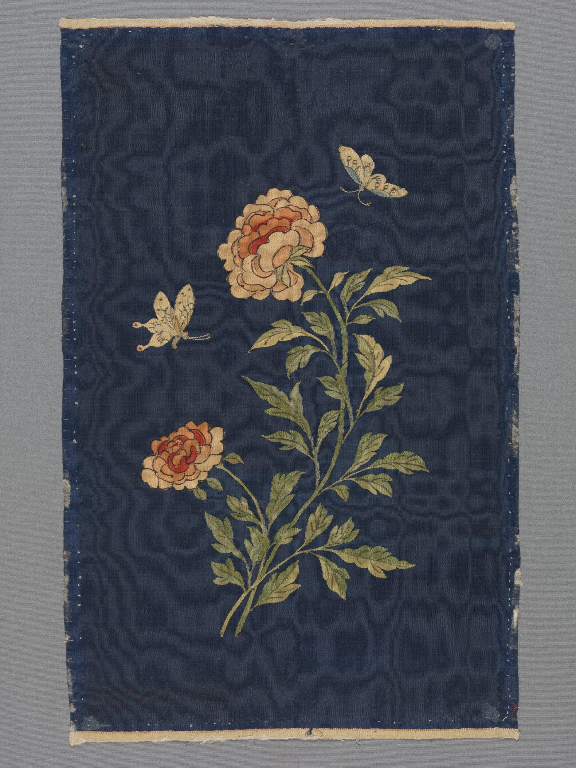
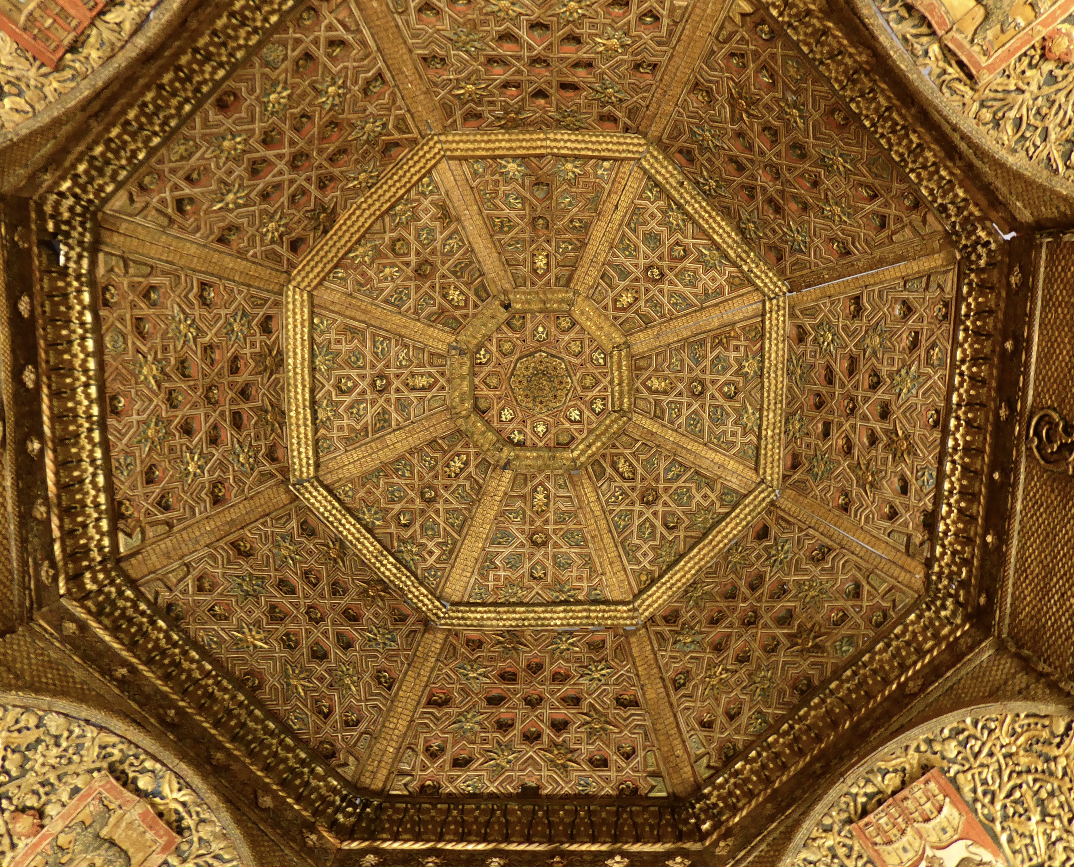
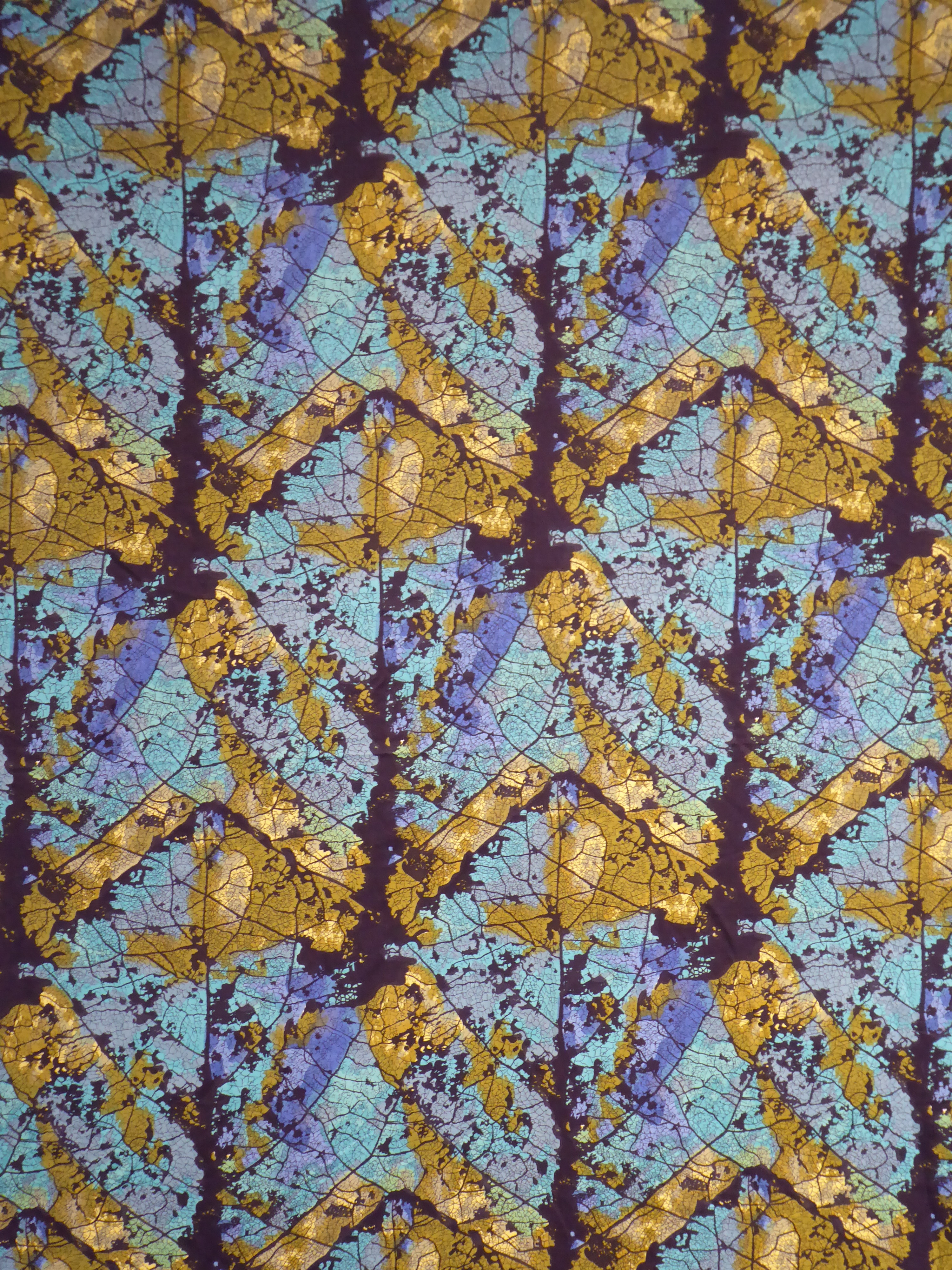
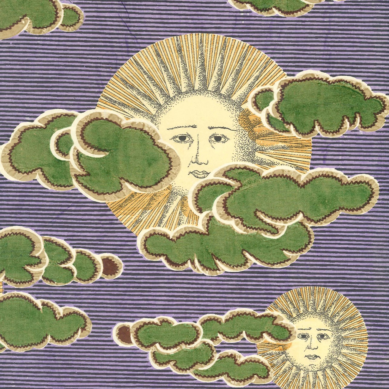
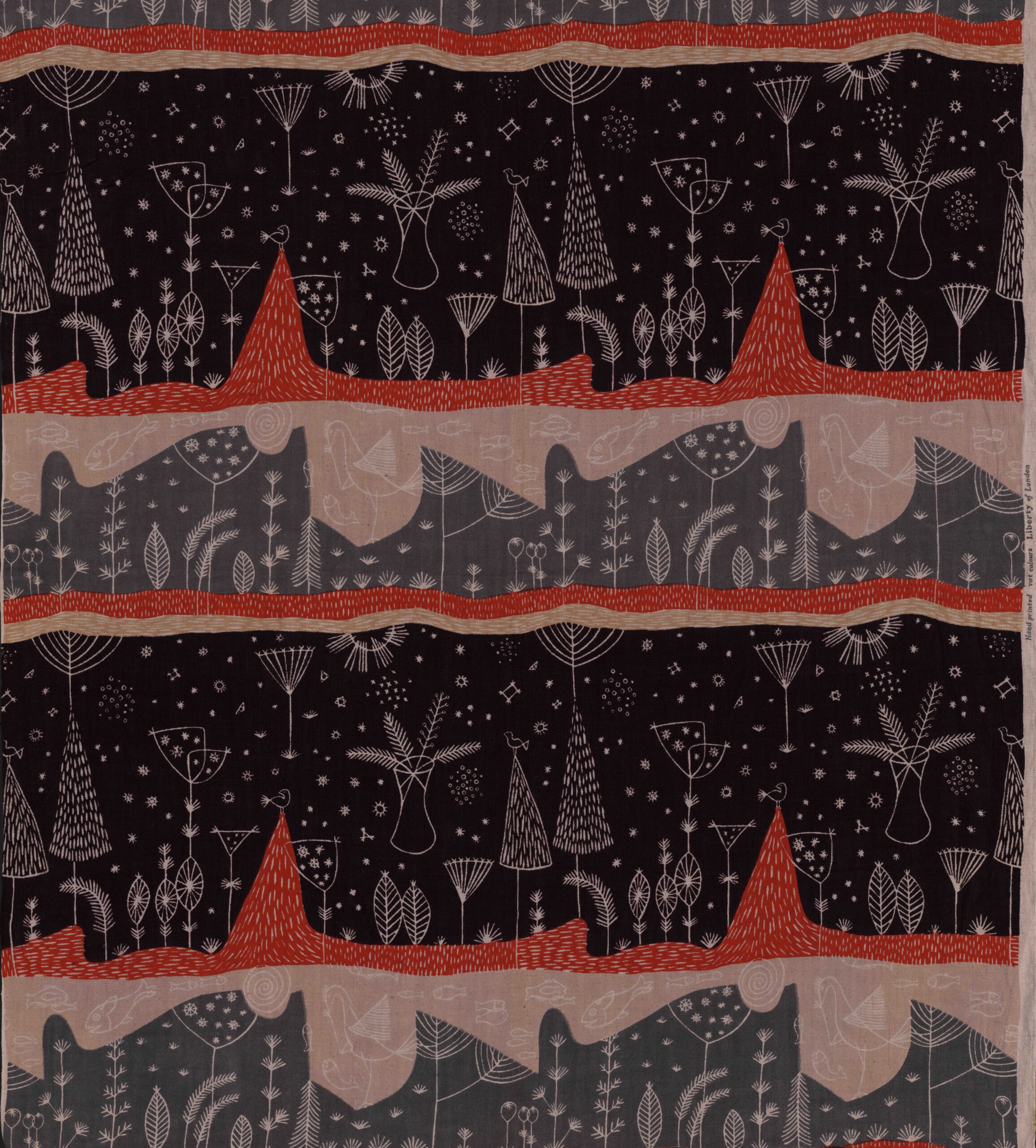
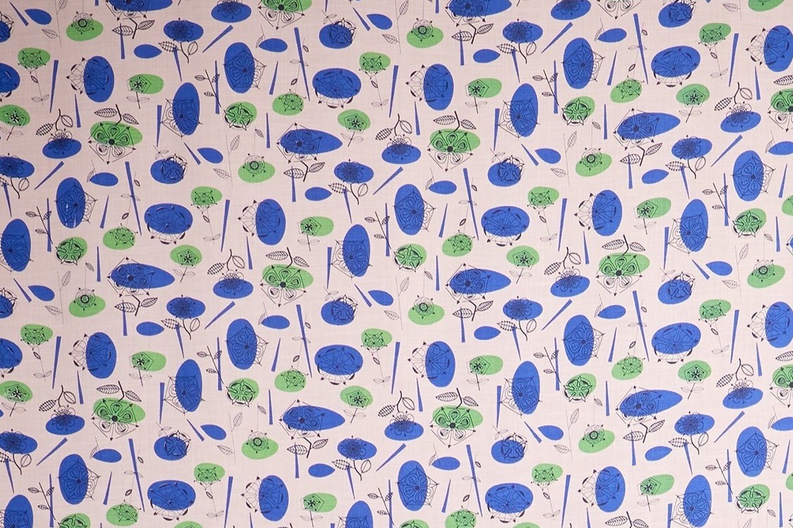
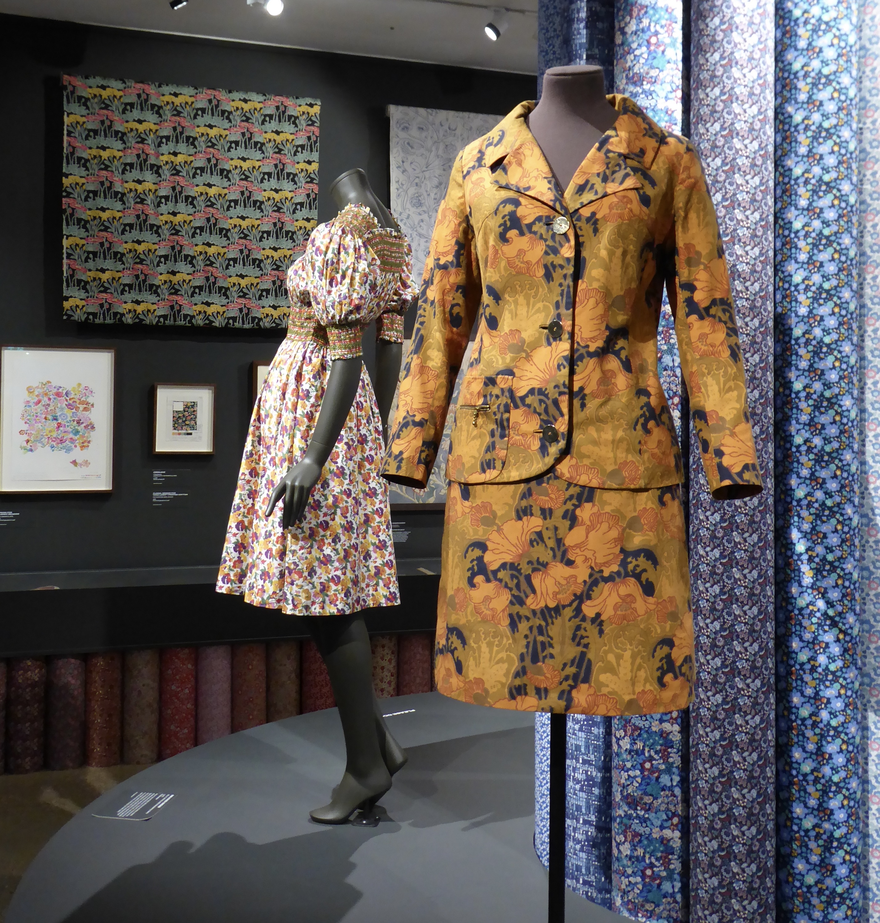
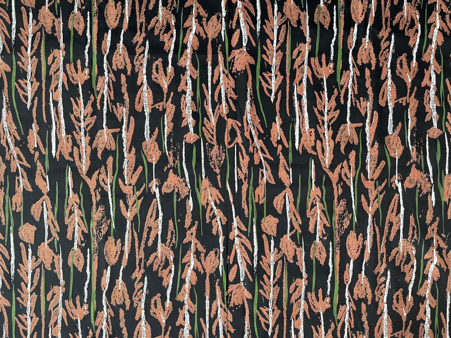
I arrived in London early and headed to Walthamstow to the William Morris Gallery for an exhibition of Liberty fabrics by women designers. There were some lovely fabrics – thankfully not all of them florals – and it was interesting to see the changing fashions over the decades. I already had a soft spot for Lucienne Day’s designs, and here I added Althea McNish, Gwenfred Jarvis, Hilda Durkin and Colleen Farr.

Arthur Liberty founded the shop in 1875, initially importing textiles and objets d’art from Asia and the Middle East. It soon moved into designing its own fabrics and helped to popularise the new Arts and Crafts and art nouveau styles. The fabrics were all printed until 1972 at the Merton Abbey Mills, and there was some fascinating film of the designs being block- or screen-printed and then rinsed in the chalk stream by men in their shirt sleeves who had been doing that work for decades. Then came the finished garment – which no doubt cost an arm and a leg to buy. A fascinating bit of social and economic history: design opportunities for talented women (initially anonymous), manufacturing work for local companies, then the sale of the finished goods to the prosperous to adorn their homes and persons – much of that exchange also transacted between women, albeit across a social divide.

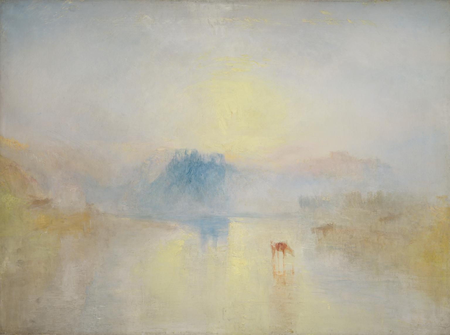
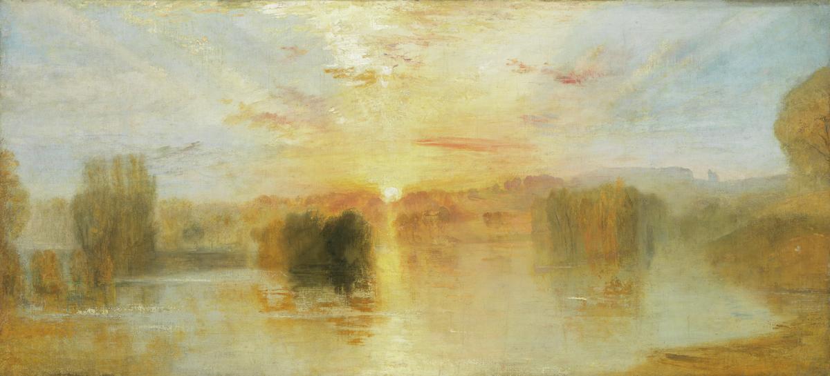
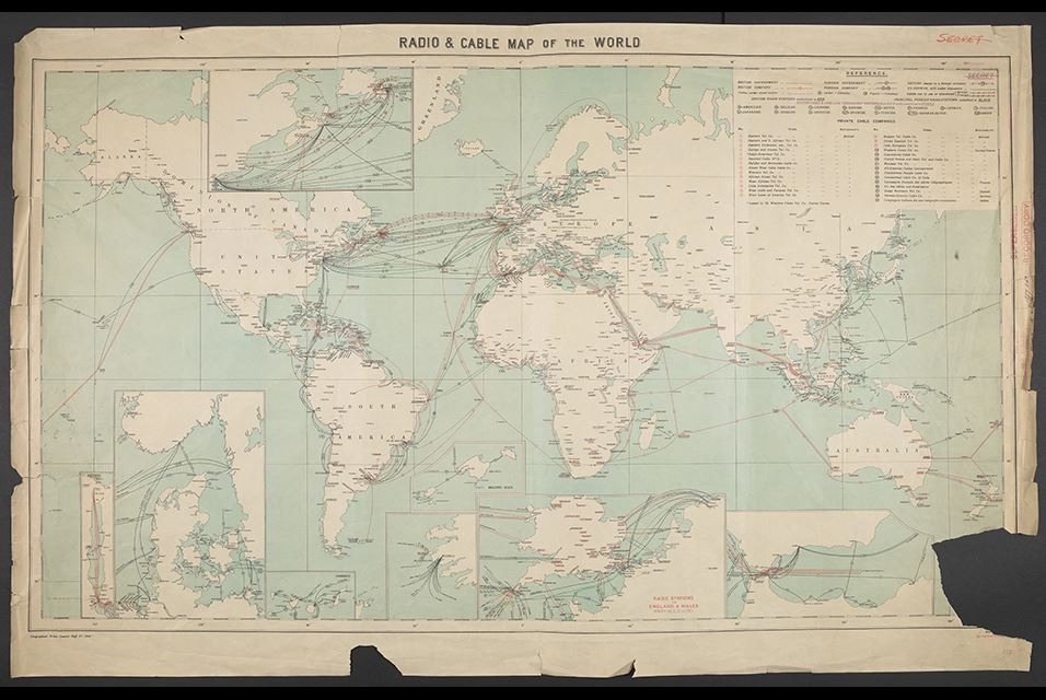
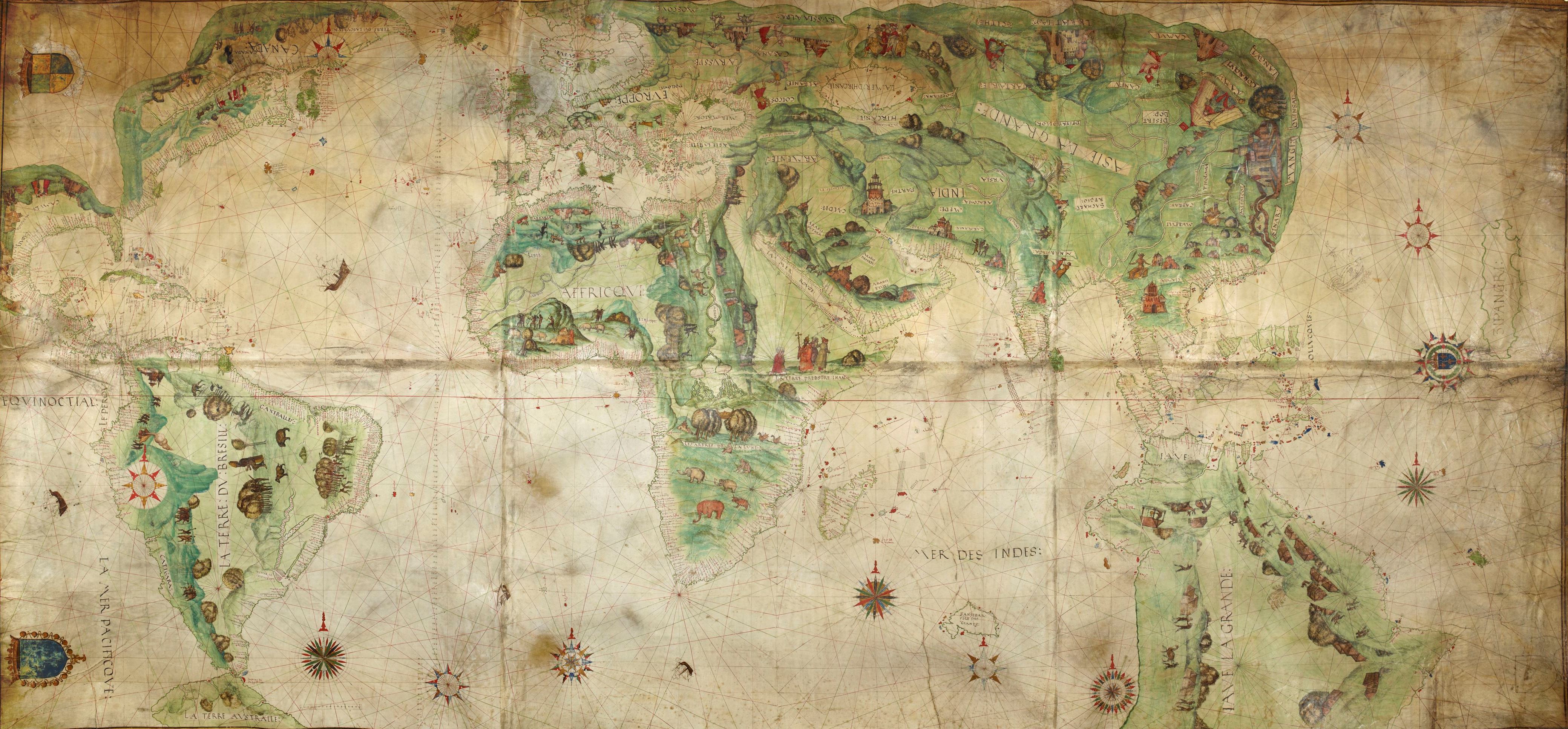
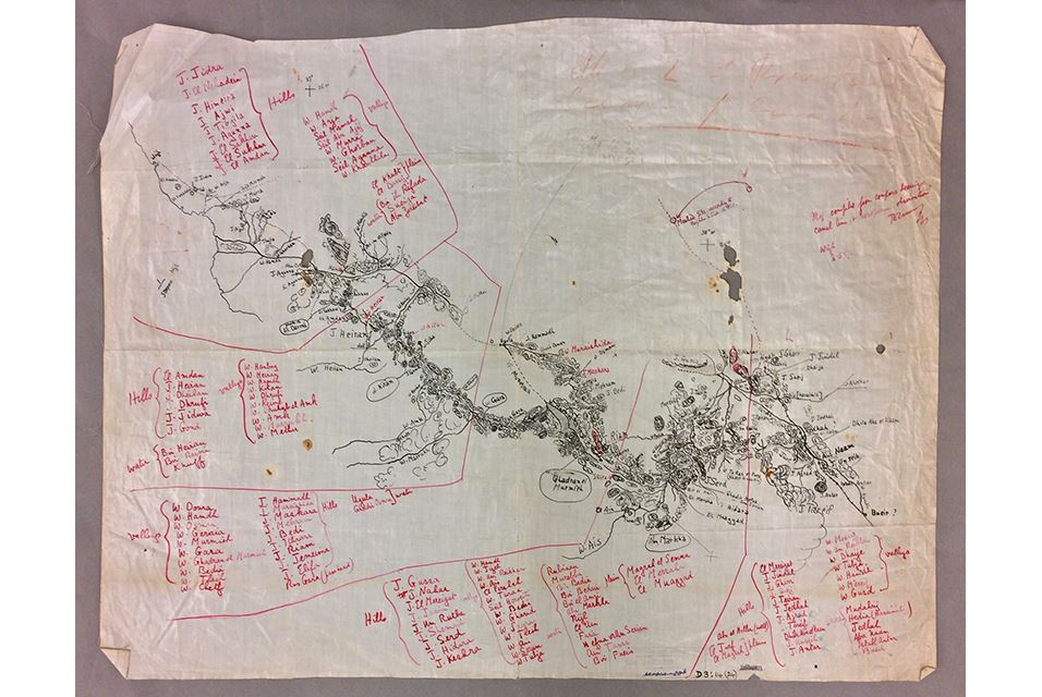
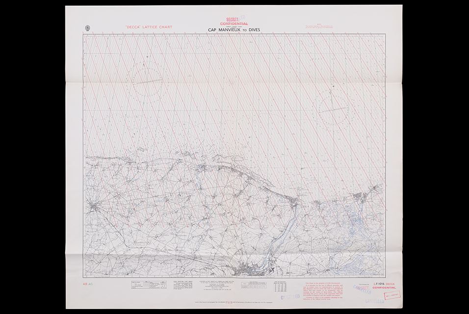
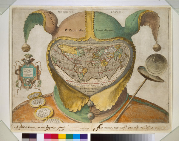
After lunch I managed to get the last ticket of the day for the Secret Maps exhibition at the British Library. (It’s the final week of the exhibition, so I was lucky.) It was good at showing the power of maps – particularly at times of war or rivalry. The Dutch East India Company tried to keep secret their world map of 1648, which showed part of the coast of Australia. Even before that, the c 1547-produced map for Henri II showed the outline of a great southern continent. Hand-drawn maps were safer, in terms of reproduction, than engraved maps. Armed or a defenceless locations could be removed from or disguised on maps (at least before aerial photography). Tiny maps or maps printed on materials like silk could be hidden (and worn). There was a wonderful hand-drawn map by T E Lawrence of his route from the Red Sea coast to the Hejaz railway. Clandestine maps of worldwide cable networks, or the chart of radio beans on the Normandy coast to assist the D-Day landings (which later influenced GPS).

The unconsidered power of maps was also revealed – as in the official map of Nairobi, which shows no sign of the vast Kibera informal settlement of perhaps 170,000 people. New rulers give new names to their colonies and territories and divide them as they wish. Certain areas/transport corridors are prioritised over others. (I note how this hierarchy is reversed when I use bike route maps: main roads are uncoloured but the route I want is a bright red line across the page.) People have not always wanted their areas to be mapped – preferring to remain under the official radar or fearing what easily accessible knowledge may bring to their land.

More personal maps: the 1930s London map which showed public toilets that were used as meeting places for gay men. Charles Booth’s 1889 map of London which marked each street on a poverty-prosperity scale. Then came GPS and all the data which can be gathered (as in the routes run by American soldiers using Strava that gave away locations of their bases in Afghanistan ) or routes that can be used by asylum seekers to cross vast distances with an encryption messaging app.

I’m glad I got the last space.

Seven Samurai (1954)

Director Akira Kurosawa

An engrossing film – despite its lasting three and a half hours and my knowing the story from The Magnificent Seven. B&W with some scene transitions that made me think (incongruously) of the 1960s Batman series. I don’t know how much the director had westerns in mind as he filmed it, but inevitably westerns were constantly in my mind as I watched it. The social types, the codes of honour, the paucity of female roles, the dress code. Quite fascinating.

Strong opposites: the peasants frightened, sly and eternal, a collective; the samurai brave, mobile and ephemeral, for they would die before their time. The bandits – ? Landless peasants, rogue samurai or just generic “baddies”? There were speeches about the importance of collective over individual defensive action, and I wondered if the film (expensive, long, prestigious) was aimed at bolstering Japan’s image after its surrender.

It made me rethink Hollywood genres and tropes too. Not just westerns but all those Robin Hood type of films and the Roman/early Christian films I saw on television as a child, which inducted me unwittingly into the “grammar” of the genres so that I know that a black cowboy shirt indicates a baddy without ever having learned the fact. I couldn’t parse the significance of sumo-style wrapping vs long culottes for samurai in the same way, but I’m not sure it mattered. There were only three guns – all in bandits’ hands at the outset – and I wondered if these foreign imports were viewed as somehow dishonourable. There was definitely an elegiac quality in the depiction of the samurai – as if their day was coming to an end.

Yes, I’m glad that I have watched this particular classic.