More London

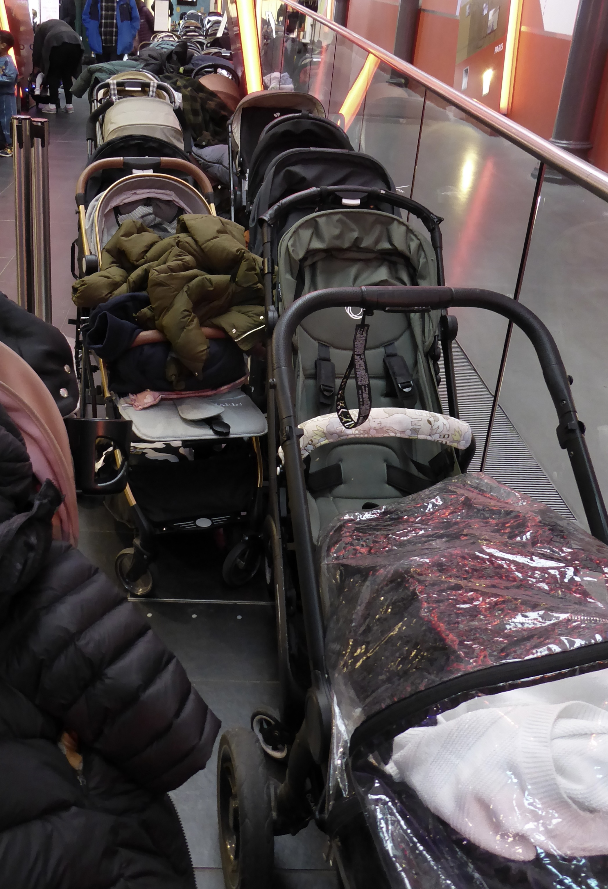
Thursday’s ticket gave me half-price entry into the London Transport Museum, so I decided to visit it, if only for the exhibition of art deco posters. Perhaps it’s an exaggeration to say that every other adult had a pushchair, but I certainly felt out of place without a small child in tow. They were pinging about all over the place. It wasn’t the first time I’d been there, so it was familiar. I did linger at the steam locomotive used on the Metropolitan & District underground for over 40 years; it had a condenser to capture the steam but nothing to alleviate the smoke. At first I thought how awful it must have been for passengers . . . and then I thought of the drivers and stokers.

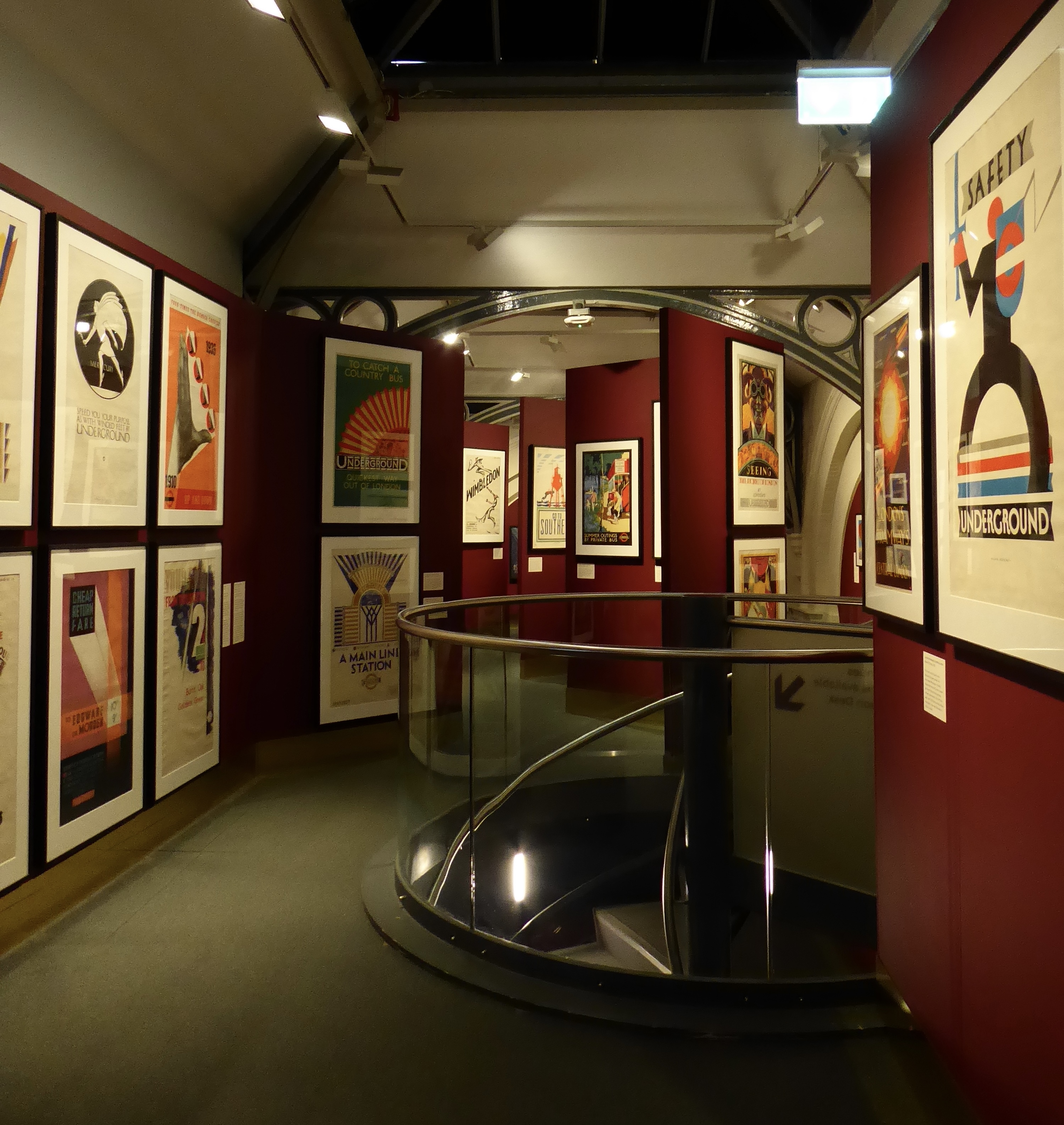
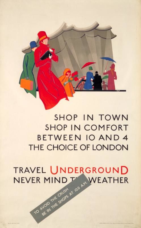
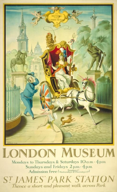
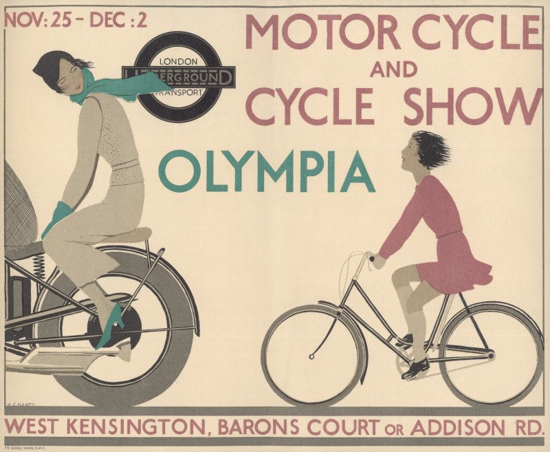
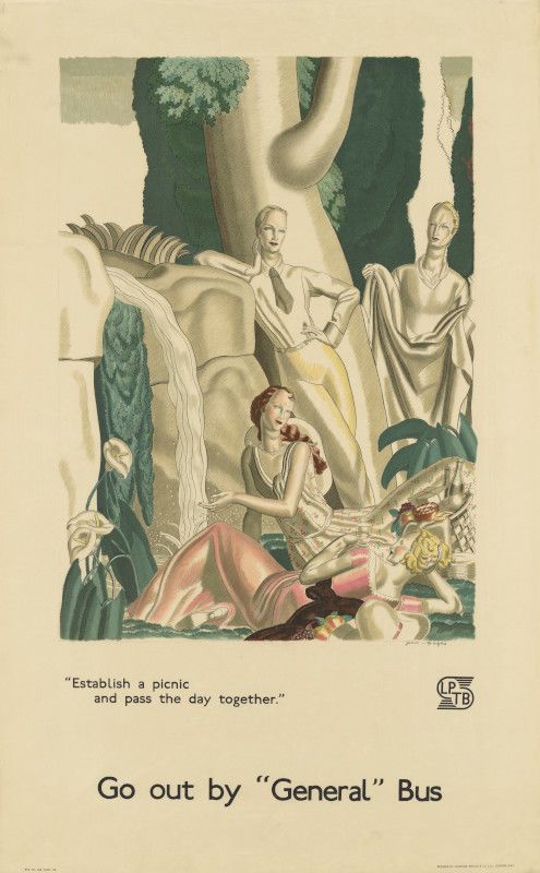
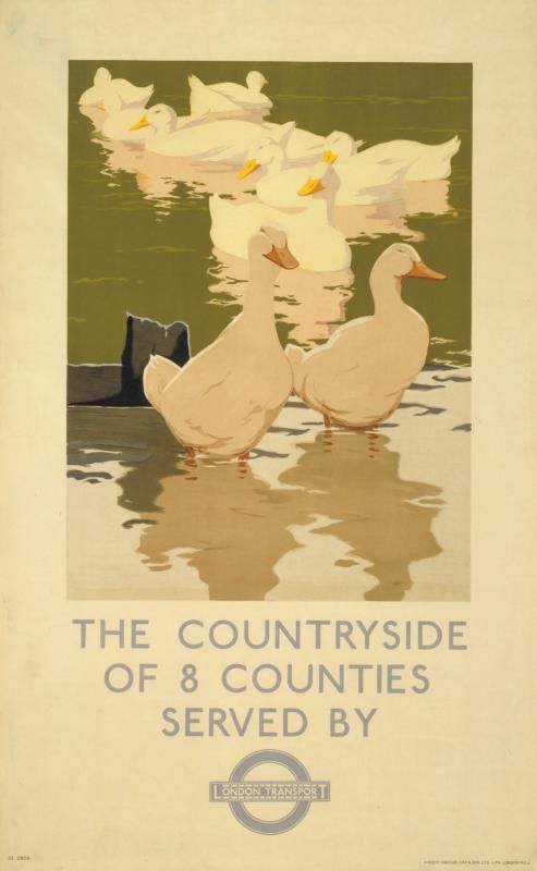
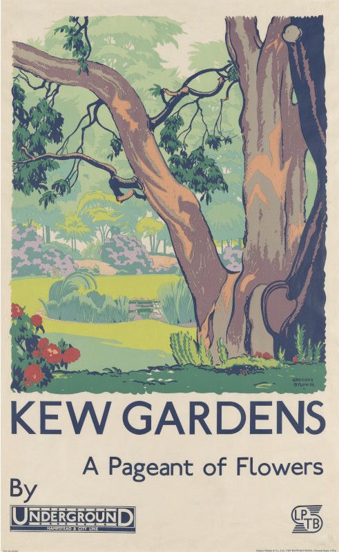
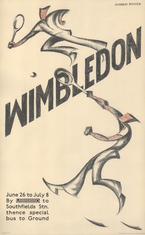
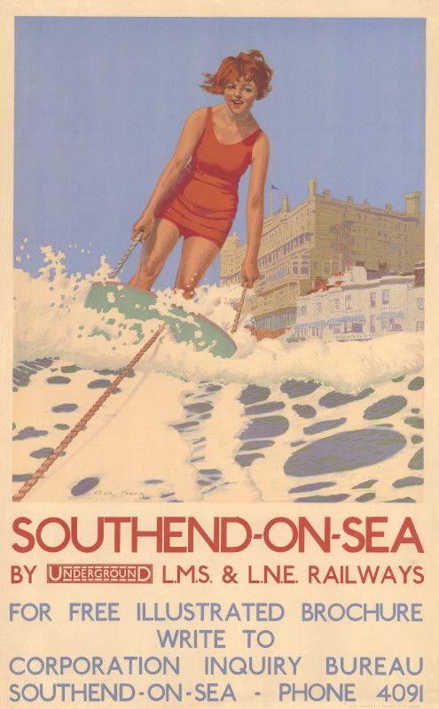
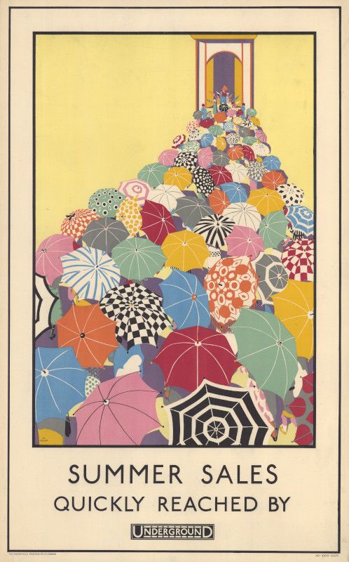
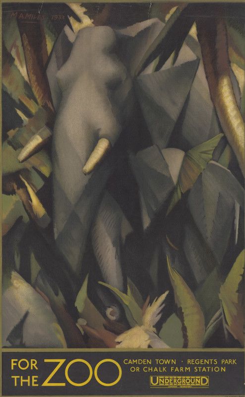
I enjoyed the exhibition of art deco posters from the underground. They implied affordable modern luxury – a visit to Kew Gardens, the zoo or the West End. There were a couple by Sybil Andrews/Cyril Power that I’d seen in Dulwich.

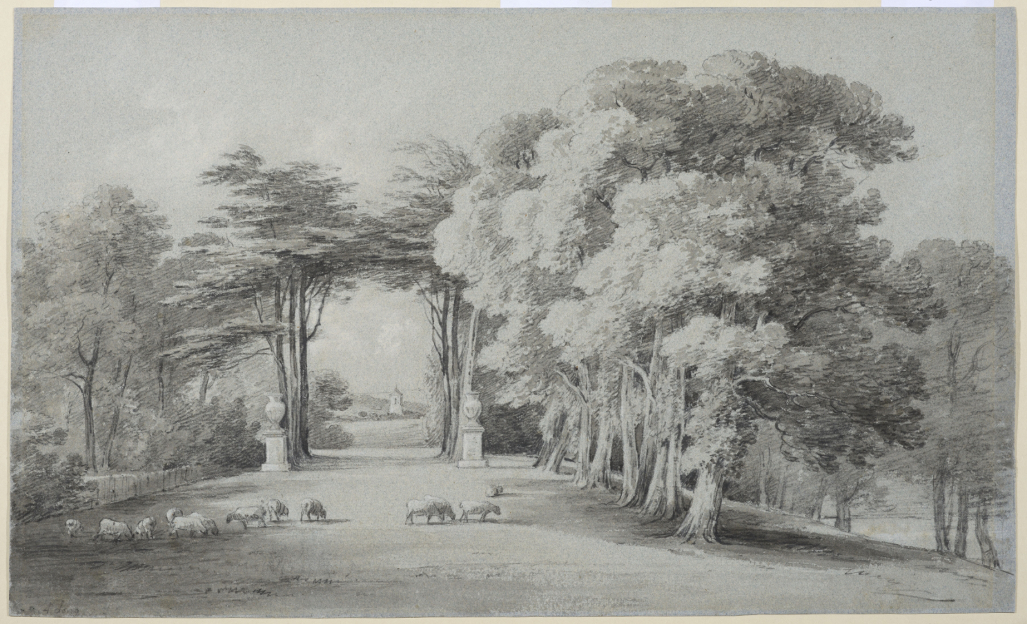
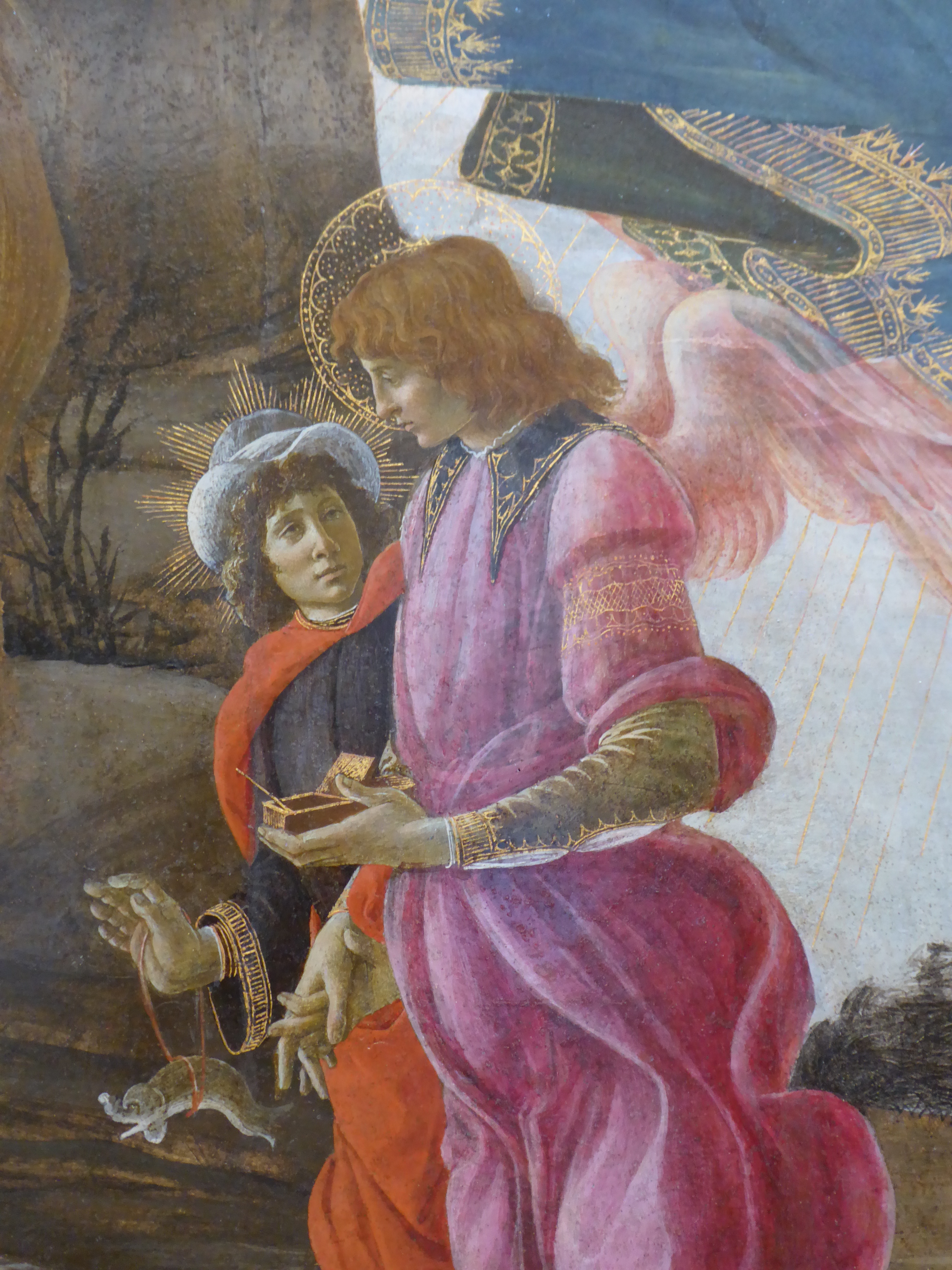
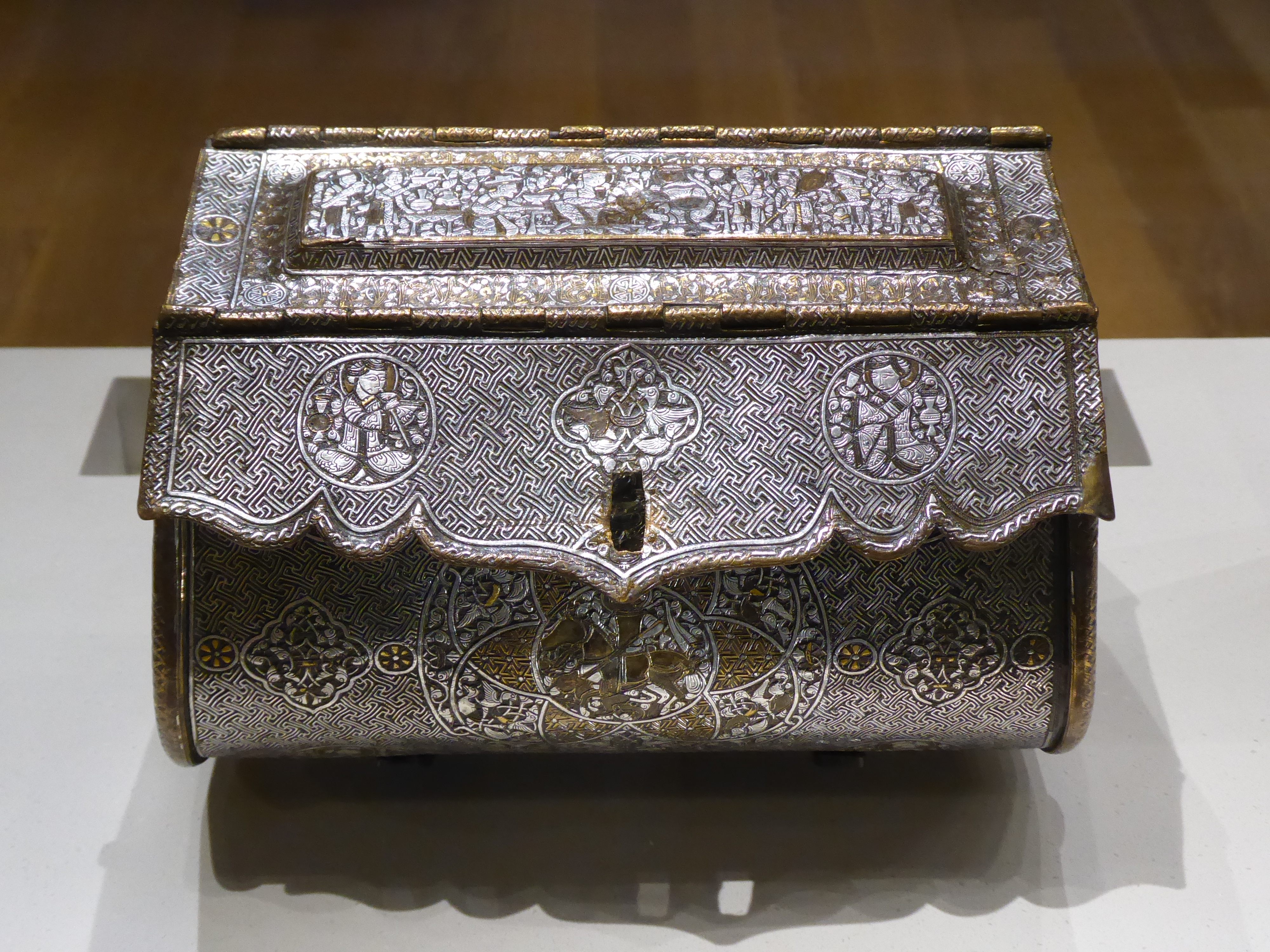
Then, since I was nearby, I headed towards the Courtauld Gallery. I was briefly sidetracked by a youthful band celebrating the anniversary of the founding of RAF air cadets. I looked at the”Courtauld bag” (from Mosul, 1300-30) and was rather taken with Tobias and his fish in the Botticelli painting of the Trinity. There was also a small exhibition: A View of One’s Own: Landscapes by British Women Artists, 1760-1860. I’ve seen a lot of Turner and Constable landscapes recently, and I can’t see that Elizabeth’s Batty’s is markedly inferior.

Wayne Thiebaud

Each era produces its own still life

Sometimes I am not sure what will grab me and what will elude me. I quite like being surprised by myself. And – for some reason – this small exhibition of a particular section of Thiebaud’s work grabbed me. The introductory panel with Thiebaud’s own quotation set me up: I couldn’t deny what he said, and it was enough to open my mind to his work. Without it I could just as easily have come away thinking that, like Lichtenstein, he had found his schtick and stuck to it. The exhibition reminded me of a book I had to read (“plough through”) for an OU course: Gombrich on the beholder’s share when looking at a work of art. It made sense in front of Thiebaud.

As a graphic artist, he knew how to make an impression. Things I noted:

  • The muddiness of his early Meat Counter painting. Rather nasty colours and textures – unless his aim was to convert you to vegetarianism.
  • Abundance/scarcity – the empty trays on the delicatessen counter. It reminded me of the shock of seeing reduced food availability during Covid. That balance in the modern world of having everything under the sun available to buy . . . but empty shelves are never far away.
  • His still lifes are of everyday objects – nothing exotic or hot-housed here. They are cheap and mass-produced, painted so thickly that you can feel your teeth ache with the sweetness.
  • My steal was the Boston Cremes. They seemed to be float like moored yachts or even like ice shards on Friedrich’s Das Eismeer. Choreographed by Busby Berkeley.
  • Cakes made me think of the cake/doughnut counter at Leeds station. I have always regarded it with a detached and puritanical eye – all that sugar! – but now I shall look at it anew. Walking back, I passed another such counter and had to acknowledge how attractive it was in a garish fashion. (Now that I have aged into an appreciation of The Savoury, I can be judgemental about and ignore the attractions of The Sweet – hypocritcally obliterating from my memory the delicious sugar cubes I used to steal from the larder.)
  • I took a photograph of Cakes above the heads off people sitting on the bench, when really I should have included them. They would have complemented the palette perfectly – him in pale blue jeans and her in a pastel pink top.
  • Thiebaud referred to Cezanne and Chardin – and I could see that his perspective echoed Cezanne and his simplicity Chardin.
  • The impasto: it worked perfectly on the food, but he also layered the paint thickly on the smooth surfaces of the counters and trays. He wasn’t trying to be that representational.
  • Picture captions pointed out that, despite the seeming repetition of, for example, his slices of pie, each one was subtly different. And later I went for a coffee and noticed the cakes under their glass cases: they were indeed all slightly different, and had I had a cake I would have been silently willing the server to choose this one rather than that one.
  • It was all utterly trivial – cakes and toffee apples, for goodness sake! – but somehow utterly wonderful.

Courtauld

To the Courtauld to look at the London street photographs of Roger Mayne from the 1950s. They were great in capturing the texture of life at that time, but it was that context that made them so engaging. I found his other photographs of family and Spain very dull – they lacked the charge of say, Chris Killip, or the compositional mastery of Vivian Maier.

There was also a small exhibition of works by Vanessa Bell, including designs for the Omega Workshop. She was also included in yesterday’s exhibition at the Tate; I still don’t “get” her any more than I do Paula Modersohn-Becker – the colours are too muddy and the shapes too blobby. But what do I know?

With the shift in mood caused by the arrival of summer, I was inspired to photograph little things to represent how that feels to me. Shadows, sunlight, blue sky – that kind of thing. What I would also like to include – but obviously can’t – are jumbles of tattoos on arms and legs now that skin is exposed. Some of them are a random collection of inkings, as if they’ve had one done after the other without regard to the overall effect. The effect is bit like an old haversack that you stitched badges onto each time you went somewhere new.