Vanessa Bell and Charles Dickens

To the Vanessa Bell exhibition in Milton Keynes to see if I could feel more positive about her work. Well, not really – but the journey to that decision was quite interesting.

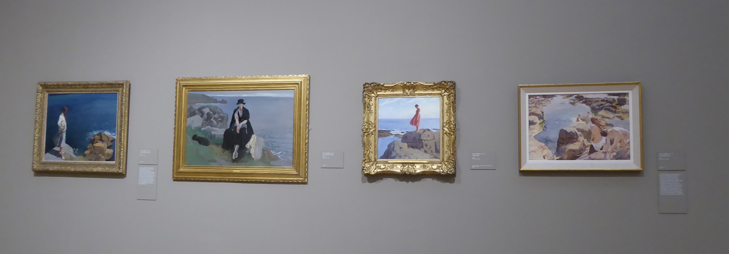
I’d been to the same gallery to see Laura Knight (1877-1970; Bell 1879-1961) and it was instructive to compare the two exhibitions and artists. Knight’s work (as curated for the exhibition) followed a path from early experimentation to a recognisable style and regular themes; she had to earn her living from an early age and she was sometimes hard up. She accepted commissions, she worked as a war artist, she designed decorative work. She was married to the same man for decades and had no children. In short – at least outwardly – a fairly tidy story of a groundbreaking woman artist and her body of work.

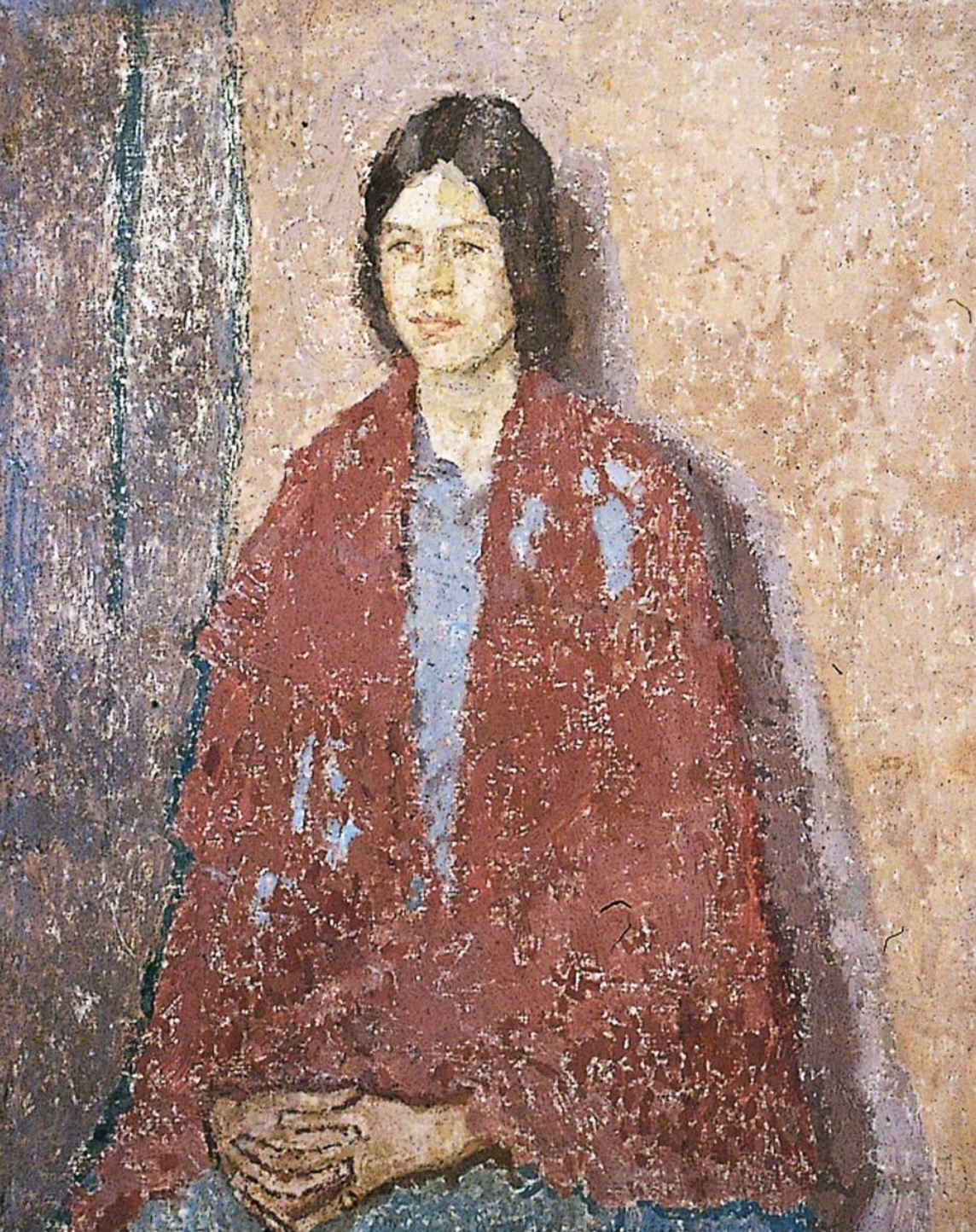
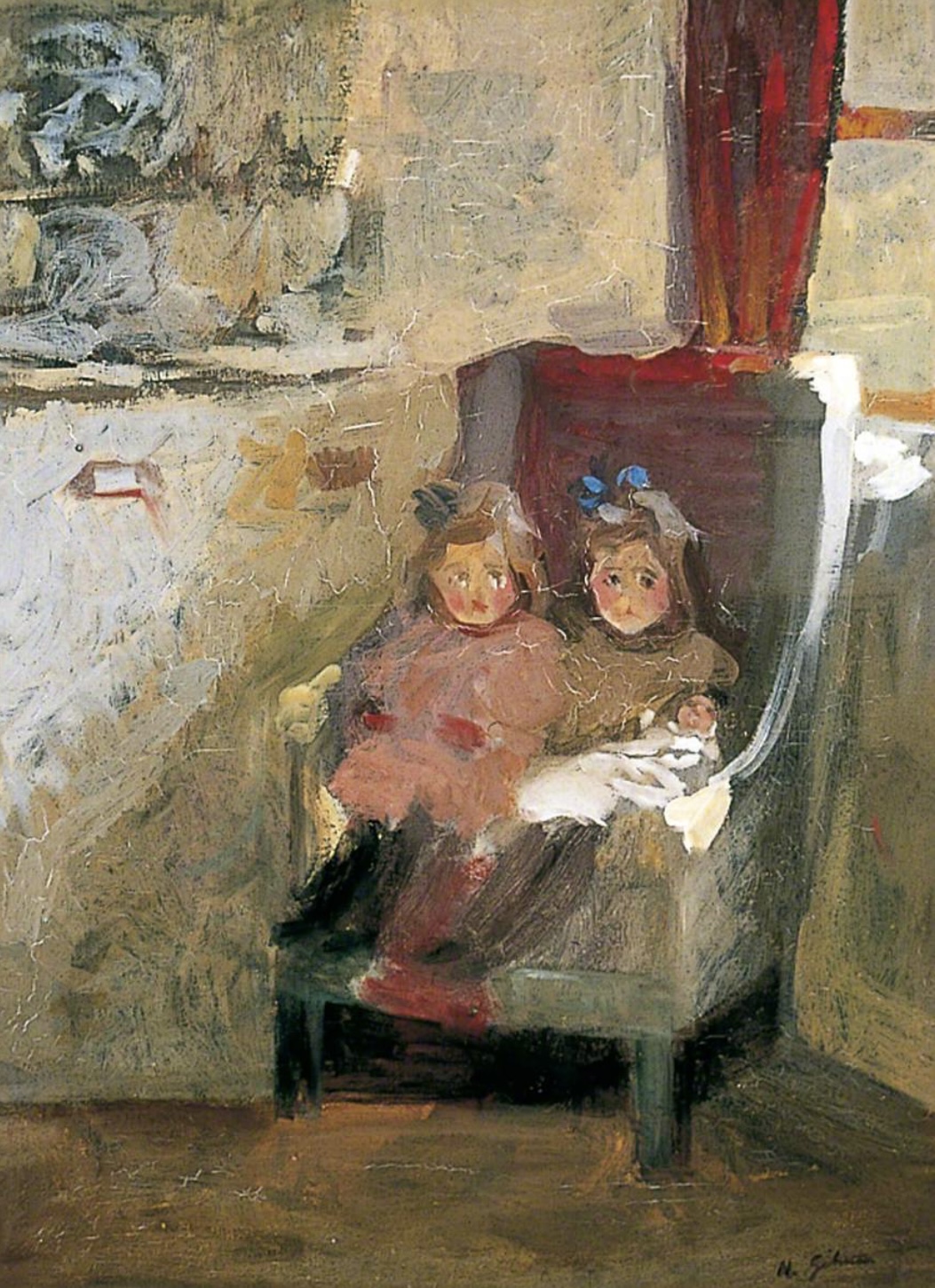
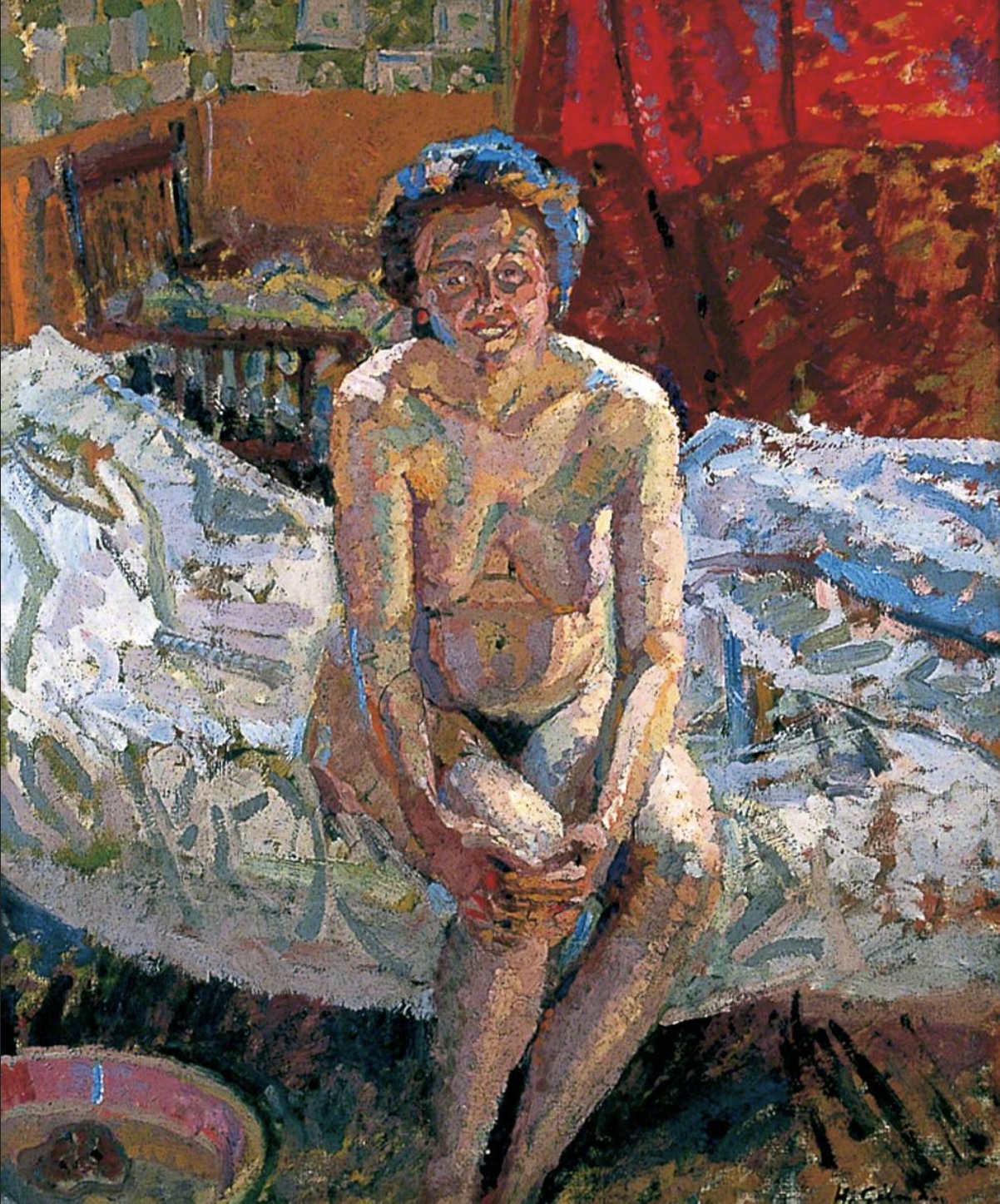
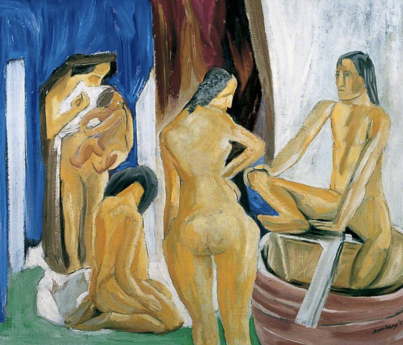
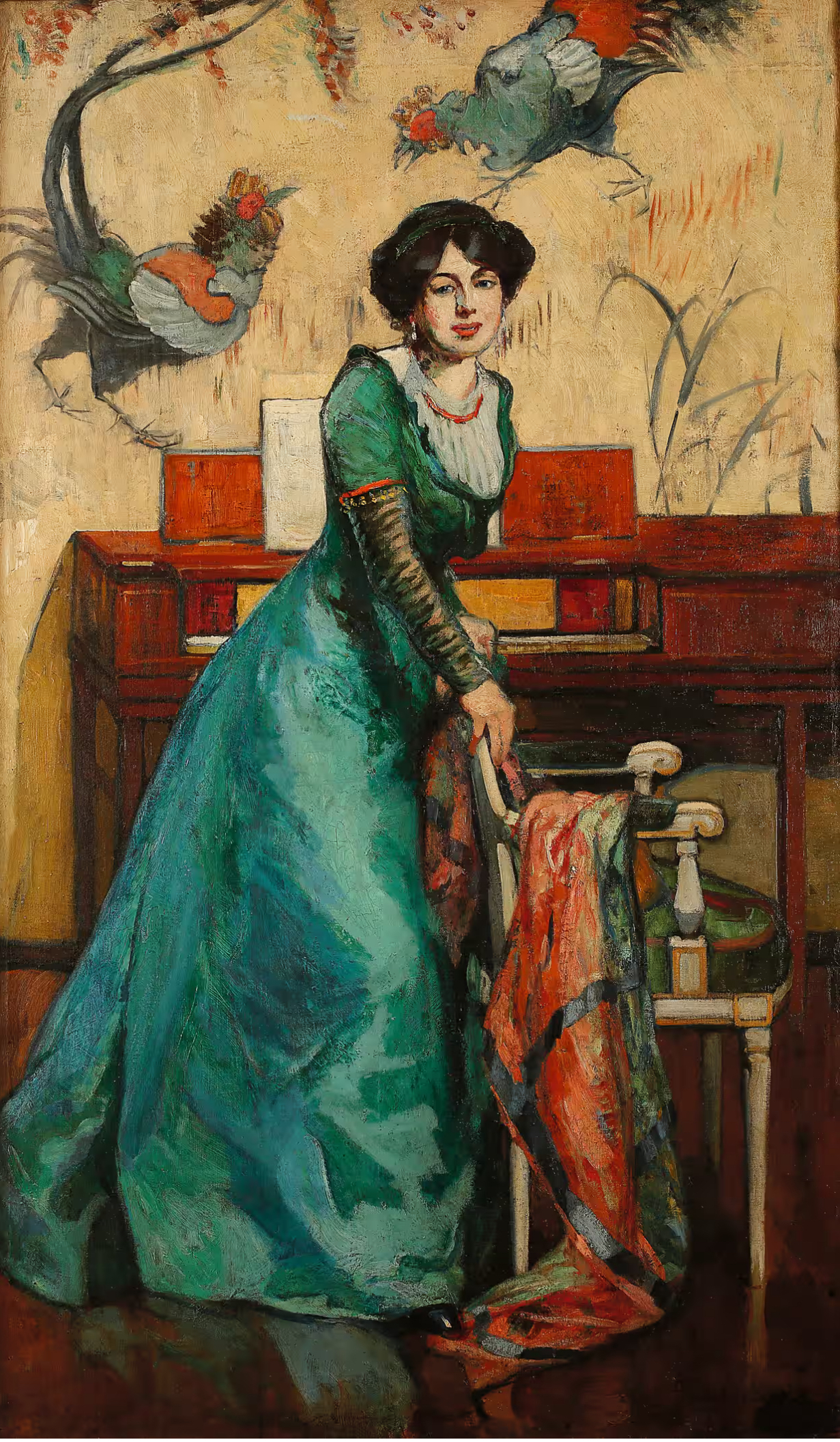
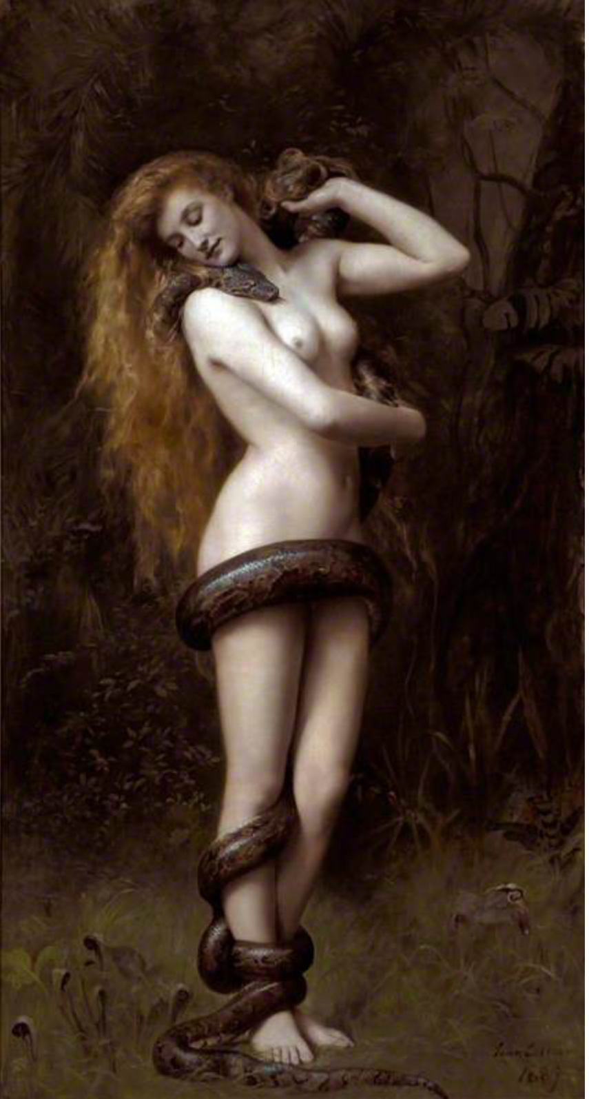
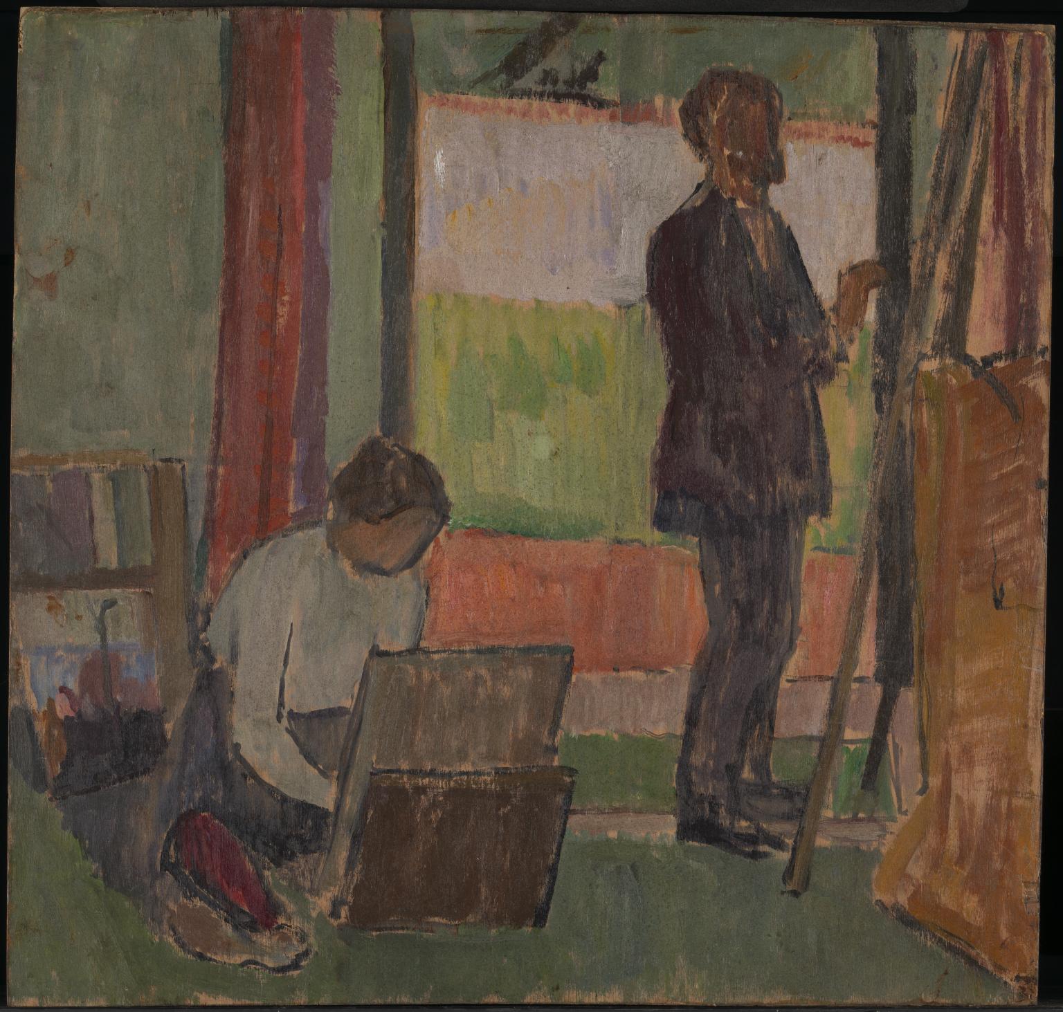
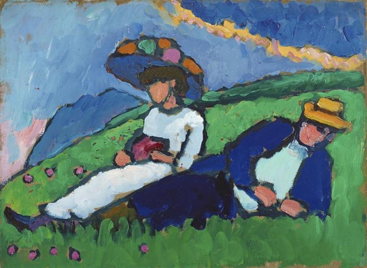
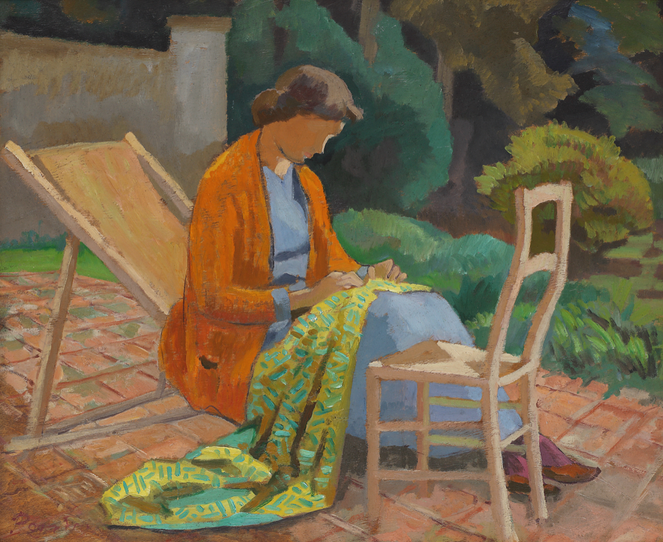
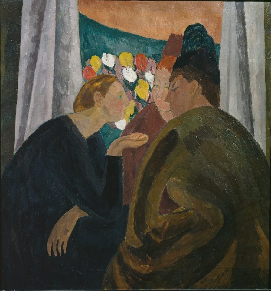
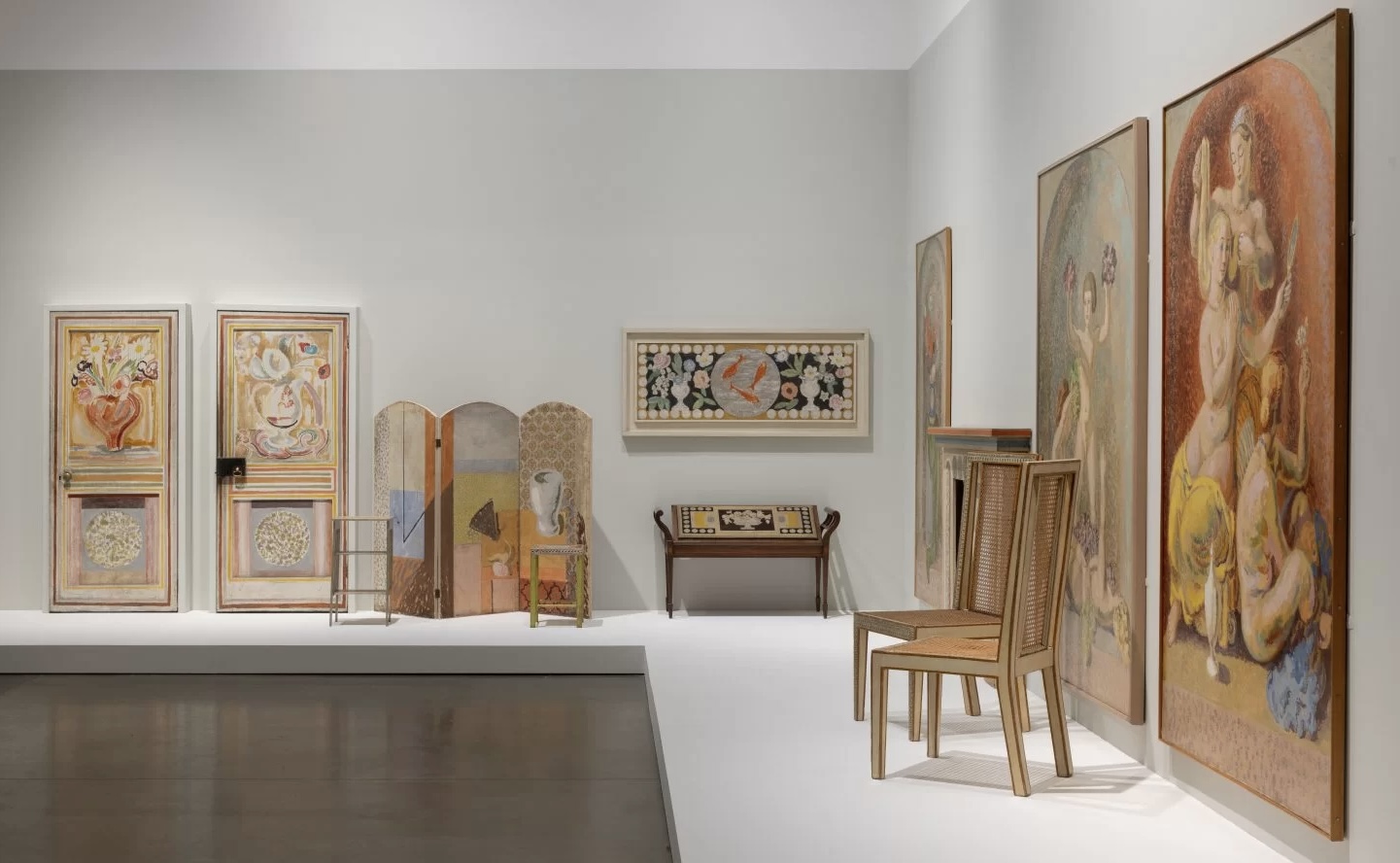
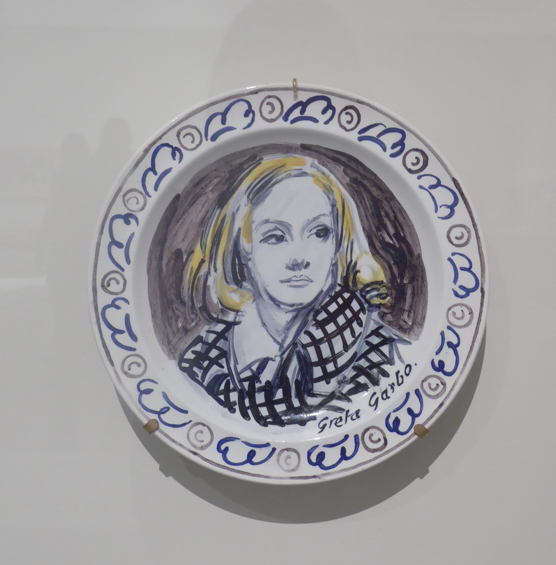
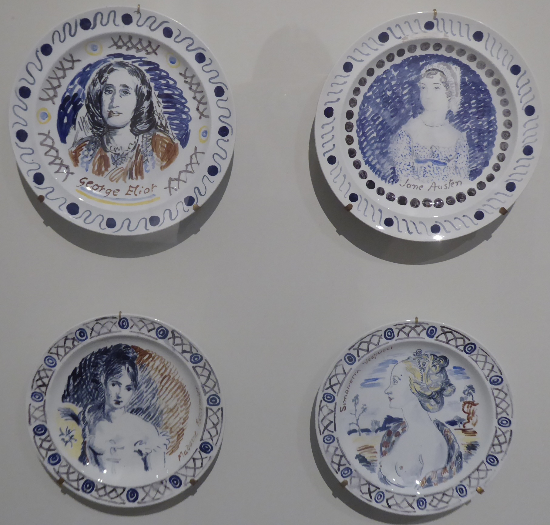
Bell, in contrast, seemed all over the place. She was more experimental (personally and professionally) and her focus was on the “language” of form and colour – but I really couldn’t find a single piece that stopped me in my tracks or pleased me entirely. I had thought of her colour palette as rather murky and muddy, but here there were brighter colours that I hadn’t expected. Nevertheless much seemed slightly unfinished or unthought-through. Her portrait of her sister, Virginia Woolf, was up there with Cassandra Austen’s of Jane: affection but not execution. Whenever something caught my eye, I found myself thinking that someone else had done it better. A painting of the Etchell siblings with featureless faces, for example: it paled beside Gabriele Münter or Roger Fry and looked slightly inept.

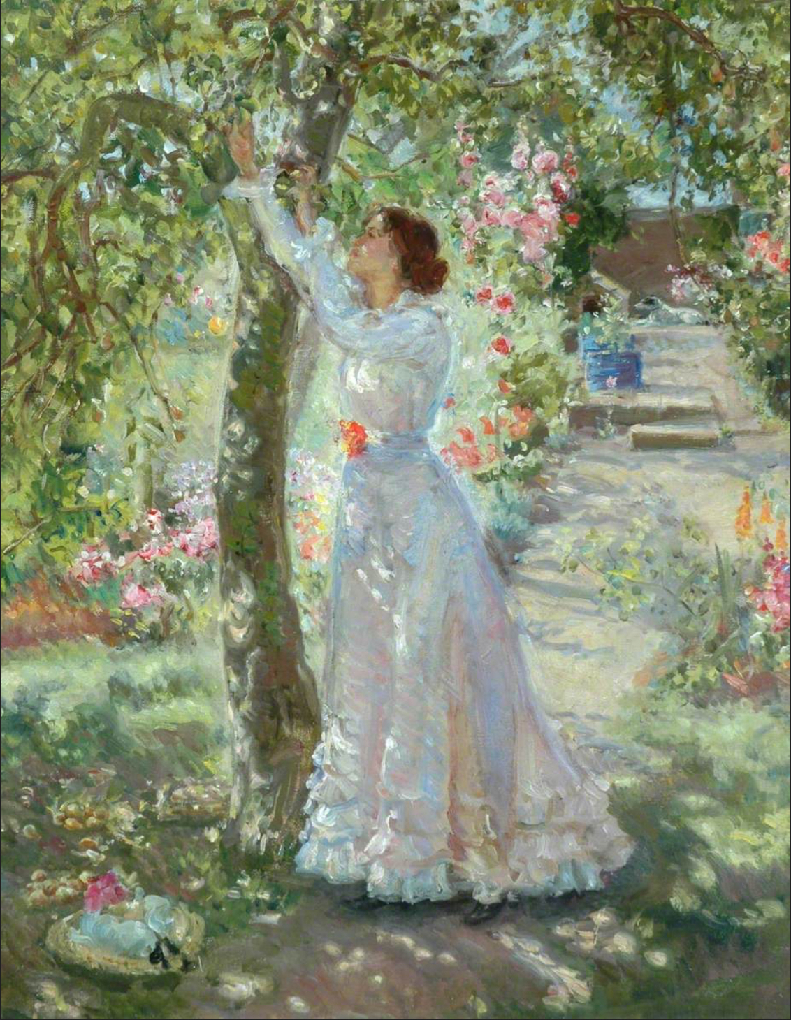
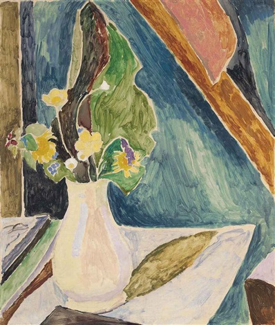
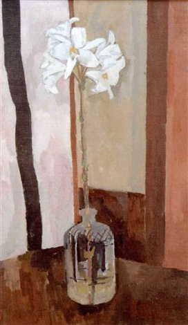
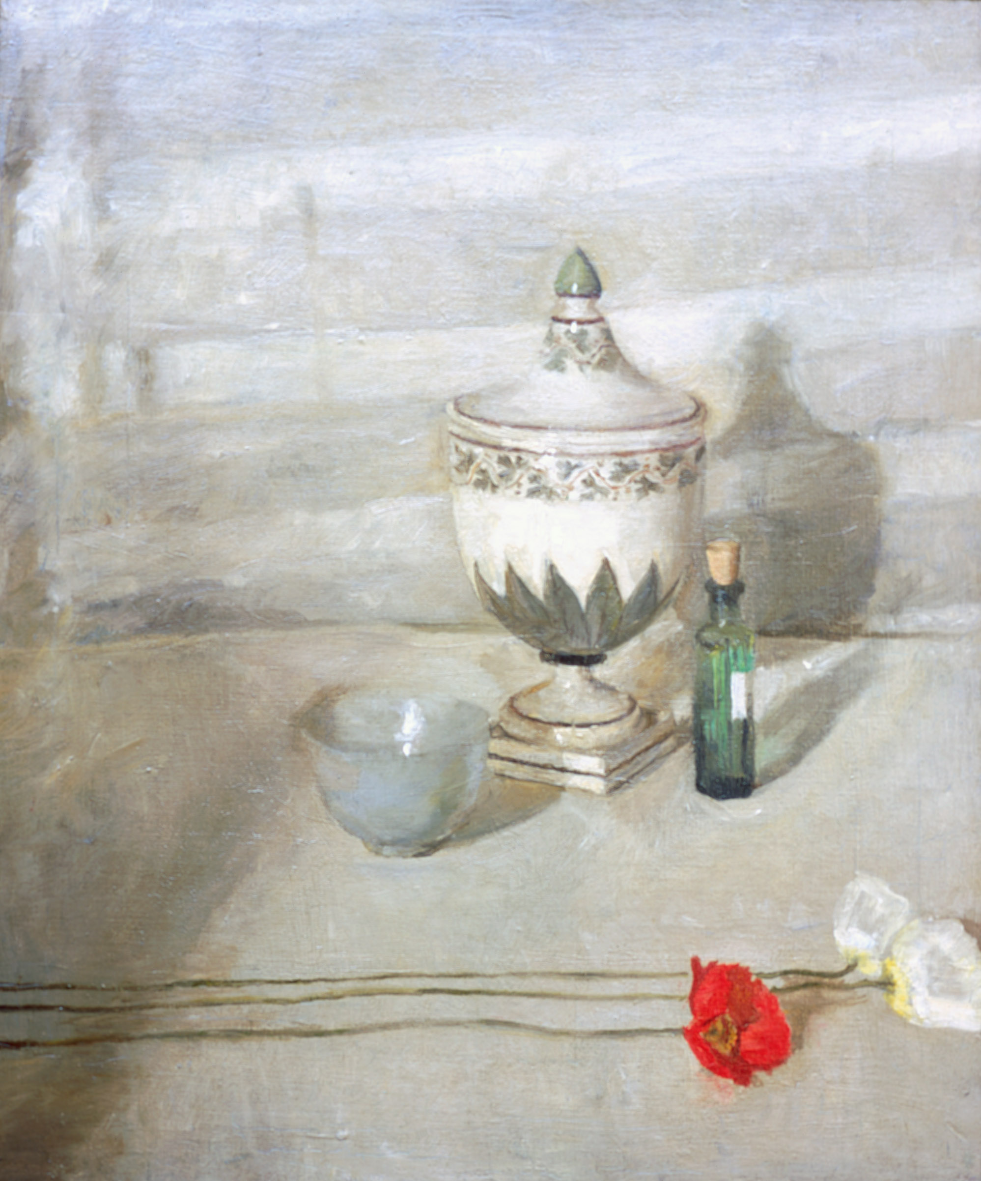
I went with a companion, who got quite irritated with a pair of still lifes. The lack of focus: was it form or colour in the wildflowers? Why did one think of felt-tip pens running out of colour? Why the silly cross-hatching on the vase in the more accomplished lilies?

One answer is that Bell did what she liked. For all her involvement with the Omega Workshops, Bell didn’t have to earn her living by her work, and she had help in bringing up her three children. She also ditched conventional morality. And I think this was the one really great thing about her – she had the chance of freedom and she really went for it. The decorations in their Charleston home, the foregrounding of women’s lives, the collaboration with others, the refusal to be confined by one style or theme, the unconventional way of life – that was what was interesting.

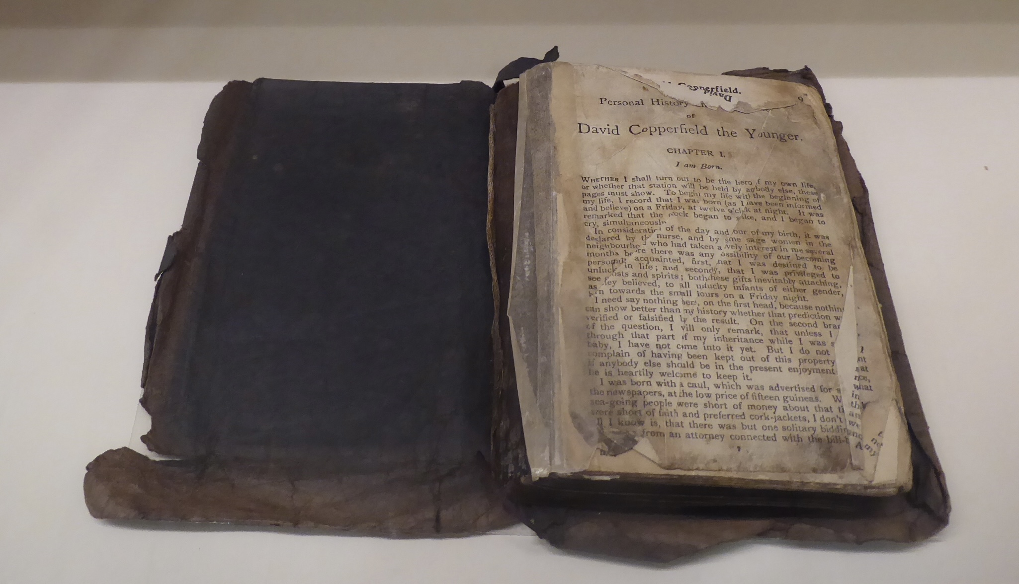
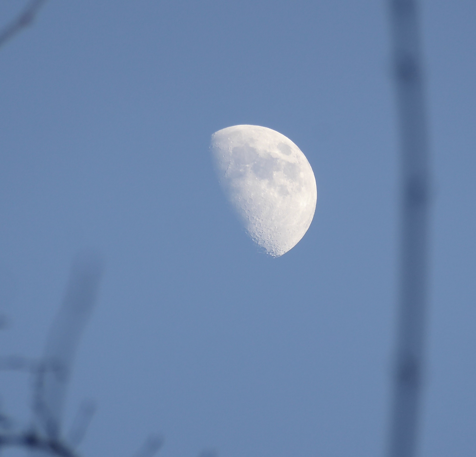
I returned to London and a much more conventional and masculine – even macho – experience. I just had time to get to the Charles Dickens Museum to see the copy of David Copperfield that had gone to Antarctica on the Terra Nova expedition. I had to see it. Edward Wilson, Apsley Cherry-Garrard, Herbert Ponting . . . the fascination I experienced when I first read Wilson’s diaries briefly returned as I looked at the blackened, dog-eared pages. And it was a lovely sky as I walked back through St George’s Gardens: perhaps I can compare this afternoon’s moon with Cassini’s map!

Newcastle

Newcastle really is a handsome city – it announces the fact from the moment you cross the river and curve into the station. Sunshine helps, of course. It’s looking a bit pinched in other ways, but that’s another matter.

Straight to the Laing and the café, but before I had my coffee I was sidetracked by the corridor display of domestic items: a teapot by Christopher Dresser plus crockery by Laura Knight and Eric Ravilious. His little tureen was a delight.

But I wasn’t there for household items. No, I was there to see Turner’s “Fighting Temeraire”, which is on loan from the National Gallery, and the exhibition surrounding it. As I walked round I felt a small surge of horrified interest in how a battle would have been fought by sailing ships atop a wooden crate riddled with gun holes. Lots of Turner’s watercolours, which – since I know one of the scenes he painted – included a great deal of artistic licence. Sometimes his painting are too undefined and blurry for my taste, and I wasn’t expecting that much of the Temeraire. Well, I was wrong. In the flesh, it is amazing. It blazes and shimmers and is utterly beautiful. Lots of artistic licence here too, but there is still pathos in the old ship that helped to defend Britain from Bonaparte’s forces being led to her death by a new-fangled steam tug. “Burial at Sea” next to it was equally breathtaking. It just glowed.

There was more about shipbuilding and industry on the Tyne, including one photograph by Chris Killip. Afterwards I went into his exhibition of “The Last Ships”. His eye is perfect, but it is perhaps the time he spent on the people and the area that was his invisible power. These photographs of the same street over the course of a couple of years in the mid-1970s:

My room is on the fourth floor and I have a perfect view of the Ionic capitals of the old Assembly Rooms. And of the buddleia sprouting from its masonry.

Staithes

We caught the bus to Staithes and arrived at 9 a.m. I had thought that a bit early, but it was actually sensible. Staithes is so picturesque – and this is the holiday season after all – that it quickly began to get busy. At the end of the nineteenth century it was popular with plein air artists, known as the Staithes School. Laura Knight lived here for a number of years both before and after her marriage, learning her trade and often burning her drawings to keep warm.

And then the long walk along the coast into a headwind back to Saltburn. En route we passed Boulby mine, which is not just a mine but also an underground laboratory. I shall think of it as a British mini-CERN.

York art gallery

The National Gallery is currently lending some of its big names to smaller art galleries, so York has one of Monet’s lily ponds – and hence a hook on which to hang a whole exhibition. Firstly Monet’s precursors: plein air painting, Barbizon, Camille Corot, Théodore Rousseau, François Daubigny, Eugène Boudin, more Japanese woodblock prints (particularly influential in the practice of depicting the same scene under different light and weather conditions). Then those who, in turn, were influenced by Monet like Wynford Dewhurst (one work borrowed from Bradford!) and Thomas Meteyard.

It was great to see up close the blobs of paint that so beautifully represented the lilies; it overcame the sensation of familiarity that you can’t help but feel when seeing such a famous painting and made it exciting again.

And then to the rest of the gallery, which taught me that I really don’t like the muddy tones of Walter Sickert and Harold Gilman* and I’ve had my fill for now of Gwen John’s stasis and meticulousness. Ethel Walker was there, along with Laura Knight, Paul Nash, Stanley Spencer and rather too many by local boy, William Etty, in a very pleasant gallery space.

* although the online reproductions are more colourful than the paintings on the wall.

Now you see us: women artists in Britain 1520-1920

To Tate Britain for this exhibition, which covered old and new ground for me and slotted in satisfyingly with recent thoughts. I think this makes the third exhibition solely by women artists I have seen in the past couple of years, so it’s obviously still A Thing. Some of the paintings were really not that good, but visiting the exhibition was like reading Dorothy Whipple: the insights and perspectives it afforded me had my head spinning and far outweighed any lapses.

Lots of women artists have just disappeared into the past or their work has not been attributed to them. There was a painting from the 17th century by Artemisia Gentileschi of Susanna and the Elders that has been misattributed to male painters a number of times during its existence. Nothing by Susanna Horenbout (16th century) is known to have survived, even though she was admired by Dürer.

Many of these women painters were not originally from Britain: Angelica Kauffman, Gentileschi, Horenbout, Levina Teerlinc, Maria Verelst, Mary Moser. And most of these were from families of painters/craftsmen – so perhaps these highly marketable skills pulled people across Europe in search of patrons and commissions and were worth passing on even to daughters.

Suitable subjects for women painters were, of course, portraits (particularly of other women or children) and flowers. History painting was beyond their imagination so they’d best stick to recording real life. Painters like Kauffman kicked against these restrictions, and she produced biblical and literary scenes, sometimes with the woman as the more active figure. A score settled – even though the finished product could be a bit blah.

Actually, my favourites among the earlier works were indeed the flowers! I really couldn’t tell that Mary Delaney’s raspberry was a collage. As for the gooseberry . . .

Joshua Reynolds had a sister, Frances – which immediately set me to thinking of “A Room of One’s Own”. Frances kept house for Joshua and learned to paint by copying his works – a more respectable outcome than for Shakespeare’s hypothetical sister.

The Society for the Encouragement of Arts, Manufactures and Commerce (the Society of Arts) was founded in 1754 and offered cash prizes and medals in many categories, including the ‘polite arts’ – e.g. patterns for embroidery, copies of prints, drawings of statues and of ‘beasts, birds, fruit or flowers’, as well as landscapes. Some prizes were specifically intended for young women and could lead to a career.

And a career was possible: Mary Beale and others had already proved that. Some of it does look a bit churned out – Joan Carlile’s re-used silver dress, for example.

The Royal Academy was founded in 1768 (with Kauffman and Moser amongst the founders) for the really serious stuff and showed work by women artists. Materials mattered. Oil paint took a long time to dry (I remember Mary Beale’s husband experimenting with ways of getting it to dry faster to speed up the production line) , but more malleable media were frowned on. Reynolds was very dismissive of pastels, and traditionally domestic crafts such as needlework were beyond the pale.

Florence Claxton’s “Women’s Work” was a brilliant dissection of the female role: essentially man’s servant, but some at the margins were plotting their escape. It put me in mind of Ford Madox Brown’s “Work” in its shape and packed social commentary.

Once women were able to study art (but not life drawing until 1893), things changed. They could paint out of doors (if not à la Caspar David Friedrich, then at least in gardens and orchards), join artistic communities and even paint female nudes. The first woman was admitted to the Royal Academy Schools in 1860, and with the founding of the Slade School in 1871 women were offered an education equal to men’s.

Another blob of red in “The Passing Train”. The way the pattern dominates everything in “The Deceitfulness of Riches”. Too many Ethels though: Wright, Walker (I saw “The Garden” at the Laing, I believe) and Sands.

There was a row of paintings by Laura Knight of women in coastal scenes, which were illuminating. In the watercolour the bathers seemed to blend into the landscape like nereids, but in the later paintings the female form is more dominant. The absence of a horizon in “At The Edge of the Cliff” turns it into a brooding scene.

Oh, the significance of a slipped shoulder strap! (John Singer Sargent’s original “Madame X”, Monica Vitti yesterday, and today “A Modern Cinderella”. Shocking . . . apparently.) And the male gaze again. I’m not sure the theory always holds up: I really couldn’t see any difference between the “gaze” of “Psyche Before the Throne of Venus” and anything by, say, J W Waterhouse or Lord Leighton.

And then more paintings that show that a woman artist is no more pin-down-able than a male artist. After all, what do Elizabeth Butler and Gwen John have in common?

And, finally, the plane trees outside the Tate have been severely pruned as if they are topiary.

Southport

To Southport on a whim. Another one of those railway stations that was designed for more passengers and bigger trains than it receives today. (Skegness is my go-to station for that.) I’m not even sure what the front of railway station looks like, for there was an entrance to Marks and Spencer immediately beyond the ticket barrier and that was how I entered the town centre.

All towns look tatty these days; it’s particularly noticeable in places that were built for the prosperous in prosperous times. Their grand Victorian and Edwardian buildings require constant maintenance, and how can grand hotels survive in an age of Airbnb? I looked at the Venetian Bridge over the artificial lake . . . and read how popular it was in the years before the war with fancy dress and lights and gondolas. Such a disconnect with what I saw on this dull, damp day.

Fortunately The Atkinson – an all-purpose gallery, museum, library, theatre and café – has recently been refurbished and is great. I wandered round the gallery, noting the Laura Knight ballerinas that I’d seen at the Milton Keynes Gallery – and surely I’ve seen that Pygmalion somewhere? It was mostly traditional art – which was fine by me when the contemporary world was represented by a Tracey Emin neon scribble. There was so little to “unpack” there. Whereas “Lilith” . . . oh, my goodness!

There was also an exhibition of paintings by Southport-born Philip Connard – impressionist, WWI artist, decorator, teacher. His dates are 1875-1958, which brings me nicely to the book I am reading at the moment: “The Horse’s Mouth”. (Fourth or fifth attempt, although I sailed through “Herself Surprised” thirty-odd years ago.) The fictional Gulley Jimson is of a similar era – although it would be libellous to suggest that Connard resembled Jimson in any other way. Connard’s paintings were a bit “blah”, but he could capture light on flowers beautifully – and he was certainly versatile.

There was also a small exhibition of Connard’s contemporaries, including Sickert, Cadell and Fergusson. I added to my collection of Glyn Philipot paintings too, along with one by Frank Brangwyn which made me realise how sensitised I have become to current preoccupations. I am so used to being lectured by gallery labels on the out-of-date mindsets and values behind so many works of art that it was quite a shock to come across Brangwyn’s painting of a slave market without any commentary. And I realised that I did indeed find it shocking: I thought it needed some context for a younger viewer – which was perhaps a bit patronising of me. (I also rethought my reaction to an earlier Brangwyn painting of the same name, which was an exercise in self-reflection.) I wasn’t even sure if it was a real scene or something conjured up from an overwrought Victorian imagination – like “Lilith” again. (It did rather amuse me that most of Napier’s output on ArtUK are portraits of Victorian worthies – with the occasional nude offering a possible peek into what went on beneath those top hats and bushy beards.)

There was more information on the painting of the Village Belle, which at first glance looked like a pretty girl chatting with the village boys. Unsurprisingly it wasn’t that simple: there had been another painting showing the same girl, now clutching a child and leaving the village under a cloud. Another insight into the Victorian mindset – and/or a warning to pretty village girls everywhere.

Lighter-hearted images were also available, as there was a Bill Tidy exhibition in the gallery. This was my steal, along with “The Nosegay” and Hawksley.