V&A

The brilliant sunshine of the last couple of days has been replaced by cold rain, and I went to the V&A simply because I was deterred by the long queue outside the Natural History Museum. It wasn’t second best however: it’s always good to get lost in the V&A for an hour or two. This time it was mostly amongst the ceramics. My goodness, but the museum has so much stuff! And not all of it what one would care to keep. As I looked at the tall glass cabinets of china ornaments I almost expected to see a replica of my parents’ souvenir of Helensburgh or a novelty ashtray.

Inevitably I drifted towards what was familiar and ended up in front of tableware designed by Eric Ravilious. There were also designs by Vanessa Bell – looking unstructured beside Ravilious’s neat delicacy. En route I was waylaid by monochrome Chinese pottery (which brought back the Burrell Collection) the composition of different types of earthenware (having forgotten what I picked at the Bowes Museum a couple of years ago) and a pile of misfired Delft plates. I am sure I first learned about these in the Delft museum, but I took no photographs and can’t rely on my memory.

Vanessa Bell and Charles Dickens

To the Vanessa Bell exhibition in Milton Keynes to see if I could feel more positive about her work. Well, not really – but the journey to that decision was quite interesting.

I’d been to the same gallery to see Laura Knight (1877-1970; Bell 1879-1961) and it was instructive to compare the two exhibitions and artists. Knight’s work (as curated for the exhibition) followed a path from early experimentation to a recognisable style and regular themes; she had to earn her living from an early age and she was sometimes hard up. She accepted commissions, she worked as a war artist, she designed decorative work. She was married to the same man for decades and had no children. In short – at least outwardly – a fairly tidy story of a groundbreaking woman artist and her body of work.

Bell, in contrast, seemed all over the place. She was more experimental (personally and professionally) and her focus was on the “language” of form and colour – but I really couldn’t find a single piece that stopped me in my tracks or pleased me entirely. I had thought of her colour palette as rather murky and muddy, but here there were brighter colours that I hadn’t expected. Nevertheless much seemed slightly unfinished or unthought-through. Her portrait of her sister, Virginia Woolf, was up there with Cassandra Austen’s of Jane: affection but not execution. Whenever something caught my eye, I found myself thinking that someone else had done it better. A painting of the Etchell siblings with featureless faces, for example: it paled beside Gabriele Münter or Roger Fry and looked slightly inept.

I went with a companion, who got quite irritated with a pair of still lifes. The lack of focus: was it form or colour in the wildflowers? Why did one think of felt-tip pens running out of colour? Why the silly cross-hatching on the vase in the more accomplished lilies?

One answer is that Bell did what she liked. For all her involvement with the Omega Workshops, Bell didn’t have to earn her living by her work, and she had help in bringing up her three children. She also ditched conventional morality. And I think this was the one really great thing about her – she had the chance of freedom and she really went for it. The decorations in their Charleston home, the foregrounding of women’s lives, the collaboration with others, the refusal to be confined by one style or theme, the unconventional way of life – that was what was interesting.

I returned to London and a much more conventional and masculine – even macho – experience. I just had time to get to the Charles Dickens Museum to see the copy of David Copperfield that had gone to Antarctica on the Terra Nova expedition. I had to see it. Edward Wilson, Apsley Cherry-Garrard, Herbert Ponting . . . the fascination I experienced when I first read Wilson’s diaries briefly returned as I looked at the blackened, dog-eared pages. And it was a lovely sky as I walked back through St George’s Gardens: perhaps I can compare this afternoon’s moon with Cassini’s map!

Lewes

I’m going to the Vanessa Bell exhibition in Milton Keynes tomorrow, so, as prep, I had a hankering to visit the Radev Collection exhibition at the Charleston in Lewes. This part of the Charleston is housed in a 1930s disused council building within spitting distance of the railway station, and the Radev Collection is of 19th/early 20th century British and French art. The origins of the collection are almost as interesting as the artworks themselves.

But first I had to get there. Change at East Croydon on the way out and Haywards Heath on the return – places that were hitherto merely names to me. As the train moved away from London I eagerly looked out of the windows to see the countryside and observe how it differed from what I am used to . . . but where on earth was it? It seemed ages before houses gave way to greenery, which set me to thinking of how George Orwell and E M Forster (more of him later) railed against the spread of interwar ribbon development. Their laments always struck me as rather paternalistic and snobbish – people must be housed after all – but today I saw their point. Perhaps we all turn nimby as we age and pay off our mortgages. “Going, going” indeed.

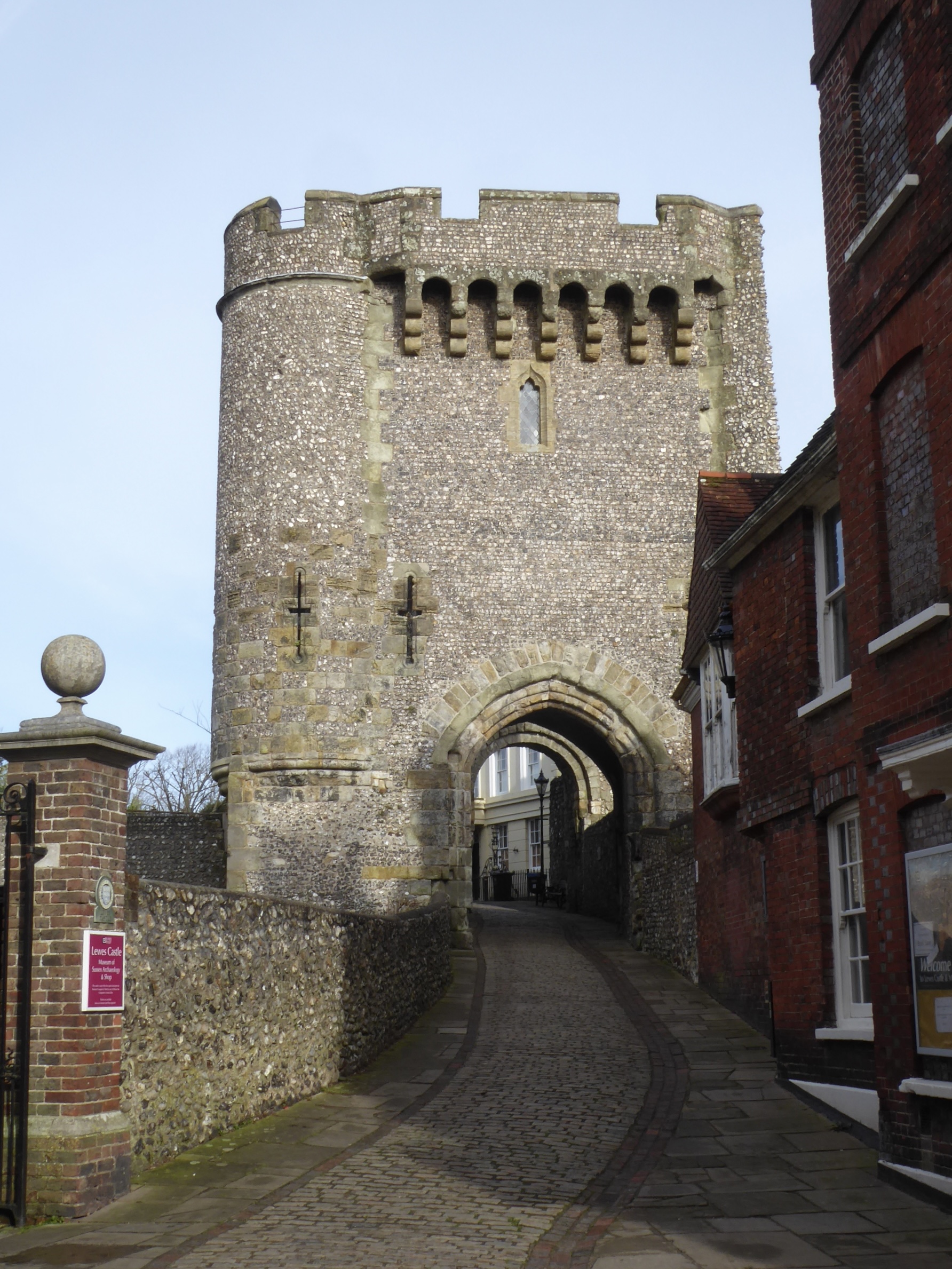
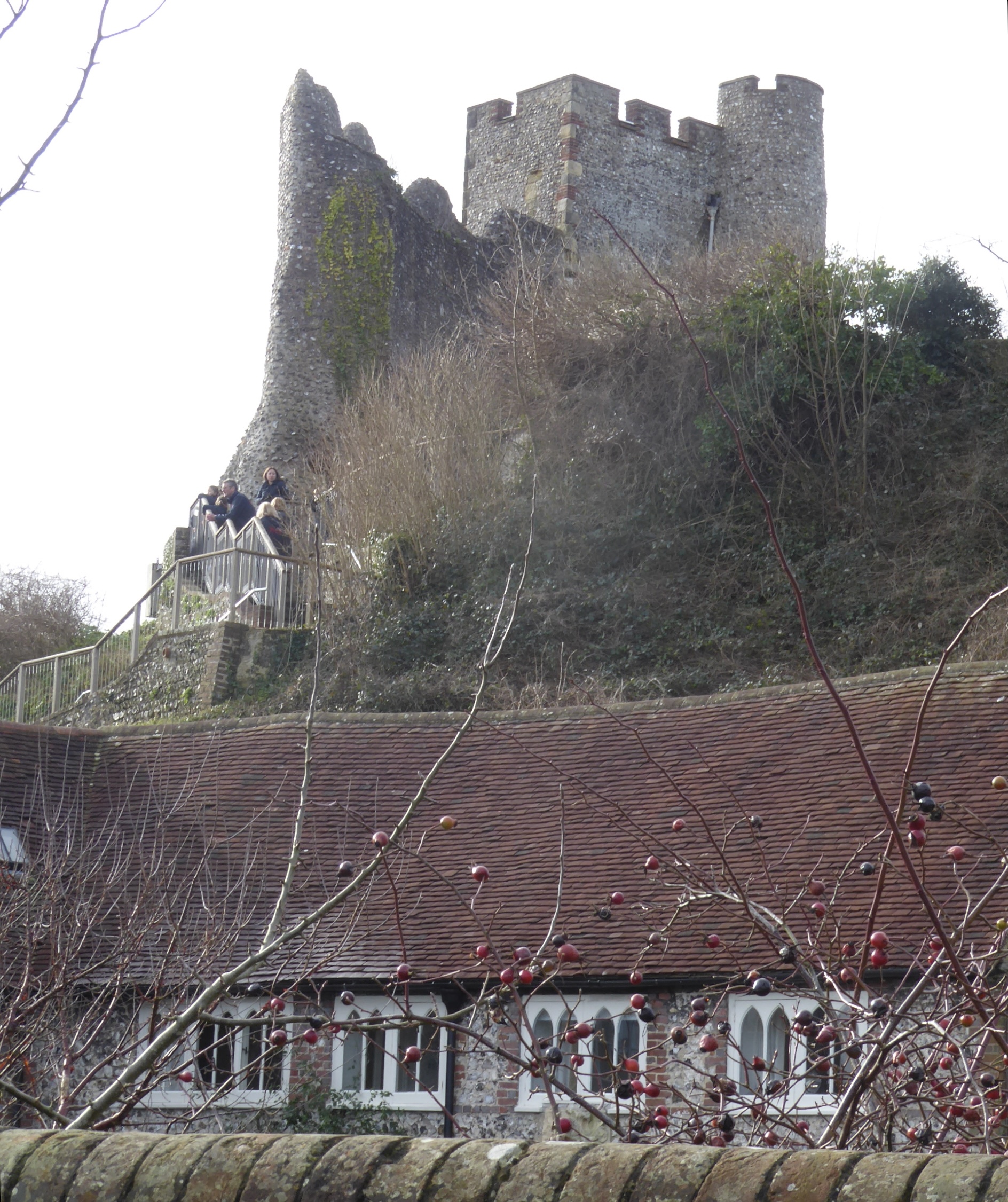
And then I got sidetracked by Lewes itself. It’s charming! It even has a castle (I really had no idea). Steep streets, Georgian buildings, knapped flint (even for the Kingdom Hall!), interesting vernacular architecture, chalk outcrops in the background, a history of brewing . . . it looks like once upon a time it was a self-contained, busy county town, an economic and administrative hub. I’m not sure that that is still the case, and quaintness only gets you so far . . . but all I can say after a short trip is that I liked it.

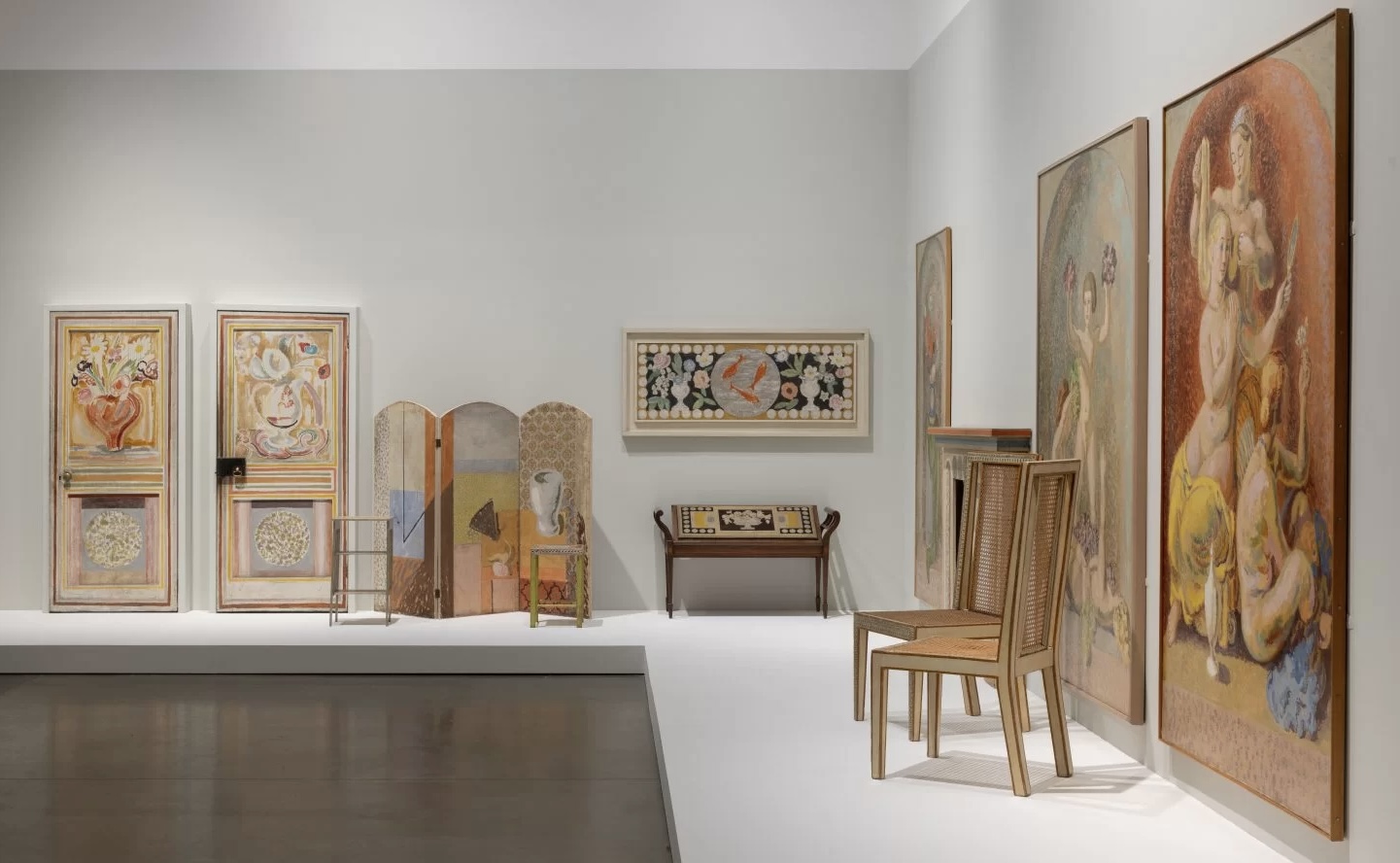
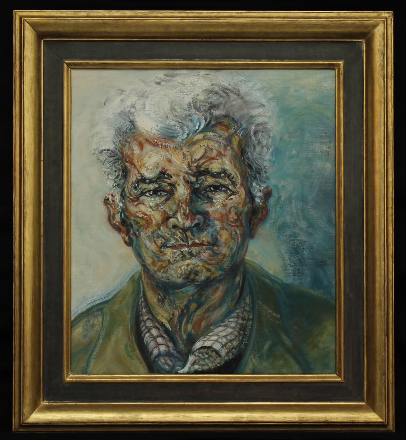
And so to the Radev Collection. The difficulty about the Bloomsbury Group and its satellites is keeping track of who had affairs/was friends with whom, because it does actually matter. So, Edward Sackville-West, a music critic, started collecting in 1938. He left his collection to a former lover, Eardley Knollys, art critic/dealer and artist who already had a collection of his own. Along with Desmond Shawe-Taylor, they had bought and created a salon at Long Crichel House in Dorset. (The former rectory – a nice irony.) Mattei Radev was a young Bulgarian refugee who stowed away on British ship in Istanbul and was granted asylum in 1950. I surmise he must have had great charm in his youth – even though the horrible painting of him by Maggi Hambling in later life does suggest ‘the worms crawl in, the worms crawl out” – for he found his way into Knollys’s life and was assisted by Knollys to establish himself as a picture-framer. After Knollys’s death Radev inherited the whole collection, which then passed to his civil partner on his death.

Oh yes – E M Forster also fell in love with Radev for a while.

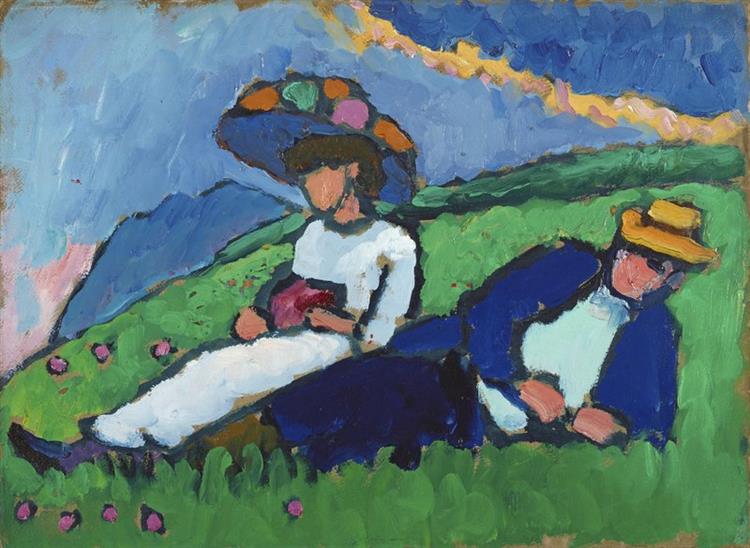
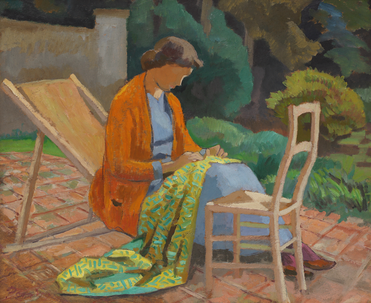
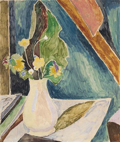
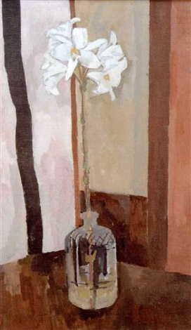
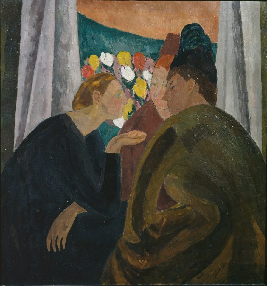
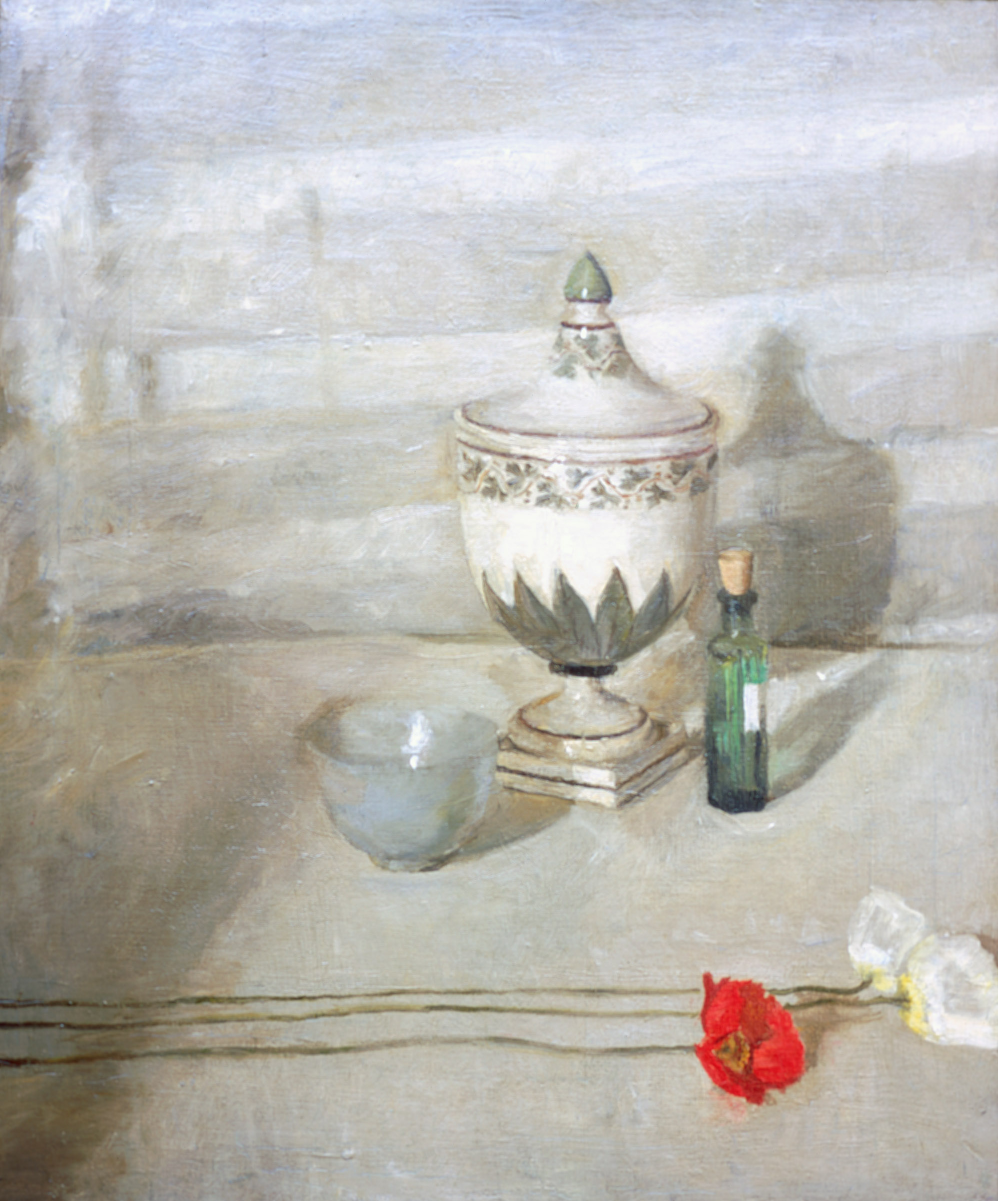
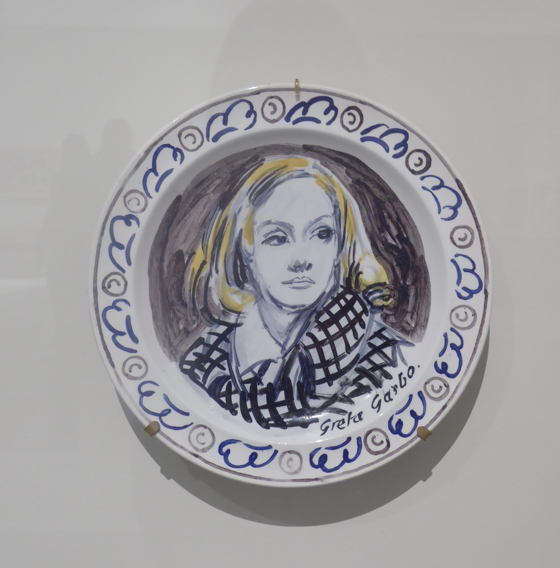
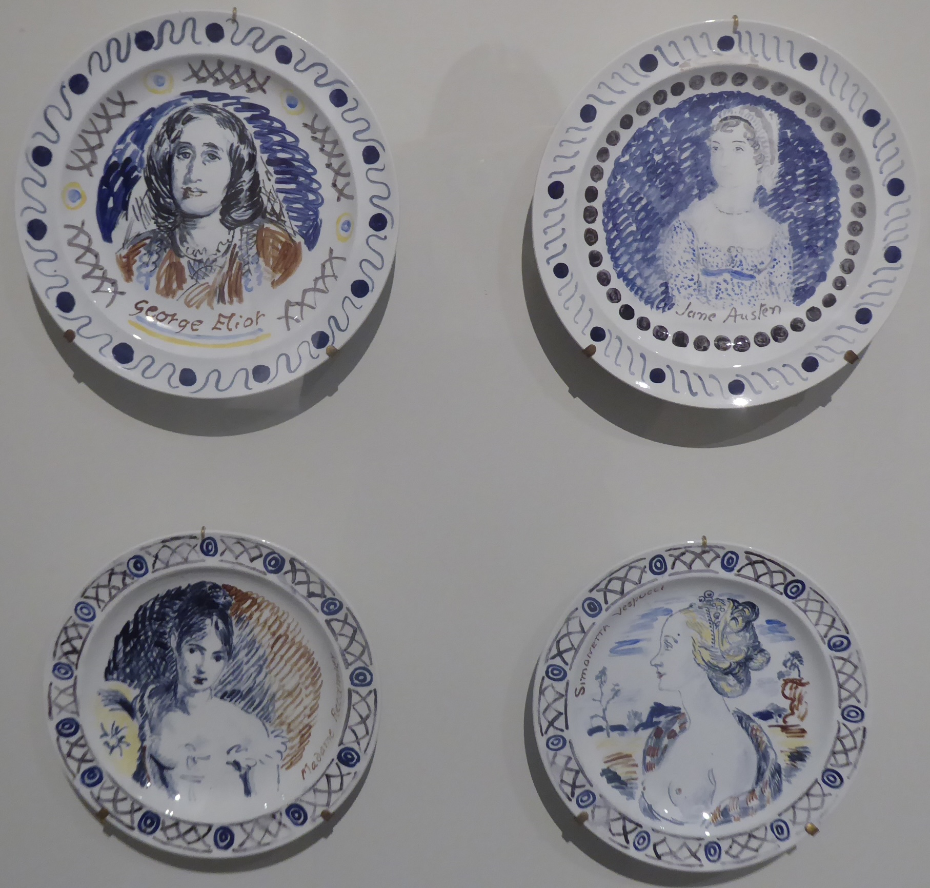
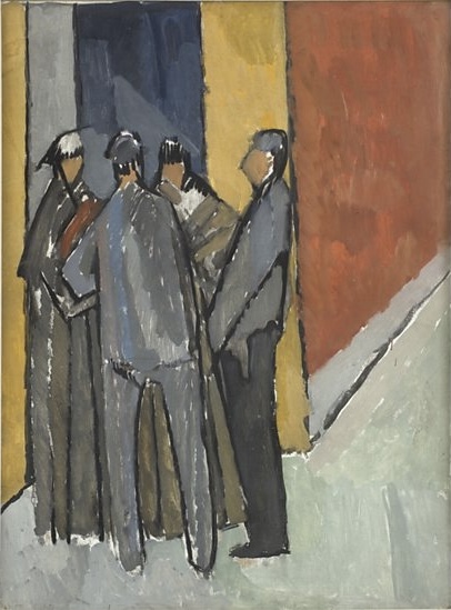
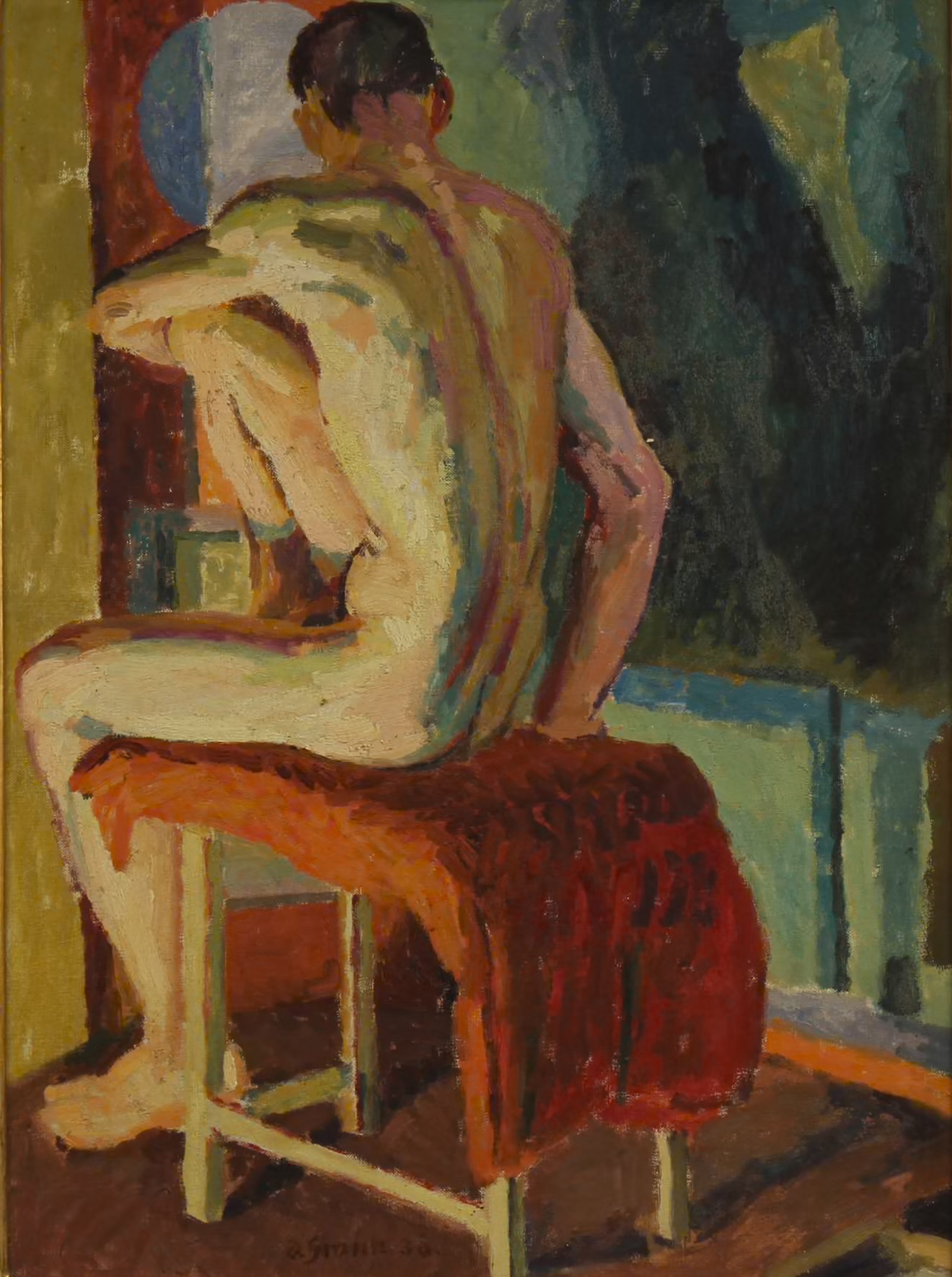
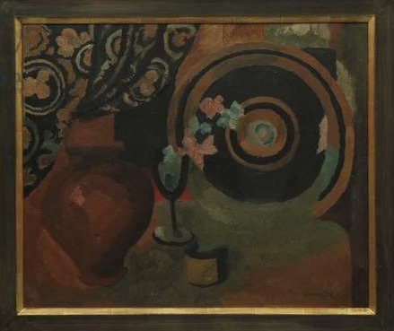
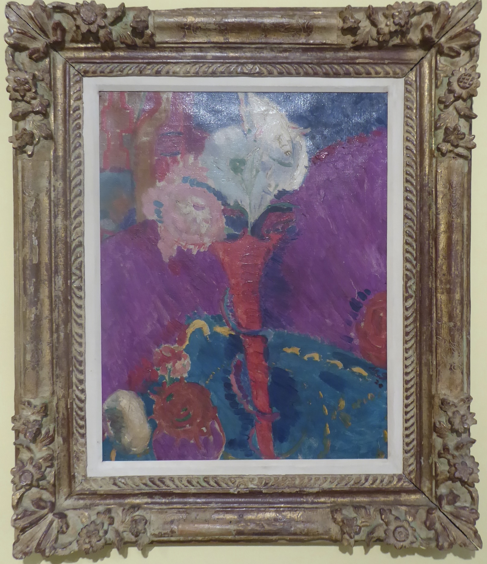
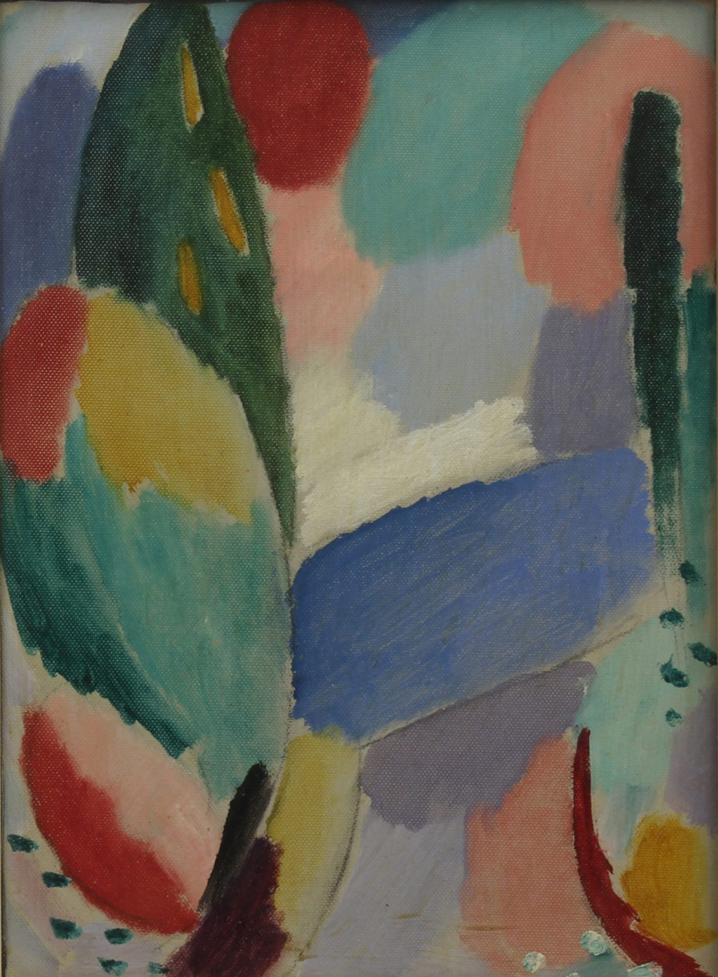
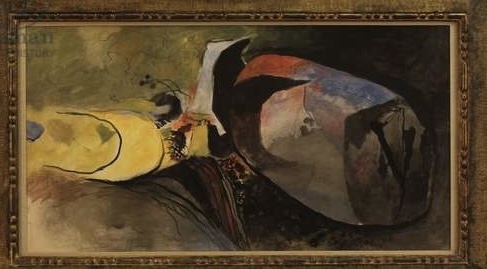
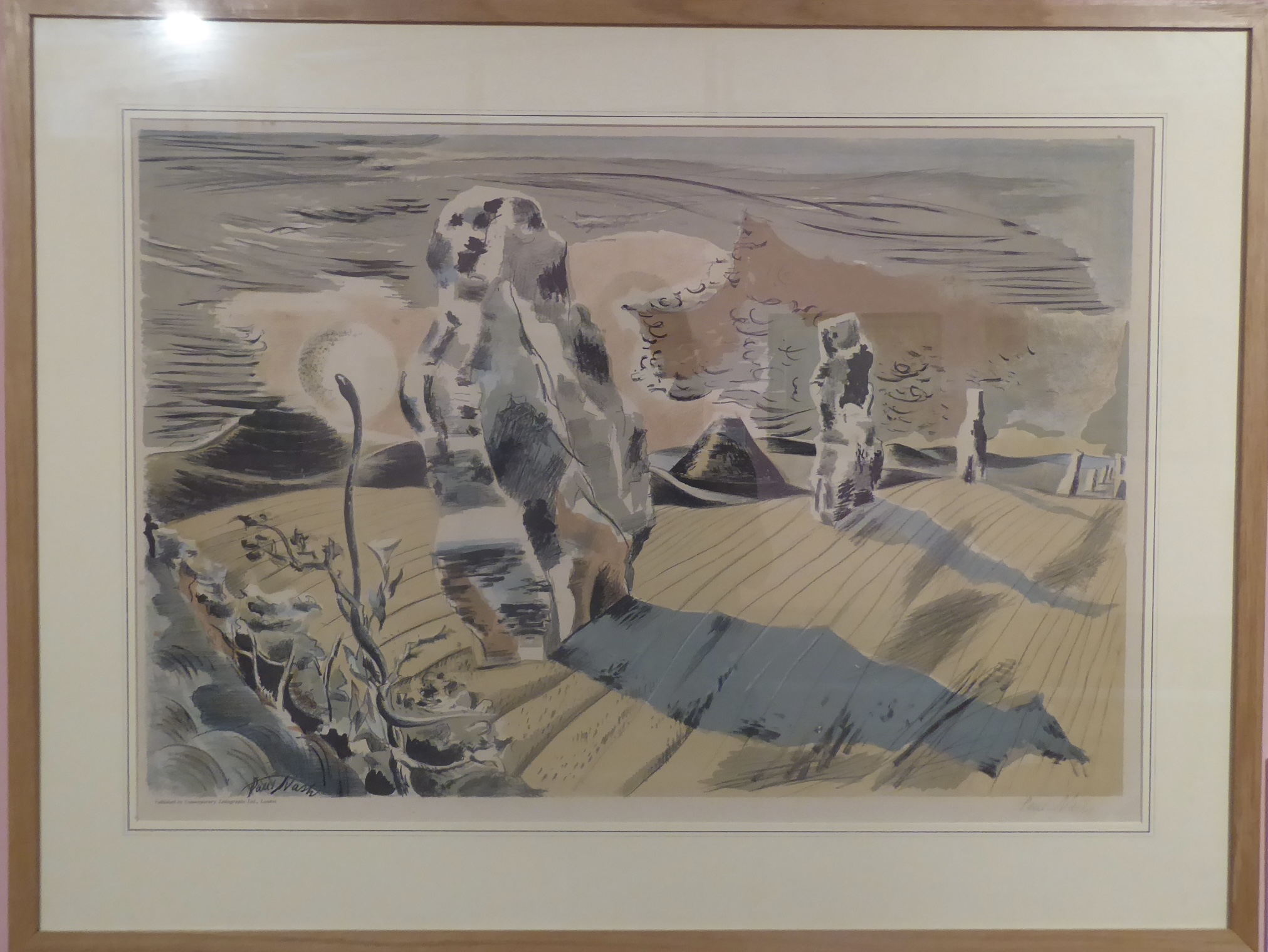
And the paintings? I wandered amongst them and confirmed my likes and dislikes – and then tried to examine why. I am still unimpressed by Vanessa Bell (such dull daubs), I still don’t care for Matthew Smith (nasty colour combinations), Eugéne Boudin’s use of oil paint is masterly, I can’t think why Alexej von Jawlensky’s colours are so appealing to me but they are, and I am beginning to like Graham Sutherland. Then the lithographs by John Piper and Paul Nash – I think I grew up on those types of illustrations and I felt very drawn to them, particularly since the Nash was inspired by the stones at Avebury.